

Vitamin Landing Pages
A seasonal supplement campaign needs one recognizable offer, not an extensive product catalog. Use a vitamin landing page to introduce a specific formula, address purchase concerns, and focus attention on one action: ordering.
-
-

-
-
-
-
-
-
-
-
Free Website Builder SoftwareDownload
-
-
-
-
-
-
-
-
-
-
-
-
-
-
-
-







More Website & HTML Templates for Vitamin





More Landing Pages from Medicine & Science Category





Other Medicine & Science Landing Pages
Minimal Vitamin Landing Page
A vitamin landing page template helps you launch a single product with its own campaign, whether it is a new vitamin D formula, a seasonal starter kit, or a bestseller pushed through paid ads. Many visitors arrive from a phone ad, so they should recognize the product the moment the page loads.
Packaging Photos Above the Fold
A first screen for a vitamin offer works best when it answers these questions in order:
- Which product this is, shown by name and packaging
- What form it comes in and how many servings a pack holds
- What it costs, including any delivery charge
- What the visitor should do next
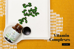
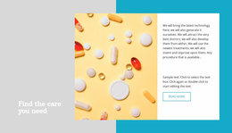
A line like "60 gummies, 30 servings" near the price handles the second question in a few words. A bottle with a striking label can carry the hero on its own with a short headline and generous space. A bundle or a discounted monthly delivery usually needs a split layout with more room for text. A few capsules or gummies poured out beside the bottle show size and color better than any description.
Ingredient Panels With Serving Counts
Below the fold, the information blocks usually follow a sequence like this:
- What's Inside, with the key ingredients and their amounts
- Supplement Facts as live text beside a label photo
- Serving and storage details
- Quality information the manufacturer can document
Pointing out that a 60-count bottle lasts a month at two tablets a day saves visitors the arithmetic. If the product comes in two pack sizes or gummy flavors, a simple selector keeps the choice on one screen. Leave out any certification you cannot show, and avoid promising health outcomes the product information does not support.
One Clear Route to Checkout
"Shop Now" fits a single bottle, "Choose Your Pack" suits a page with size options, and "Get Product Details" works for a launch still gathering interest. Pick one and stick with it, because two buttons with different goals pull attention in different directions.
With the Nicepage Payment Button Element, supplement retailers can configure a purchase action and connect PayPal or Stripe for payment processing. Place the button beside the price and again after the ingredient section, with identical wording both times. If the offer includes recurring delivery, state the billing terms in plain numbers next to the price.
Open the published page on a phone and check the product name, the price, and the payment flow. If someone who has never heard of the brand can follow the product and the terms without opening another tab, the page is ready.