

Neurology Landing Pages
For a first visit to a headache clinic, patients may be unsure which specialist to contact. A neurology landing page explains the consultation process and guides them toward one non-urgent action.
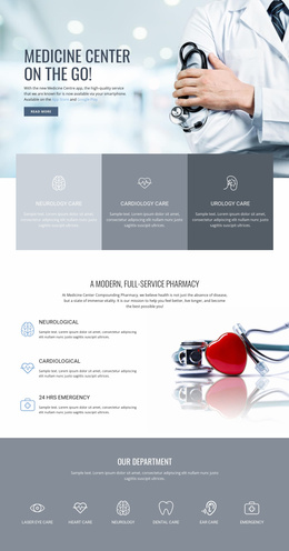
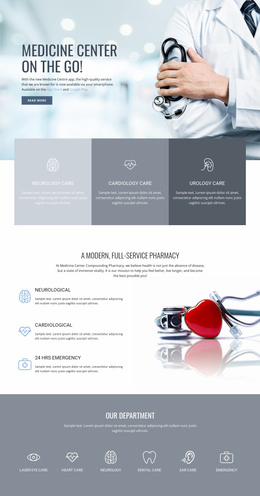
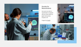
More Landing Pages from Medicine & Science Category
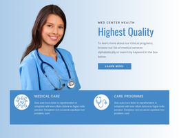



Other Medicine & Science Landing Pages
Mobile-friendly Neurology Landing Page
A person with recurring headaches may hesitate to contact a clinic if the purpose and cost of a consultation are unclear. They're often reading on a phone, in a waiting room, or on the bus. A mobile-friendly neurology landing page brings the answers together in one place, so nobody has to dig through the clinic's main site.
Built Around One Consultation
Each ready layout centers on one clearly defined service. A headache clinic might use it for migraine assessments, while a larger center could promote EEG examinations or movement disorder consultations. The first screen usually combines a descriptive headline with a real photo of the neurologist. A brief note about the visit and an appointment button follow. Further down, most layouts make room for the following:
- A specialist introduction with verified qualifications in the advertised area.
- Consultation details covering the price, the length of the visit, and whether a referral is needed.
- A short FAQ about documents or previous scans to bring.
- The request form and the clinic address.
A consultation version leans on the specialist's experience. An EEG version allows more preparation, such as washing your hair the evening before. Avoid promising guaranteed recovery and explain what the neurologist evaluates during the first visit.
Comfortable Reading on Small Screens
On a smartphone, start with the service and specialist, then the consultation terms. Short paragraphs, a generous font size, and strong contrast keep the text readable. Compressed photos help the page load quickly. Unrelated offers only add scrolling, so leave them out.
For visitors with tremor or reduced hand control, a large appointment button is far easier to tap than a small link. Repeating it after the price block saves a trip back to the top.
Keeping the Request Form Short
Typing on a phone is tedious, so long forms lose people who only want a first appointment. With the Nicepage Contact Form Field Types, a clinic can limit the request to a name, phone number, and service selection list. Clear labels and enough space between fields make the form easy to fill out with one thumb. Sensitive medical details can wait for the clinic's secure channels.
Label the button for what happens next, such as "Request a Neurology Consultation" or "Request an EEG Appointment," and say when the clinic will call to confirm. Add a note near the form reminding visitors that sudden numbness or slurred speech needs emergency care.
Start from a ready neurology landing page design in Nicepage, adapt it to your service, and give patients a straightforward next step toward specialist care.