Center of quality medicine Landing Page
Edit Template Offline
2. Create new page and search for id 22907
Edit Template Online
Create Awesome Websites


Free Nicepage Builder
Keywords
App Engagement Leads Into Care Proof and a Final Inquiry Point
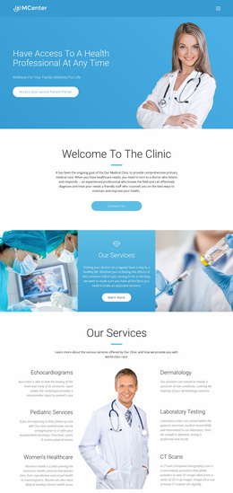
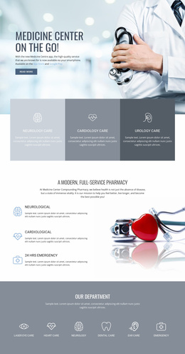
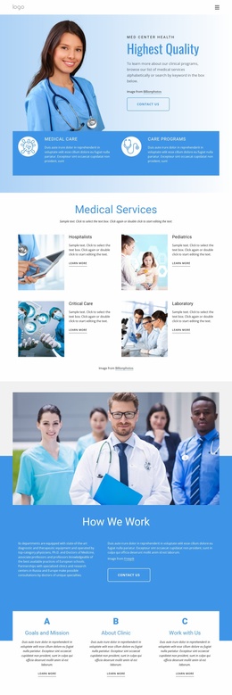
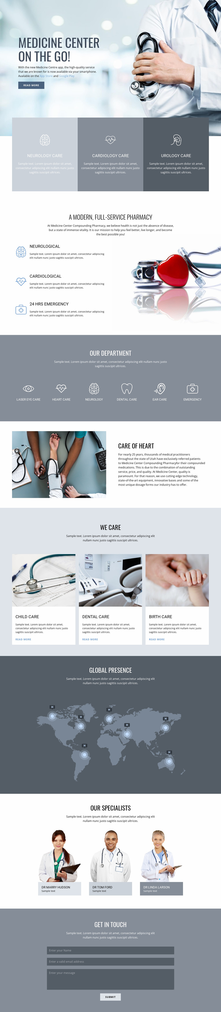
The first section gives the page a focused response path by placing the mobile app message over a large medical image and pairing it with App Store, Google Play, and Read More actions. Those links establish an immediate engagement option, while the following three-panel row clarifies the main care categories: neurology, cardiology, and urology. The sequence moves from a broad invitation into recognizable service choices rather than asking visitors to respond before they understand the center’s scope.
The pharmacy section and six-item department band then provide supporting depth. Neurological, cardiological, and 24-hour emergency capabilities appear beside medical imagery, followed by laser eye care, heart care, neurology, dental care, ear care, and emergency categories. This progression lets the page present breadth without abandoning its primary response direction. The child, dental, and birth-care cards add more approachable examples, while the heart-care text section supplies an explanatory pause between grouped service displays.
The world map illustration and specialist portraits contribute context and reassurance before the closing Get in Touch section. Three practitioner cards give the page a human-facing proof area, although their names remain structural demonstration content rather than verified staff claims. The vertically arranged contact form provides the final inquiry action. Keeping the app links and contact response visually subordinate to a consistent healthcare message would preserve a focused landing-page journey.
Customize with Nicepage
Open this ready-made template in the Landing Page Builder and customize it visually in the Nicepage editor. Replace demo content, edit page sections, and adapt the design to your project without rebuilding the template from scratch.
Build a Landing Page Around One Conversion Goal
Focus on One Primary Action
Use the landing page to guide visitors toward one measurable response, such as requesting a quote, registering, subscribing, booking a consultation, applying for a service, or submitting an inquiry. Keep the primary call-to-action consistent across the important sections so the headline, supporting content, form, and CTA buttons work toward the same campaign goal instead of competing for attention.
Capture Leads With a Form
Use the Contact Form Element to add a contact, subscription, application, or other conversion form directly to the landing page. Customize the form fields, layout, labels, inputs, and button to collect the information required for your campaign while keeping the form focused on the action you want visitors to complete.
Nicepage also provides several form submission options. Form submissions can be sent to Email, stored as Leads, added to Google Sheets, passed to a custom URL or server endpoint, or used to populate a MailChimp mailing list. This provides practical options for collecting inquiries, registrations, subscriptions, applications, and other campaign responses.
Manage Leads and Campaign Responses
When submissions are stored as Leads, you can use Contact Form Leads to review the information collected through the landing page and use it for follow-up. Keep the form connected to the same offer and primary CTA presented throughout the page so visitors move from the campaign message to a clear conversion action.
This workflow makes the template suitable for landing pages where the offer, content, call-to-action, form, and lead collection process work together toward one defined conversion goal.

More from Medicine & Science Landing Pages
-
Free Website Builder SoftwareDownload