
Challenges Landing Pages
A challenge campaign needs more than an attractive announcement. Give participants the rules, deadline, reward, proof, and a single, clear registration or submission path, without sending them through unrelated sections of the site.
-
-

-
-
-
-
-
Free Website Builder SoftwareDownload
-
-
-
-
-
-
-
-
-
-
-
-










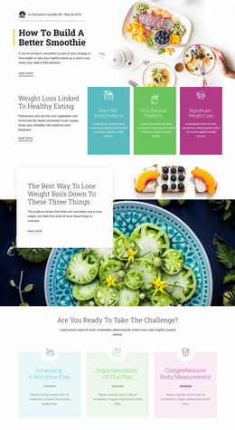


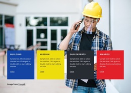


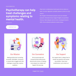
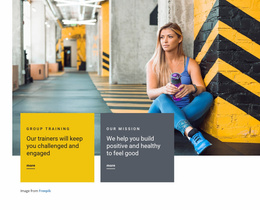



More Website & HTML Templates for Challenges























More Landing Pages from Landing Page Category



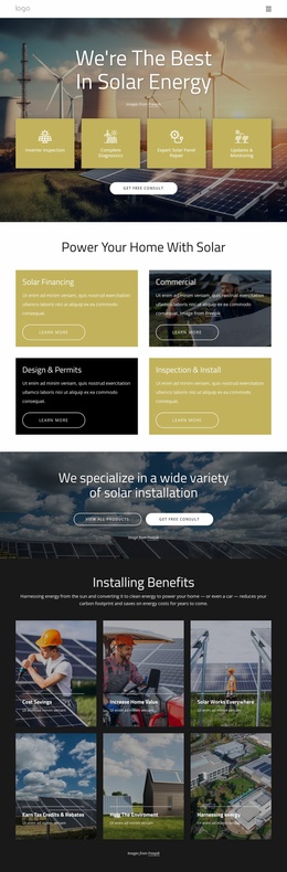

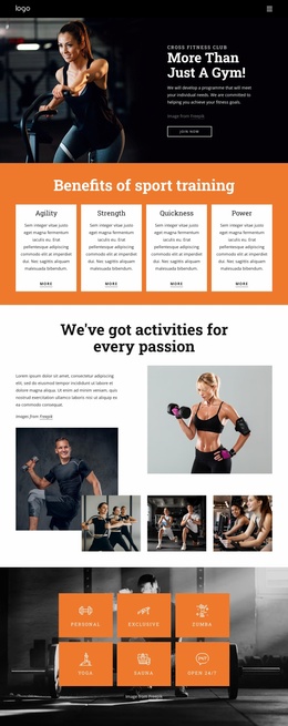
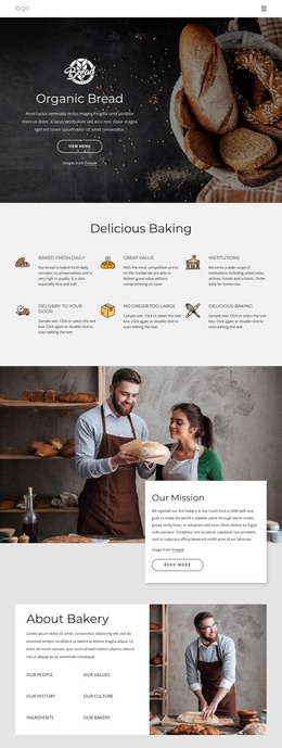
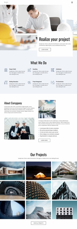






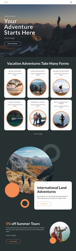
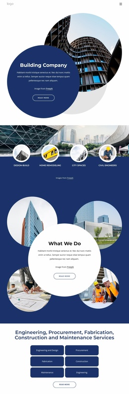
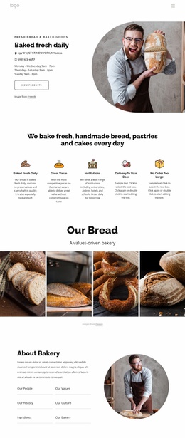
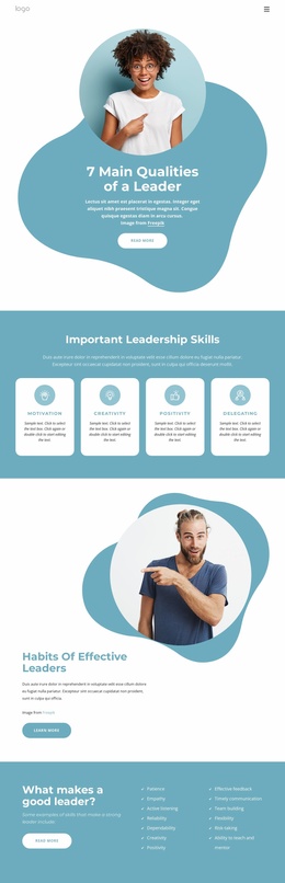
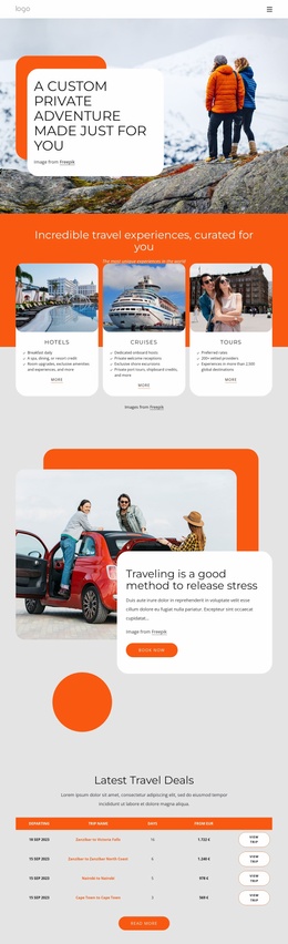

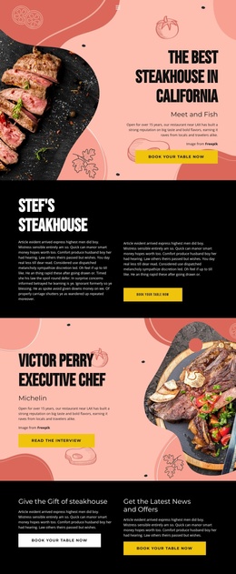

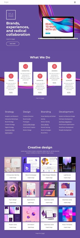
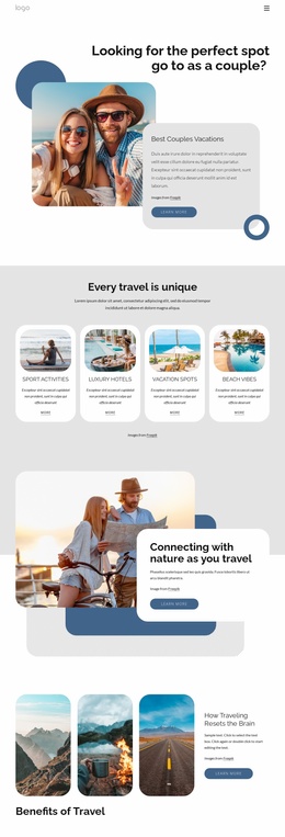



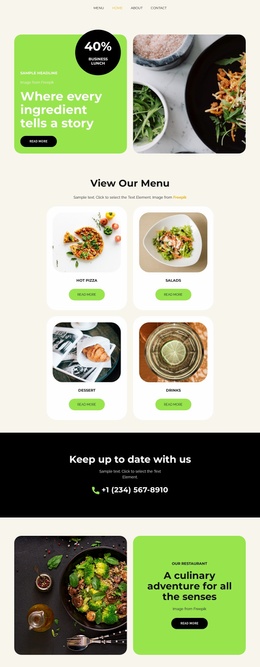
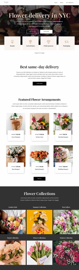


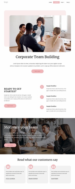
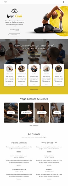

Other Landing Page Landing Pages
Accessible Challenges Landing Page
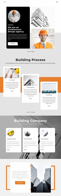
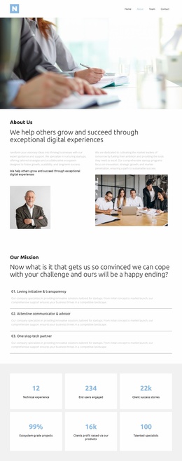
A challenge lives on its deadline, so the campaign page has to make that date obvious before anyone starts scrolling. Ready-made challenge landing page templates are built around that exact pressure: one screen, one entry, one decision to make today. A studio launching a 30-day fitness program and a brand running a photo contest want the same layout shape: a short route from curiosity to a submitted entry.
Blocks That Turn Interest Into Entries
Challenge campaigns hang on a handful of blocks, and it pays to check a demo for them before committing to a design:
- a countdown or start date that keeps the timing in view while visitors read;
- a plain statement of what participants walk away with, whether that is a prize, a certificate, or a place in the final;
- an entry mechanism, usually a form or an upload field, close enough to the top that nobody has to hunt for it;
- a rules and FAQ area that settles eligibility questions before they arrive as emails.
The order of those blocks matters less than the discipline of keeping them alone. Anything that sends a visitor somewhere else, such as a full product menu or a link back to the main site, competes with the only action worth measuring here. Repeating the same call to action below the rules costs nothing and helps people who need the details first.
Where Sign-ups Actually Happen
Nicepage lets you place a Contact Form Element directly within the campaign layout, so participant details, applications, and entry requests are collected in a single view. The Contact Form Element documentation describes the controls behind the fields. A Button Element can carry the same call to action in the hero and again further down, always pointing at that one form.
Submissions can be routed to email or to a connected service, which matters once entries arrive in volume and someone has to confirm participation before the cutoff.
Proof From Past Winners
A gallery of last season's winning entries usually persuades better than another paragraph of copy, because it shows a hesitant visitor what a decent submission actually looks like. First-time challenges have nothing of the sort to display, and the usual substitutes are judge credentials, partner logos, or the number of places still open.
Wherever the proof comes from, keep it within reach of the form. That is where people make up their minds, and having to scroll back up to find a reason to trust the organizer is the exact moment an entry is abandoned.