
Typing Templates
For a typing lesson, practice hub, or tutor page, the right visual structure depends on the content and learner. Compare different template directions before selecting the layout that best fits the educational task.







More Templates from Education Category
-

-

-
-
-
-
-
-
-
-
-
-
-
Free Website Builder SoftwareDownload
-
-
-
-
-
-
-
-
-
-
-
-
-
-
-
-

















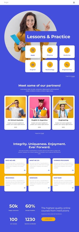


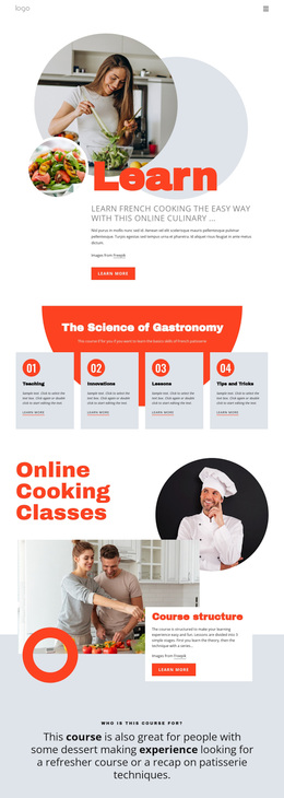

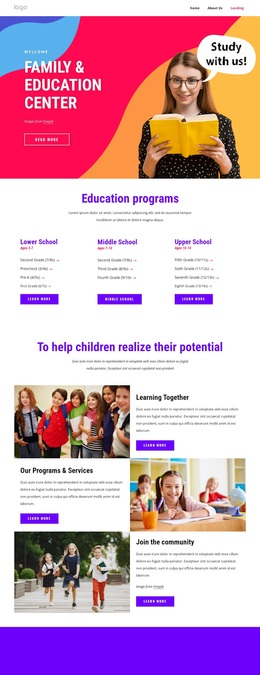
Other Education Templates
Creative Typing Templates for Lesson, Practice, and Tutor Layouts
Every design in a typing collection looks fine as a thumbnail. The difference shows up the moment real content lands inside: a timed drill wants a large, quiet area for the text being typed, while a tutor introduction wants room for teaching methods and student feedback. Typing templates are a broad set of design directions for keyboard material, and the work is picking the composition that gives your own content the right order of importance.
Compare Visual Directions Before Anything Else
A beginner lesson and a speed drill pull a design in opposite ways. One asks for a calm explanation, short steps, and generous spacing. The other puts a single block of text in the middle and keeps everything around it quiet. Look at the demo and picture your own material in its place.
A handful of directions cover most keyboard material:
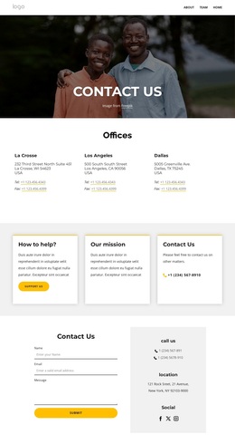
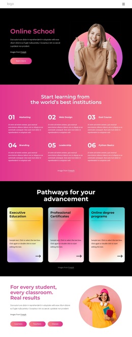
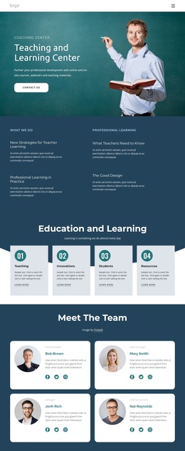
- A lesson design that leads with explanation, key guidance, and a level index;
- A practice design built around one exercise area, with the timer and the score close by;
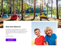
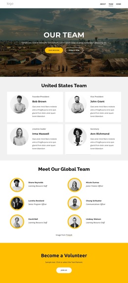
- A tutor design where credentials and learner feedback carry the weight;
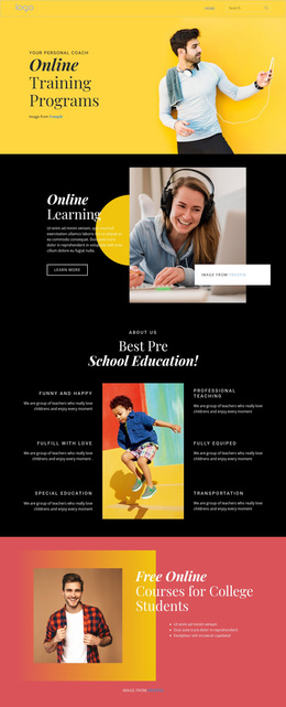
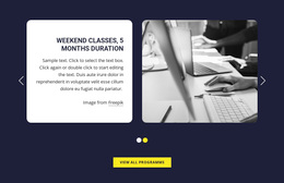
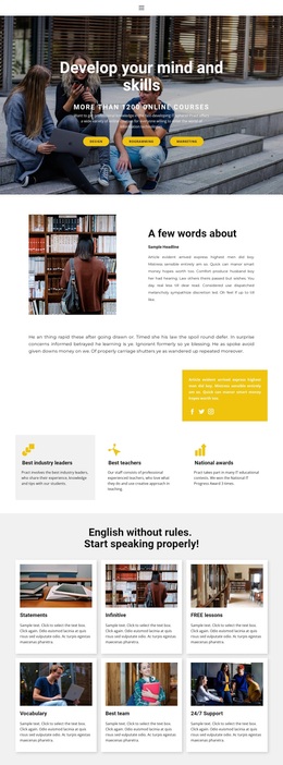
- A promotional design for a short course, with the sign-up block high on the screen.
If speed and accuracy figures matter, take a composition that reserves visible space for them beside the exercise.
Swap Demo Blocks Into Real Material
Whatever direction you pick, the demo sections are placeholders. Nicepage assembles pages from editable blocks, and the Block Basics guide explains how they combine, which helps when a typing design needs a different mix of instruction, practice, and profile material.
Most of the rework is substitution:
- Counters become average WPM and accuracy figures;
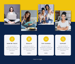
- Pricing cards become course levels or drill categories;
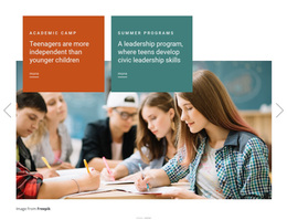
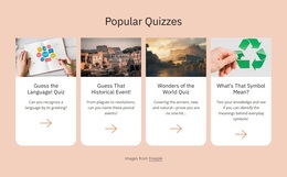
- A gallery becomes keyboard technique illustrations or finger charts;
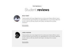
- Testimonials become notes from learners about the speed they reached.
The less reshuffling a design needs, the better it fits; when the emphasis already falls on your strongest material, editing stays cosmetic.
Pick a Composition That Fits Your Content
Density is the next filter. A course for children reads better with large type, strong color contrast, and fewer sections per screen, while adult training uses quieter styling and longer descriptions. Typography deserves its own look, since the typed text has to remain readable and visually distinct from the surrounding instructions.
Narrow widths are worth a check as well. See that the exercise stays legible, that instructions and figures stack sensibly, and that the main button keeps its place.
Planning a full site comes later. The job here is to compare arrangement, density, and emphasis, then take the design whose composition already matches your content.