1240 Split One Page Templates































































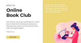



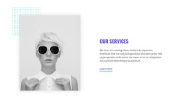

Modern Split One Page Template for a Clear Two-Part Section
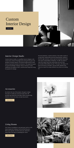
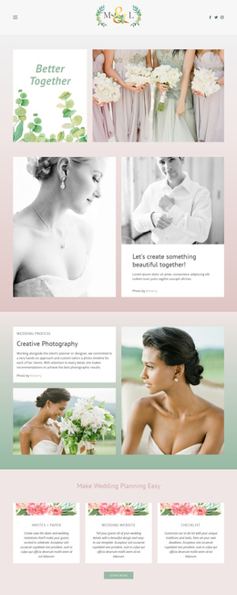
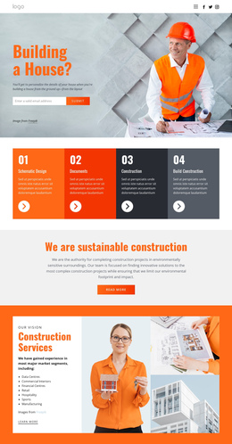
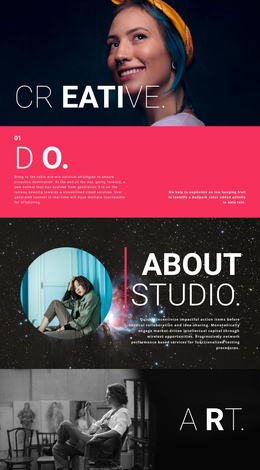
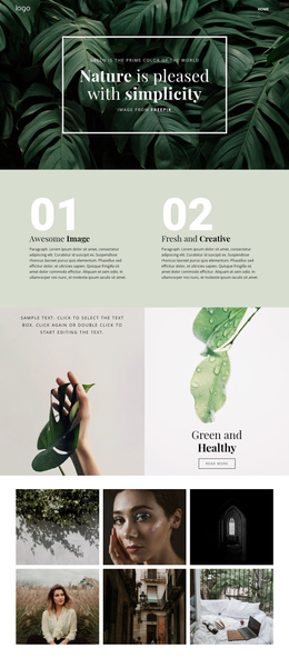
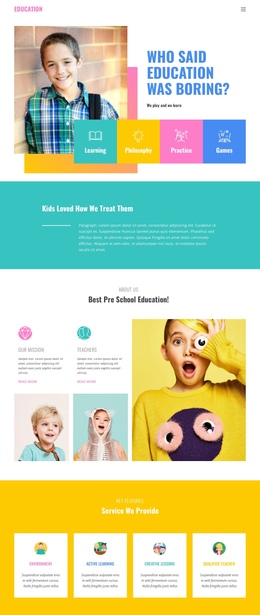
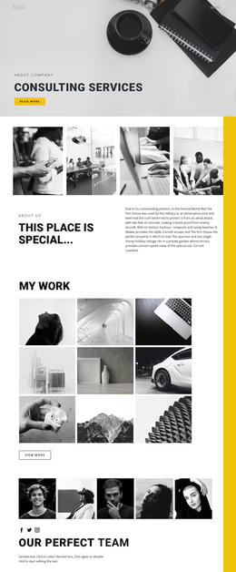
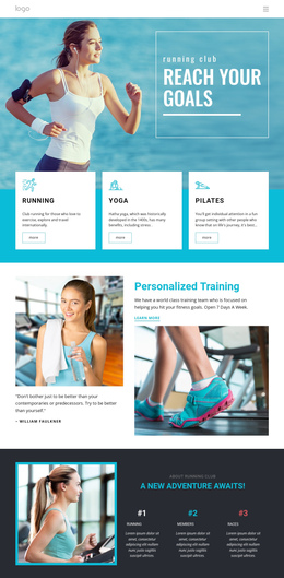
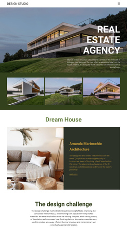
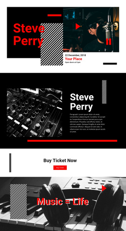
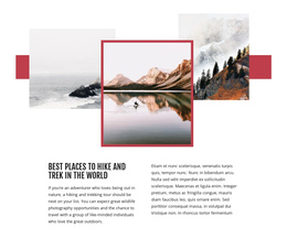
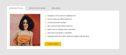
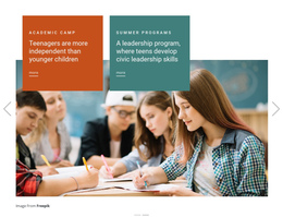
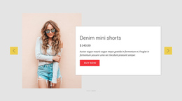
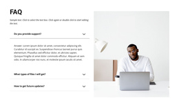
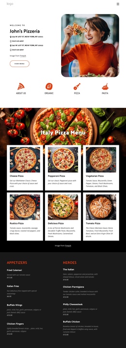
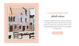
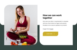
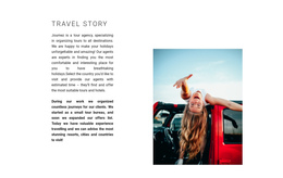
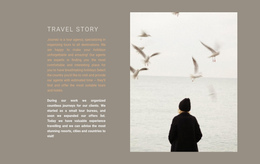
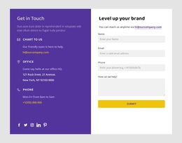
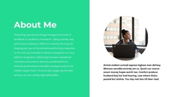
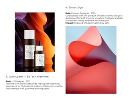
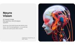
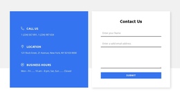
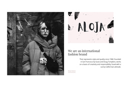
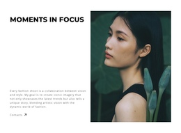
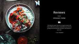
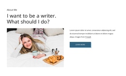
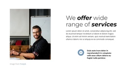
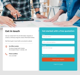
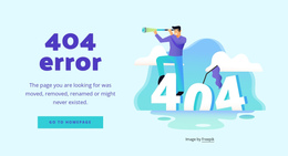
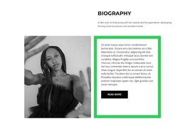
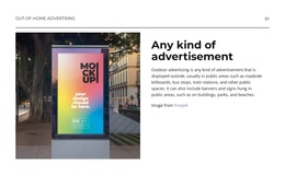
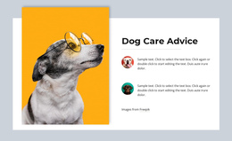
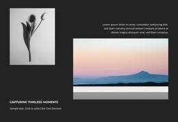
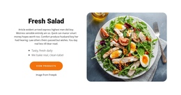
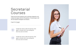
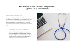
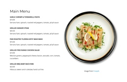
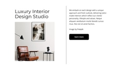
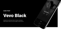
A Split One Page Template uses a section that is visibly divided into two connected halves. A common composition places an image or other visual on one side and a heading, supporting text, and a button on the other. The two parts work together as one block rather than acting as separate destinations.
On a one-page website, this layout can create a strong visual pause inside the vertical sequence without interrupting the overall scroll. The Split section may appear near the top, in the middle of the page, or closer to a key action depending on where an image-and-content pair is most useful.
Build the Section Around Two Connected Halves
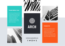
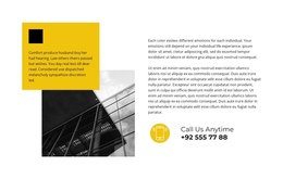
A classic Split block often uses a 50/50 division, but equal width is not required. A 60/40 or other asymmetric proportion can give more space to the image or the text while preserving the same two-part composition.
Common one-page combinations include:
- a large image beside a heading, description, and button;
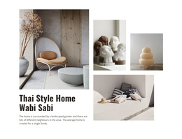
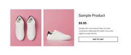
- product imagery beside a concise explanation;
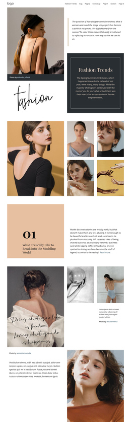
- editorial photography paired with supporting copy;
- a visual example beside a short feature or service introduction.
The Nicepage Grid Element can organize the two main areas in columns and rows. The important point is that both sides remain part of one coordinated section.
Fit the Split Block Into the One-Page Flow
A Split section should support the sequence around it. A strong image-and-text block can follow a simpler introduction, break up a long run of full-width content, or prepare visitors for the next section without becoming a separate page experience.
If the Split block represents an important section of the one-page site, the Menu For One-Page Site can support navigation to it. Smaller Split sections can remain part of the natural scroll.
Keep the Two Halves Visually Balanced
The two sides do not need identical visual weight. A large image can dominate one half while the text area stays compact, or the text side can become more prominent when the message needs greater emphasis.
Spacing, alignment, image crop, heading length, and button placement should make the two halves feel intentional. The section should read as one composition, not as two unrelated columns placed next to each other.
Plan the Responsive Order
On wide screens, the two halves can remain side by side. On tablets and phones, the layout may need to stack vertically.
Choose the mobile order according to the content. An image can appear first to establish context, while a text-first order may work better when the message needs to lead. The responsive version should preserve the same image-and-content relationship even after the horizontal split becomes vertical.
Split One-Page Template Questions
Can I Start a Split Section From Pre-Designed Nicepage Content?
Yes. Nicepage provides pre-designed Elements and Blocks, including text, images, forms, sliders, and grids, that you can place on the visual canvas and adapt for the section.
Can the Layout Be Adjusted for Different Screen Sizes?
Yes. Nicepage Responsive Modes support Large Screens, Desktops, Laptops, Tablets, and horizontal or vertical phone views, with layouts customizable for those screen categories.
Does a Split One-Page Layout Have to Use Equal 50/50 Halves?
No. Equal halves create a classic Split look, but asymmetric proportions can give more space to imagery or content while preserving the same two-part section.
What Content Works Well in a Split One-Page Section?
A common choice is an image on one side with a heading, text, and button on the other. Product visuals, service introductions, editorial content, and feature explanations can also work well when both halves support one message.
Adapt the Split Block to the Page Sequence
Choose a Split design whose two halves already fit the content you want to present. Replace the sample image and copy, adjust the proportions and responsive order in the Nicepage editor, and place the block where it adds a clear visual and informational step to the one-page flow.