Cutiest home pets Web Page Design
Edit Template Offline
2. Create new page and search for id 12869
Edit Template Online
Create Awesome Websites


Free Nicepage Builder
Keywords
Image Scale and Section Rhythm Guide the Article Composition
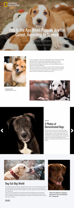
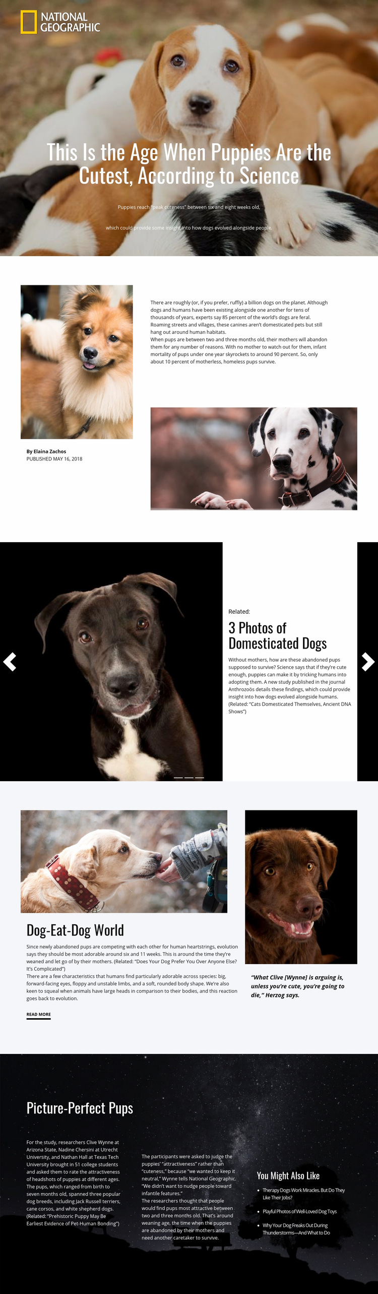
The composition begins with a full-width puppy photograph that occupies the largest visual field on the page. Centered white headline text sits over that image, creating a direct relationship between scale, contrast, and subject recognition. The following split introduction reduces the image scale and divides attention between a narrow author-and-supporting-image column and a wider text area, allowing article context to become more prominent after the hero.
The slider introduces a different spatial rhythm. Its full-width image area is repeated across three slides, while a white related-story card overlays each image. Indicators and previous-and-next controls provide small visual anchors within the larger media block. The next split section changes the balance again: “Dog-Eat-Dog World” gives more space to research text and a main photograph, then offsets that mass with a narrower quotation panel. This alternation prevents every section from having the same density or alignment.
The final dark block uses three text columns and a related-links column to contain more information without returning to the opening hero proportions. Generous spacing separates the study details, while the darker background creates a deliberate transition from the lighter article panels. These shifts in image scale, column width, overlay treatment, and background tone make the page composition readable as a sequence of visual decisions rather than a list of interchangeable sections.
Customize with Nicepage
Open this ready-made template in the Web Page Design Builder and customize it visually in the Nicepage editor. Replace demo content, edit page sections, and adapt the design to your project without rebuilding the template from scratch.
Design a Web Page Section by Section
Choose a Design for Each Section
Build the page from individual content sections instead of starting with a fixed full-page layout. Use Block Designs to browse ready-made sections for different purposes, including introductions, services, galleries, testimonials, contact forms, pricing, and other common parts of a web page. Search or filter the available designs to find a layout that fits the content you want to add.
Combine Blocks and Page Elements
Add selected Blocks to the page and arrange them in the order that supports the page's purpose. A hero section can introduce the main message, followed by services, benefits, portfolio content, testimonials, calls to action, or contact information.
Inside each section, use Web Page Elements such as Text, Image, Hyperlink, Grid, Gallery, and other elements to build and present the page content. Individual elements can be added and adjusted within the Blocks, giving you more control over the composition of each section without having to create the complete layout from scratch.
Refine the Page Layout and Flow
After assembling the main sections, adjust their content, spacing, backgrounds, images, typography, and element placement in the Nicepage editor. Reorder Blocks when necessary and refine the transition from one section to the next so the information hierarchy and visual flow remain clear throughout the page.
This workflow makes the template useful as a web page design that can be composed from ready-made sections, customized with individual page elements, rearranged, and adapted to the content and purpose of an individual page.