
Child Landing Pages
A parent who arrives from an ad or campaign should immediately understand the child program, age range, schedule, and next step. A focused landing page keeps those details around one enrollment, registration, or inquiry action.

















































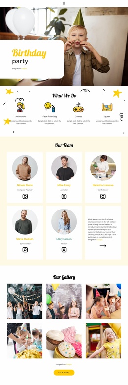







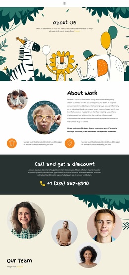




























Other Education Landing Pages
High-Performance Child Landing Page
A landing page carries one campaign at a time: a weekend robotics workshop, tickets for a children's theater show, an open week at a language center. Everything on the screen either helps a parent decide about that single thing or competes with it. Templates in this category are built around the limit, which is why they look shorter and louder than full website designs.
Blocks Worth Checking Before Purchase
Most demos here are single-page scrolls, and every design argument has to happen within it. They also vary more than the category name suggests, so it pays to look at what a particular one carries:
- a hero area where the offer name, the date, and the price fit without redesign;
- a details section for ages, venue, and what the payment includes;
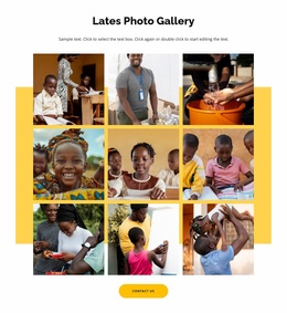
- room for photographs or a short video from a previous session;
- a form placed near the button, so nobody scrolls back up to find it.
Attention Stays With One Offer
The first screen should repeat the promise that brought the visitor in. If the ad promotes a free robotics session, the main button should link to that session, and the general contact request can wait for the footer. Secondary links stay visually quieter for the same reason. A theater page selling tickets and a workshop page collecting registrations need different endings, even when the design underneath is identical.
Parents often open such a page twice. The first visit happens on a phone, straight from the ad, and lasts about as long as it takes to see the date. The second one comes in the evening on a laptop, when the page has to survive being shown to somebody who did not see the ad at all: prices, ages, and the address matter far more on that second visit.
Where Parents Tap on Phones
The button that works on desktop can end up below the fold on a narrow screen, which is why a repeated call to action near the details usually earns its place. Forms behave the same way, since every extra field on a phone costs replies. A look at the finished page on a real device, with the browser bars taking their share of the screen, tells you more than any preview window.
Nicepage forms support several submission options, from a mailbox to an external service, and a campaign page typically needs only a name, a phone number, and the child's age group. Anything that does not serve this one campaign belongs on the main site, where there is room for it.