
Vk Templates
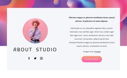
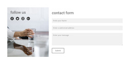
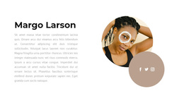
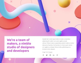
A creator profile, an active community, a brand campaign, and an event page rarely need the same visual structure. Compare VK-oriented concepts by content emphasis, media treatment, and audience purpose before refining the selected direction.






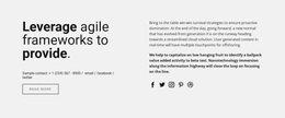






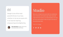
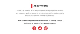
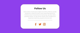










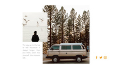
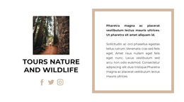
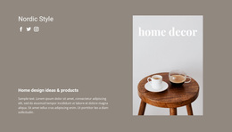








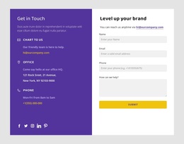

More Website & HTML Templates for Vk

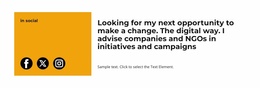


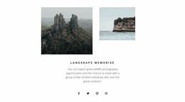





More Templates from Social Category
Other Social Templates
Flexible VK Templates for Community Visuals
Search for VK templates, and you rarely arrive with a finished plan. Most of the time, the question is more about how a community could look: what the cover says, how the identity block is arranged, whether photo sets have room to breathe. A broad collection is useful at exactly that moment, because two designs that look equally good in a preview can behave very differently once your own material sits inside them.
Mood, Density, Media Weight
VK projects publish differently from one another. A music project relies on visuals and dates, while a discussion club is mostly text with occasional images. Comparing directions goes faster with a few concrete criteria:
- How much room the cover area takes, and whether it carries a slogan or stays purely visual;
- Whether the identity block reads like a compact profile card or a full introduction;
- How repeated material looks in a dense grid of small cards or in a few large announcements;
- How loud do the colors and type feel next to the visuals you already publish in VK?
The fourth criterion is the one people skip. A design can be excellent on its own and still clash with the photography a community has been posting for two years, and you notice it only after dropping a real cover image into the preview.
Filling Gaps in a Chosen Concept
The closest direction is rarely a perfect fit, and it does not have to be. Predesigned Blocks add text, images, and grids to a design you already like, so a concept that is right in mood can gain the part it lacks:
- Keep the direction you liked and write down what is genuinely missing;
- Add a block that covers it, a wider gallery for a photo-led community, or a repeatable card row for one that announces something every week;
- Match spacing and type to the original so the addition does not read as a patch.
Two or three additions are normal here. Once the list grows past that, the honest conclusion is that a different concept was closer to the project from the start.
Discovery Before Implementation
Broad VK templates answer one question: which visual direction suits what this community actually publishes. Settling that first makes everything that follows cheaper, because a technical decision can be revisited in an afternoon, whereas a design nobody likes tends to be rebuilt from scratch.