
Blogger Landing Pages
Readers may enjoy an article without knowing why they should subscribe. A blogger landing page presents an exclusive guide, newsletter, or editorial series as one clear offer, supported by persuasive content and a direct sign-up action.
-
-

-
-
-
-
-
-
-
Free Website Builder SoftwareDownload
-
-
-
-
-
-
-
-
-
-
-
-
-
-
-
-
-
-
-


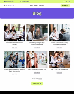
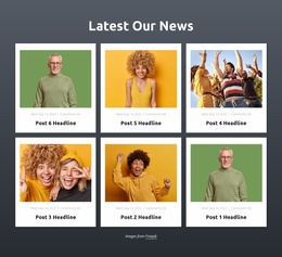
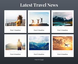
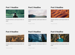
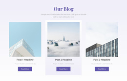
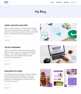
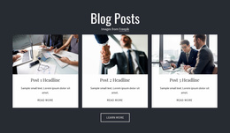




More Landing Pages from Blog Posts Category
-
-
-
-
-
-
-
-
-
-
-
Free Website Builder SoftwareDownload
-
-
-
-
-
-
-
-
-
-
-
-
-
-
-
-
-
-
Other Blog Posts Landing Pages
Creative Blogger Landing Page Templates for Newsletter Signups
Independent bloggers who publish exclusive essays, travel guides, or educational newsletters need a clear way to convert casual visitors into interested subscribers. A blogger landing page concentrates attention on one editorial offer rather than presenting an entire article archive. Whether the goal is to grow a weekly newsletter or distribute a free reading guide, a focused message helps visitors understand the benefit of sharing their email address.
Present a Clear Offer That Motivates Blog Readers
A successful blogger landing page begins with a specific promise. Instead of asking visitors to join a mailing list without context, explain what they will receive and why it matters.
A travel blogger could offer a downloadable city itinerary, while a personal finance writer might provide a budgeting checklist. For a literary blogger, access to original essays or a curated monthly reading list may be more relevant.
The landing page should connect the offer to the interests that originally attracted visitors to the blog.
Effective conversion elements include:
- Benefit-driven headline: Explain the value of the newsletter or exclusive resource immediately.
- Focused description: Clarify the content, format, and expected value of the offer.
- Relevant visual: Show a guide cover, newsletter preview, or sample editorial material.
- Short signup form: Request only the information necessary to deliver the promised content.
- Consistent call to action: Use wording that describes the specific reader benefit.
Keep the guide preview, delivery explanation, and form close enough that visitors understand what they are requesting. Avoid unrelated article promotions that compete with the offer.
Guide Interested Visitors Toward One Signup Action
The headline should name the resource, a sample or short contents list should show what is included, and the form should explain what happens after submission. A brief privacy note can clarify how the email address will be used.
A food blogger promoting a seasonal recipe collection could include a short description of the recipes, a sample page, and an email field. A career blogger offering an interview preparation guide might emphasize the practical topics covered in the resource.
Nicepage provides a Contact Form Element with configurable fields and submission settings. Collecting an email address through a form is not the same as enrolling that address in an automated newsletter. Delivery, consent handling, and any email-service integration must be configured and verified separately; do not assume that a form alone creates a mailing-list subscription.
The primary CTA should appear where the offer is understandable. On longer landing pages, repeating the same signup action after supporting information can help readers respond without searching for the form.
Mobile visitors also need a straightforward experience, with readable offer descriptions, accessible buttons, and clearly labeled fields.
Evaluate a blogger landing page by how effectively it communicates one offer and encourages the intended response. Select a template that keeps the subscription benefit prominent, minimizes unnecessary form fields, and gives readers a clear reason to join.