You can use the Contact Form Element to collect data from website visitors. You can watch the video lesson about the Contact Form Element.
Add Contact Form Element
Add a new Contact Form from the Add Elements list in the Top Menu.

Horizontal Form Type
You can use the Horizontal Preset for the Contact Form Element.

Add Fields To Contact Form
Add fields to the Contact Form from the Add Panel. You can add a new field to any position in the Contact Form Element. You can also add Elements to the Contact Form from the Options Menu of the Context Toolbar.

Learn more about the Field Types, which you can add to the Contact Form.

Change Field Type
You can also change the Field Type in the Contact Form in the Property Panel for the selected Field.

Contact Form Properties
After selecting the Contact Form or Field, you can specify various properties in the Property Panel.
Contact Form Submit To
You can specify the Submit To options to send Contact Form submissions.
Please read more about Contact Form Submit To Options.

If you incorrectly set the Submit To options, you will see a warning about the problem during Publishing.

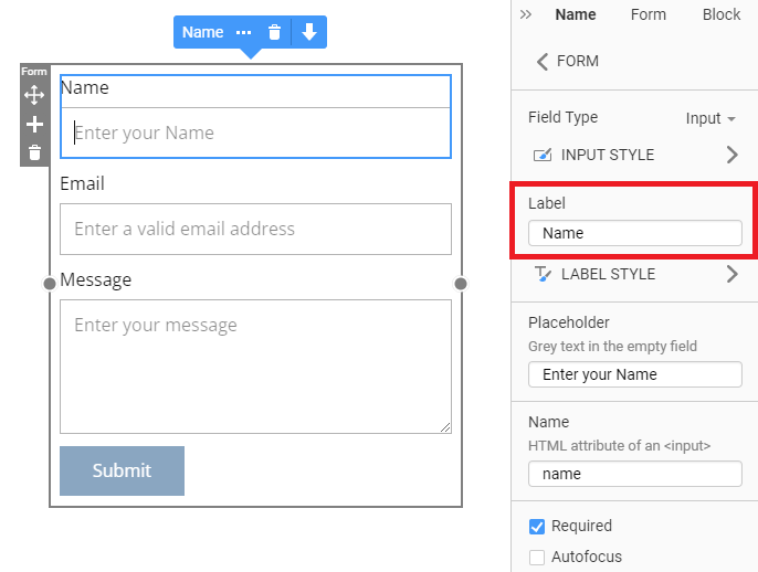
Field Labels
You can enable the Labels on the Contact Form Element in the Property Panel. To switch all Labels, uncheck the Label checkbox for the selected Field.

Edit Labels
Conveniently, you can also edit the Field Labels on the Contact Form Element directly in the Editor, in addition to modifying its Properties.

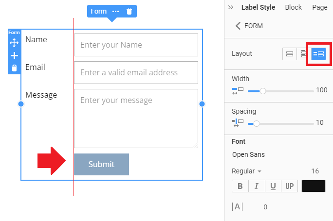
Label Position
In the Property Panel, you can show Labels to the left of the Inputs and switch the layout at any time.

Label Spacing
When you place your Contact Form Labels to the left, you can modify the Spacing from Labels to Inputs and change the width of the Label Column.

Default Label Values
You can view the default values for Contact Form Fields, which are primarily required for specific layouts with labels.
Contact Form Styling
You can set the Fill and Border for the Contact Form Element.
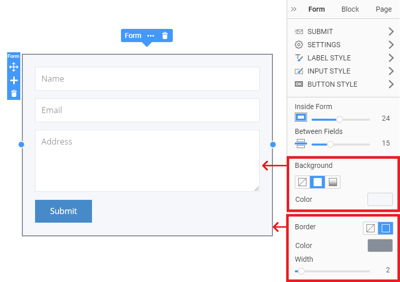
You can also modify the Radius and Shadow properties. Please note that the Radius property is available only if you have Background or Border enabled for your Contact Form.

Input Styles On Context Toolbar
You can style the Contact Form quickly by selecting properties on the Context Toolbar.

Input Height
You can also change the Height of the Input Field.

Input Radius
You can use the Radius property for the Contact Form input Fields.

Spacing Between Fields
You can now set the Spacing between the Contact Form Fields in the Property Panel.

Field Style Links
You can find the links to styling Properties near the corresponding properties in the Property Panel.

Submit Button
You can change the position of the Submit Button by dragging it to the left, center, or right.

You can use the Shadow property on the Contact Form's Button.

Submit Button Left Alignment
For the Contact Form layouts with labels, the Submit Button Alignment is to the left of the inputs.
Contact Form Button Resize
You can also resize the Contact Form Button in the Editor by dragging the markers on the Button.

Wide Form Button
Contact forms are often present in Modal Popups. Moreover, many users stretch the Submit Button to 100% of its width. We have added such an option, especially for the Submit Button.

Contact Form Responsive Modes
You can modify the size and position of the Contact Form in each Mobile View.

The Horizontal Layout Labels automatically move over the Fields in the Responsive Modes for smaller screens.
