
Swiss WordPress Themes
Editors need a Swiss visual order to remain recognizable as WordPress content changes. These themes combine restrained typography and geometric layouts with a CMS workflow for portfolios, publications, studios, and creative organizations.
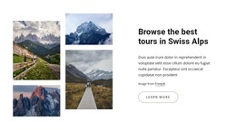

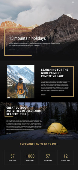
More WordPress Themes from Travel & Hotels Category
-

-

-
-
-
-
-
-
-
-
-
-
-
-
-
-
-
-
-
-
-
-
-
-
-
-
-
-
Free Website Builder SoftwareDownload
-
-
-
-
-
-
-
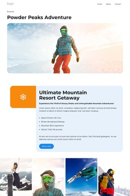
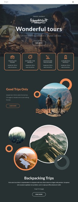




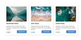
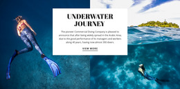
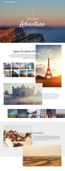
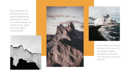






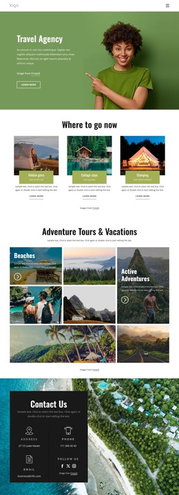

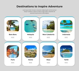

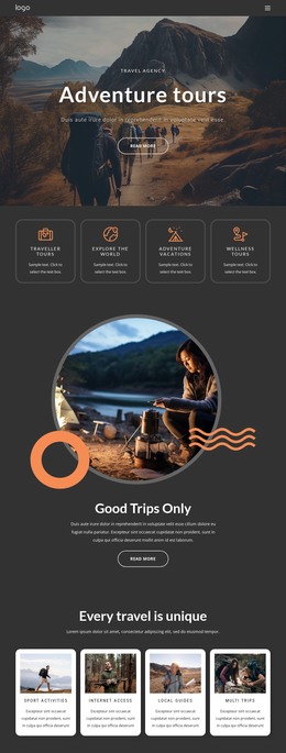


Other Travel & Hotels WordPress Themes
Flexible Swiss WordPress Themes
Keeping a Swiss composition perfect is simple while nothing on it changes, and on a WordPress site, something always does. An editor publishes a headline twice as long as the one in the demo. A new post arrives with a tall portrait photo where the grid expected a wide one. One portfolio entry needs a single paragraph, and the next needs five. The job of a Swiss WordPress theme is to keep its grid and type scale steady through all of that.
When Real Posts Arrive
Swiss design copes with that pressure because its order comes from rules that work for any content, whatever its length or shape. A theme proves itself on the views WordPress generates from your posts and projects:
- Single posts, where a long title wraps inside its column and still sits clearly above the text.
- Blog listings, where featured images of different proportions fit fixed grid shapes, so one portrait photo cannot break a row of landscape ones.
- Archive and category views, which need the same rhythm whether a category holds three posts or three hundred.
- Portfolio entries, which line up best when every project lists the same details, such as client, year, and discipline.
Desktop Export, Then Everyday Updates
With Nicepage, the Swiss rules are settled before WordPress ever sees the theme. A typical Nicepage workflow runs in three steps:
- The grid, type scale, and accent color are designed in the Nicepage Desktop Application, which exports the project as a WordPress theme.
- The theme is uploaded and activated in WordPress, where it supplies the header, the footer, and the layouts for blog posts.
- The Nicepage WordPress Plugin then lets you edit page content inside WordPress and adjust site style settings such as colors and fonts.
The split suits Swiss design well. Columns and hierarchy are set once by the theme designer, and editors spend their time on articles and projects without having to redraw the layout.
Picturing Next Year's Archive
The right theme depends on what your editors will actually publish. A magazine-style publication needs bold article titles and generous text columns. An architecture studio posts less often but leans on large project images and short specification lists. A design practice may mix case studies, studio news, and standard pages, each with its own layout on the same columns and type scale. When comparing demos, start with the post and archive views and imagine them a year after launch. They will hold most of your content by then, and they show fastest whether a grid can handle uneven headlines and photos.