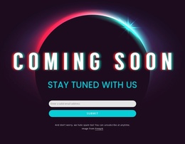
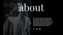
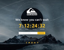
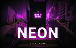
Dark Landing Pages


More Website & HTML Templates for Dark

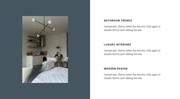


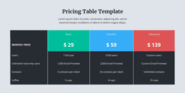


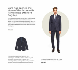
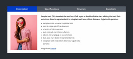
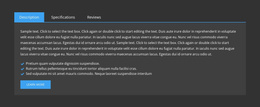
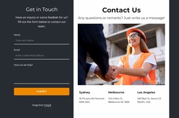
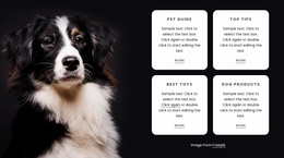
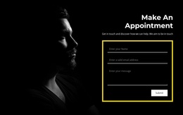
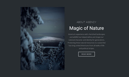
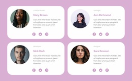
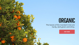
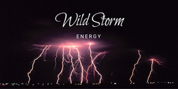
Other Text On Image Landing Pages
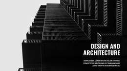
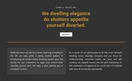
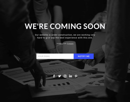
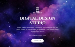
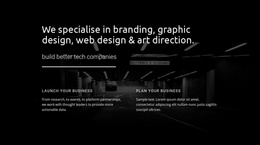
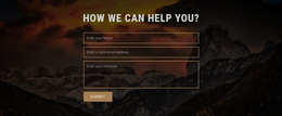
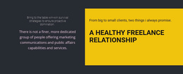
Focused Campaigns With an Advanced Dark Landing Page
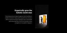
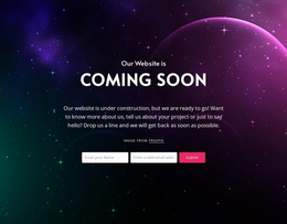
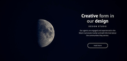
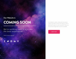
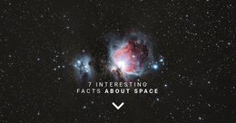
Dark landing pages can quickly capture attention with contrast visuals. Focused messaging is another of their features. Their color schemes help highlight key UI and structural elements, such as headlines and CTA blocks, to create a strong first impression. If your campaign relies on mood or bold presentation, then this is the solution for you. A controlled layout ensures attention remains on the primary goal. And landing pages are really impressive at achieving high conversion rates: they are at least 55% better than regular web pages, with metrics often exceeding that threshold.
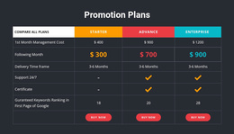
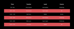
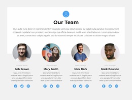
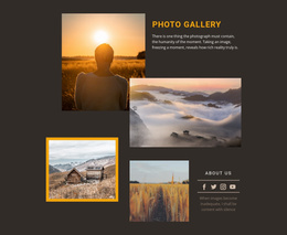
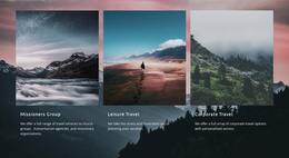
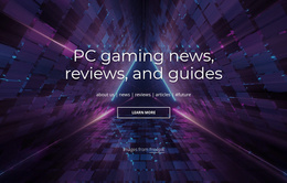
How can you use them in practice? Actually, there are plenty of ways. For example, a gaming hardware brand can present keyboards, headsets, and comparison sections in a performance-focused layout. A night photography portfolio could use an entry point to showcase all of the important projects, client work, and booking details in an accessible manner.
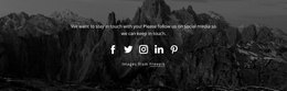
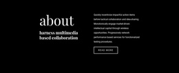
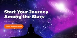
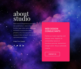
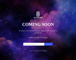
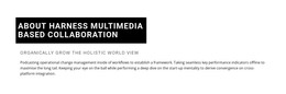
Dark Entry Points and Brand Emphasis
The format removes unnecessary distractions, placing all attention on messaging and key info. The whole structure can support a single action and guide users toward related engagement points.
It’s time to take a look at the reasons to use this format. Below are some of the notable things:
- Single-goal approach.
- Clear CTA placement.
- Strong visual contrast.
- Responsive design.
- Simplified customization.
- Works well with common CEO practices.
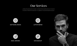
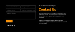
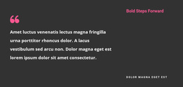
Focused Messaging for Your Dark-Themed Campaigns
Refine content with ease. Everything here is highly modifiable, and it’s easy to adjust details. You can also extend content as your campaign evolves. You can already do it in a couple of minutes, and since everything is in one place, you don’t have to switch between multiple pages to apply changes.
The resulting experience is focused and deliberate. Since complicated navigation is no longer there, your visitors will find it easy to find important information and take action with confidence.
Create Dark Landing Pages with High Impact
Get familiar with this assortment of dark landing page templates. All layouts here are highly customizable and multifunctional. Check them out today to highlight your messaging in an approachable way.