

Banner Web Page Designs
A large promotional banner can overwhelm product details or interrupt the natural flow of a webpage. Balanced page design coordinates banner proportions, surrounding content, alignment, and whitespace so that each visual element has a clear purpose.







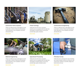
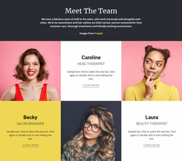



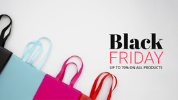




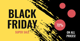
















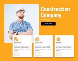

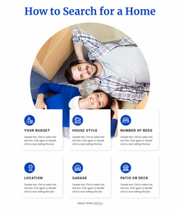
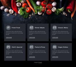
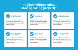



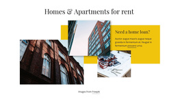

Other Sale Web Page Designs
Professional Banner Web Page Design for Balanced Layouts
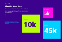
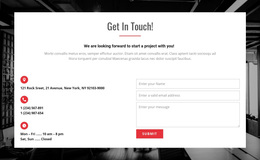
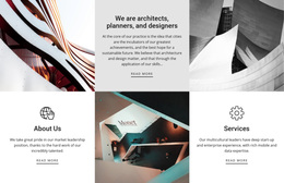
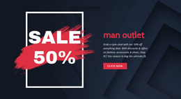
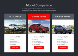
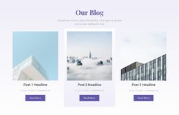
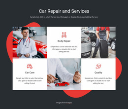
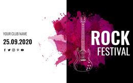
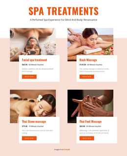
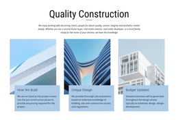
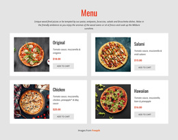
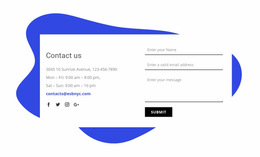
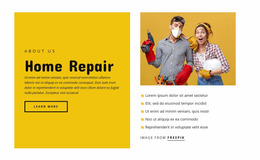
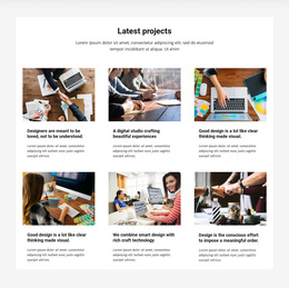
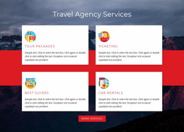
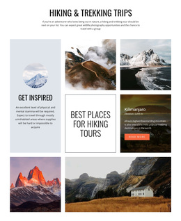
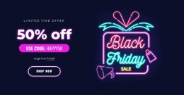
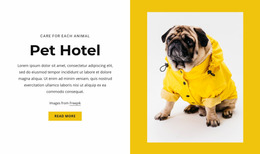
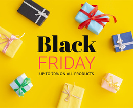
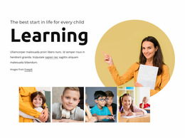
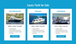
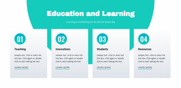
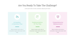
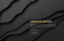
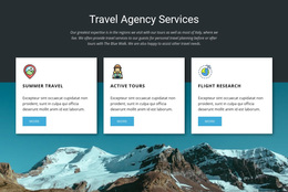
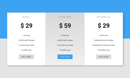
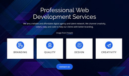
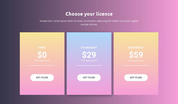
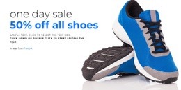
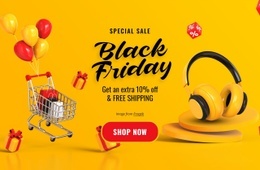
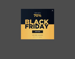
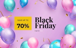
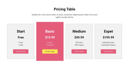
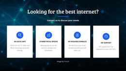
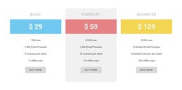
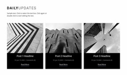
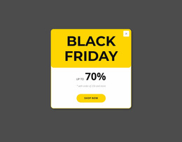
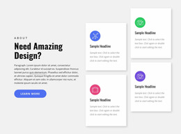
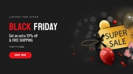
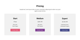
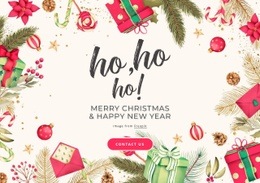
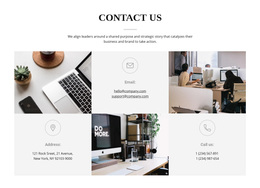
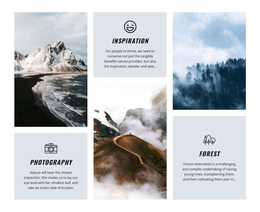
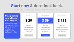
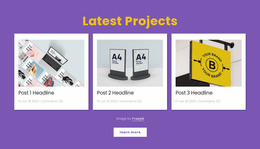
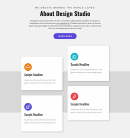
Banner Web Page Design options differ in how prominently they feature a promotion within an existing page. A hero-focused layout leads with a large campaign message, an inline promotional design introduces a secondary offer within content, and a product-led page places its merchandise ahead of the advertisement. Compare the finished page compositions rather than judging the banner in isolation.
Banner Placement and Visual Hierarchy on Web Pages
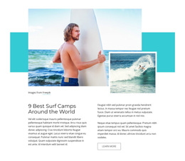
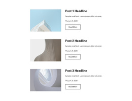
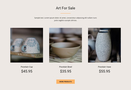
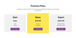
A hero-focused design gives a major launch or seasonal promotion space at the top of the page. An inline layout can support a smaller announcement among existing sections without overwhelming the content. A product-led composition may show the merchandise first and reserve a compact area for related offers. These alternatives suit different browsing goals.
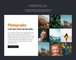
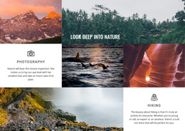
For a photography portfolio, a workshop promotion beneath the gallery can preserve the focus on the work. A restaurant menu design may instead pair a compact lunch-special banner with the relevant category. These examples illustrate why page context determines the best ready-made arrangement.
Whitespace and contrast in a finished design can indicate whether the promotion stays distinct from navigation or product content. These visual qualities help explain why one page composition may fit a campaign better than another.
Balancing Images, Text, and Whitespace
Consider a product category page whose tall hero banner pushes the first product row below the fold. A product-led, ready-made design with a shorter promotional area may be a better choice than extensively editing the oversized hero. If the offer is secondary, an inline layout can make the merchandise visible sooner while still leaving room for the message.
Aligning Banner Layouts With Surrounding Content
Compare the alignment of banner imagery, headlines, and surrounding page sections in each candidate design. A page with a coherent grid makes the promotion feel intentional rather than added as an unrelated graphic.
Nicepage provides Grid Columns to help position and align text, images, and containers. Designers can use this framework to coordinate the banner's content with adjacent product cards, descriptions, or page sections.
Five page-level design relationships can help distinguish a suitable banner composition:
- Content alignment: The banner headline follows the same visual grid as the surrounding sections.
- Image proportions: Promotional artwork complements nearby product images rather than overpowering them.
- Section spacing: The banner has enough separation from adjacent content without creating an excessive gap.
- Visual priority: The main page content remains recognizable when the promotion is secondary.
- Mobile continuity: The banner and neighboring sections retain a coherent reading order on narrower screens.
In product-focused designs, grid proportions can give the merchandise a clear visual lead while still leaving a defined area for the promotion. This is a selection advantage, not just an editing technique.
The final layout should remain understandable at narrower screen widths, where image placement and content relationships may need adjustment.
Choose a banner web page design based on the relationship between the promotion and the content that follows. A strong ready-made composition keeps the page's main browsing purpose visible while giving the announcement appropriate emphasis.