

Menu HTML5 Templates
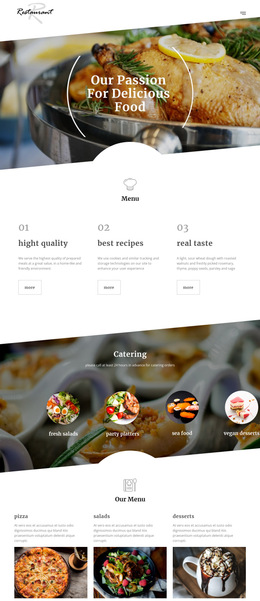
For restaurants with extensive food selections, dish names, prices, and descriptions must stay clear. An HTML5 menu structure groups these details into meaningful sections, helping cafés and dining establishments present organized content across different devices.








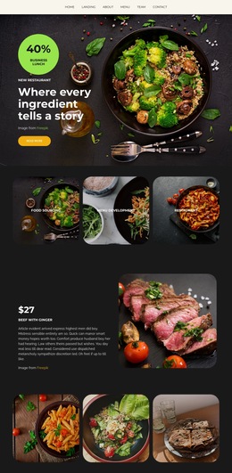

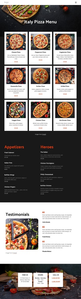
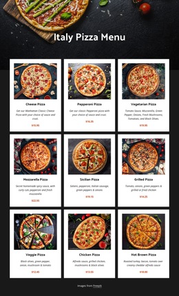





More Website & HTML Templates for Menu
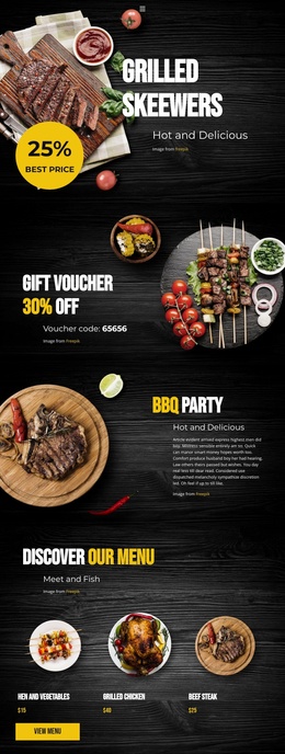
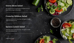
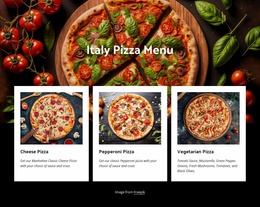
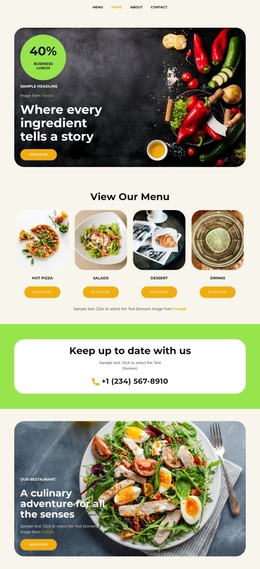
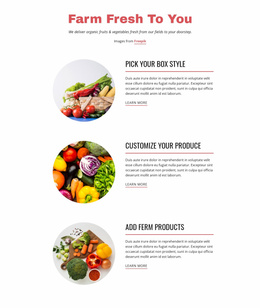
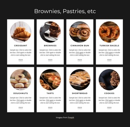
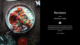
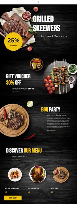

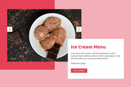

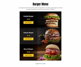
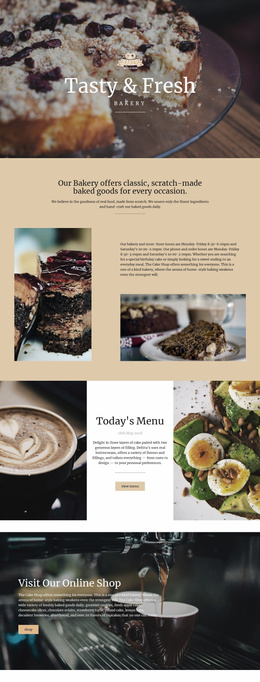
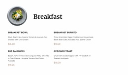
Other Food & Restaurant HTML5 Templates
Semantic Menu HTML5 Template for Restaurant Content
A menu HTML5 template is useful when a restaurant wants more than a visually tidy list of dishes. Meaningful document structure helps visitors, including people using assistive technology, understand where the menu begins, which category they are reading, and which details belong to a particular dish. The goal is not to invent special HTML5 elements for food but to use established elements appropriately.
Semantic HTML5 Structure for Food Menus
The <main> element identifies the page's primary content. Inside it, a <section> can group a category such as Starters or Desserts, with a heading that names that category. Where a dish is a self-contained entry, an <article> can group its name, description, price, and relevant allergen information. An <article> is not mandatory for every dish; a well-structured list may be equally appropriate depending on the content.
For example, a Starters section might contain a Caesar Salad entry. Its heading identifies Caesar Salad, a paragraph describes romaine lettuce and dressing, a nearby text element displays $11, and an allergen note states that the dish contains wheat and dairy when applicable. HTML5 does not provide a dedicated semantic tag for a restaurant price or allergen. The benefit comes from clear grouping, understandable labels, and placing important details in the reading sequence.
A logical heading hierarchy also matters. The page title introduces the menu, category headings identify groups, and dish names can use appropriately nested headings when that suits the document outline. Avoid choosing heading levels merely because they look smaller; typography can be adjusted separately.
Reading Order and Accessible Menu Information
On a desktop, a design may display Starters and Main Courses in adjacent columns. In the document, however, the reading order should still follow a sensible sequence so screen readers and keyboard users don't encounter disconnected names, prices, and notes. Mobile layouts should preserve that relationship rather than relying on visual proximity alone.
Use descriptive image alternatives when food photographs convey information; decorative images can be treated as decorative. If a menu includes interactive filters or ordering controls, test their labels and keyboard behavior separately. A visually responsive page isn't automatically accessible.
Nicepage Responsive Modes can help review presentation at different widths, but the exported markup and assistive-technology experience deserve their own checks. Select a semantic menu foundation that makes categories, dishes, and essential dietary information understandable even when the visual layout is removed.