

Banner Landing Pages
A promotional banner can attract visitors to a flash sale, product launch, or registration offer, but the page must guide them to respond. Focused landing layouts connect the campaign headline, supporting evidence, and primary action without unnecessary distractions.
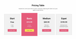














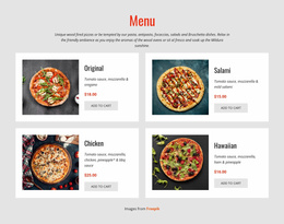
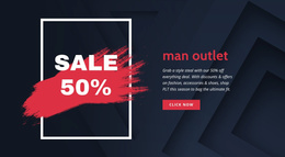

































Other Sale Landing Pages
Ready-To-Use Banner Landing Page Templates for Promotions
Banner Landing Page Templates offer different ready-made campaign structures for trials, registrations, limited sales, and inquiries. A product-trial page may put a signup area near the banner, whereas an event registration design needs room for dates and program details. Compare how the opening promotion, supporting sections, and response area are arranged before adapting the chosen page to a specific offer.
Banner Landing Page Layouts for Different Offers
A consultation landing page may feature professional credentials and an inquiry section, while a limited sale can devote more space to featured products and conditions. For a software trial, the most useful ready-made layout often puts a short product explanation near the signup area. The difference lies in how much evidence the visitor needs and what kind of response the design supports.
Compare five ready-made banner landing page compositions according to the offer and the intended response:
- Product trial: A software-focused hero followed by a short feature preview and trial sign-up area.
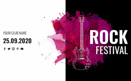
- Event registration: An announcement with prominent date and venue details, a program preview, and a registration section.
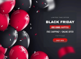
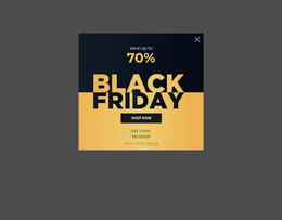
- Limited-time sale: A product- or discount-led banner that connects naturally to featured items and offer conditions.
- Consultation request: A service introduction supported by credentials or case examples, leading to an inquiry form.
- Lead generation: A compact value proposition with space for a downloadable resource or other incentive and a short contact form.
A focused landing page generally favors one campaign over the broad navigation of a full business website. The layout should make the offer recognizable and provide room for the details most relevant to that action.
Comparing CTA and Lead Form Arrangements
In one ready-made layout, the main action sits beside the promotional headline; in another, it follows a short set of benefits or event details. Compare the page designs by how prominently they display the response area, not simply by the presence of a button.
For a focused promotional page, the opening composition should make four things clear:
- What is offered? Repeat the specific benefit from the advertisement.
- Who is it for? Clarify eligibility when the promotion is limited.
- What happens next? Label the primary action plainly.
- Can I act on mobile? Keep the CTA usable without searching below a large image.
This short set of questions helps assess a completed design without turning the article into a general conversion-optimization guide.
Some banner landing page designs include room for a form. Nicepage provides a Contact Form Element for inquiries or registrations where that feature is appropriate. For a trial-oriented layout, make sure the button and adjacent response area clearly communicate the intended signup; you can add detailed form configuration after selecting the page.
The most appropriate template is the one whose existing section order and response area already suit the campaign, leaving only offer-specific content to adapt.