

Love Web Page Designs
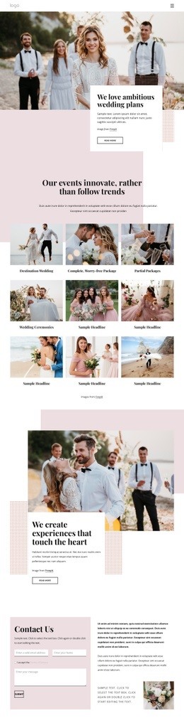
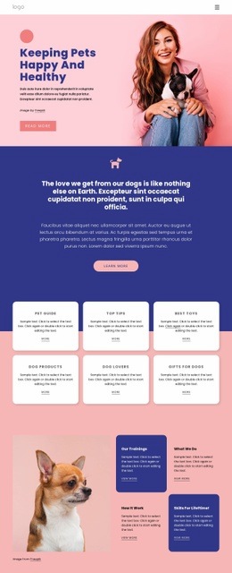
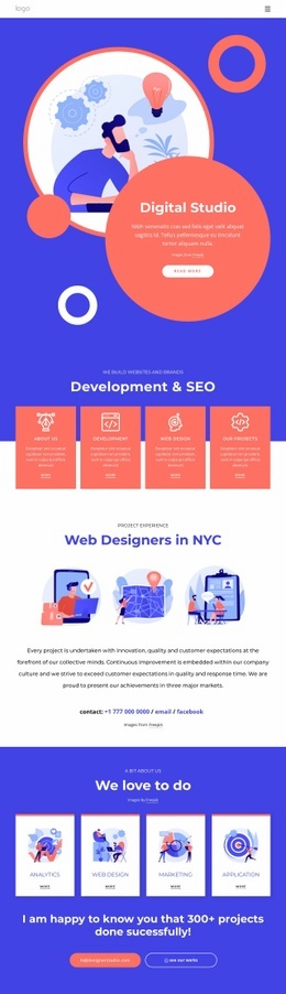
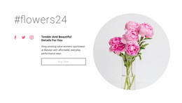
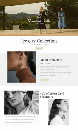
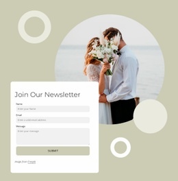
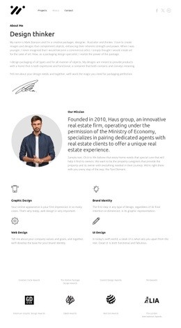
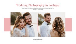
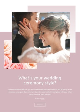
Arrange a portrait and a personal message so each gets the attention it deserves. Explore page compositions that use scale, spacing, and image placement effectively.







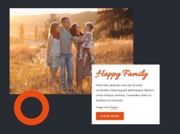

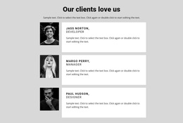
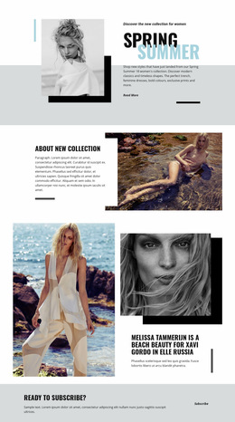

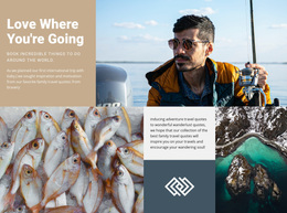
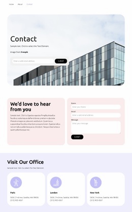
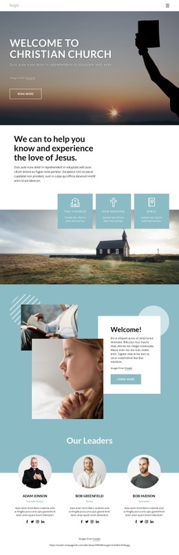
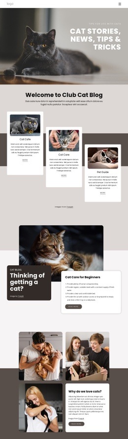
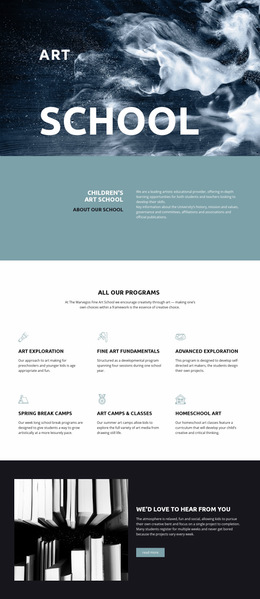
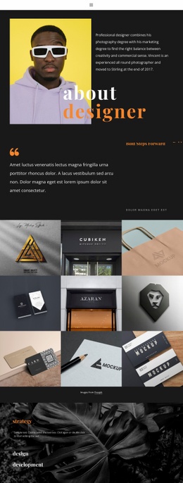

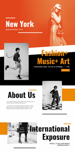
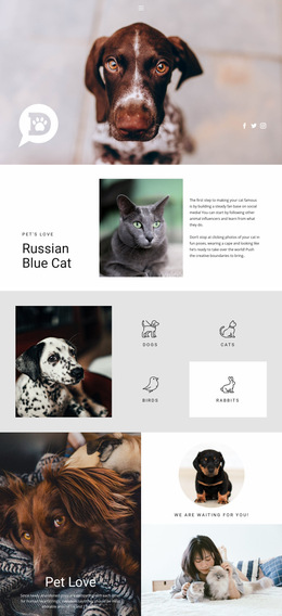
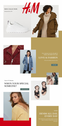
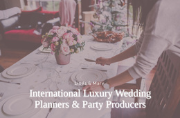
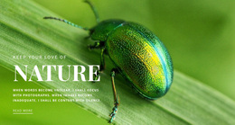


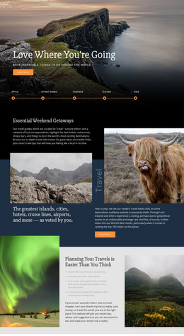



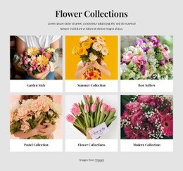


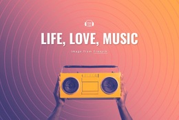
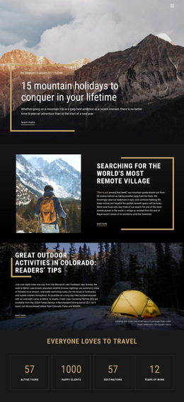
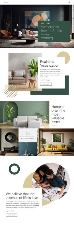
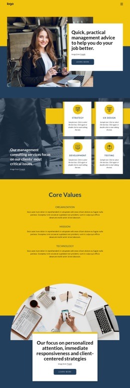
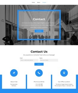
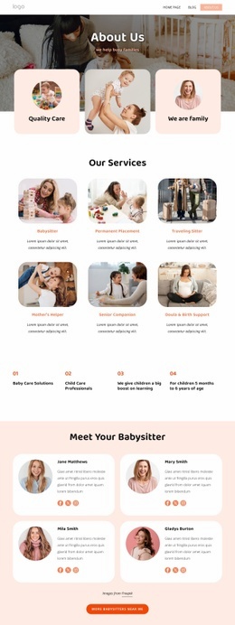
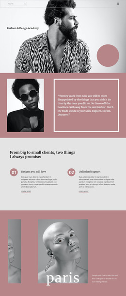
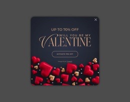
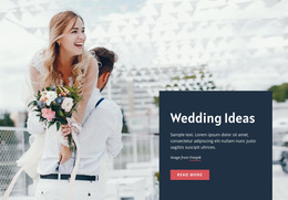
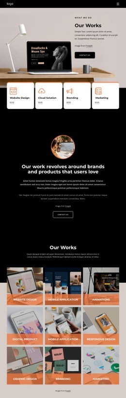

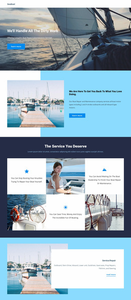
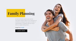

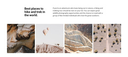


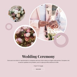



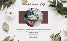










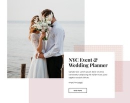




Other Wedding Web Page Designs
Creative Love Web Page Design for Emotional Storytelling
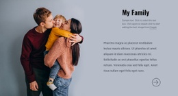
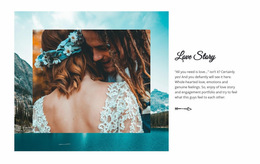
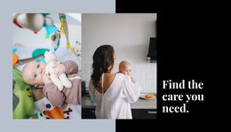
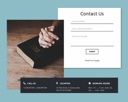
Picture a full-height portrait on the left side of a screen and a short dedication on the right. The photograph attracts attention first, but the smaller message has enough space to be read without interruption. That is one possible direction for love web page design. Another might use a series of photographs down the center of a long page, with small captions between them. The choice depends on how you want someone to move through one particular page and which part of the composition should be noticed first.
Arrange the Hero and Supporting Images
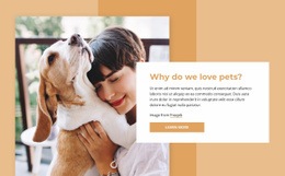
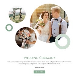
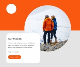
A large portrait can anchor a spacious hero section, especially when the accompanying text is only a couple of lines long. For a photograph with a busy background, place the dedication in a separate area rather than forcing it over the image. An asymmetrical composition may work well when the photographs have different proportions.
Possible page arrangements include:
- A split hero with a portrait and dedication.
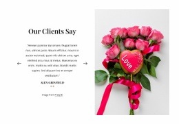
- A centered quotation surrounded by generous whitespace.
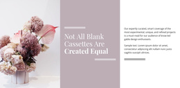
- An asymmetrical album with one dominant photograph.
- A vertical narrative alternating pictures and captions.
- A full-width image followed by a quiet text section.
Keep the Composition Easy to Follow
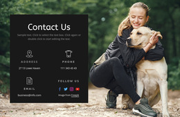
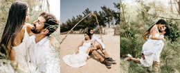
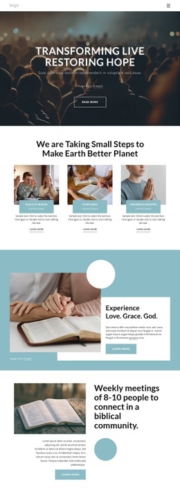
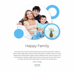
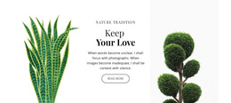
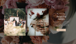
A long love story can benefit from alternating wide photographs with smaller ones. Changing scale gives the reader a natural place to pause before continuing down the page. Keep dates and captions near the corresponding image so the sequence stays clear.
Nicepage's Gallery Carousel Element can accommodate additional photographs within a single block. It works particularly well when secondary pictures would otherwise interrupt the main composition. Make the gallery controls recognizable and keep any essential dedication outside the carousel so readers do not have to browse every slide to find it.
Common composition mistakes to avoid include:
- Giving every photograph the same visual prominence.
- Placing long messages over busy backgrounds.
- Separating captions too far from their images.
- Crowding the main portrait with decorative graphics.
Look at the page at a smaller scale and notice which element stands out first. Then inspect it at the width of a phone. The large portrait and its surrounding text may need a different arrangement on a narrow display, particularly when one image has a very tall aspect ratio.
No single arrangement is correct for a love page. A brief dedication can be stronger with a single photograph, while a visual diary benefits from a longer sequence. Compare compositions using the material you intend to present rather than judging layouts only by the quality of their sample images.