
Cozy Web Page Designs
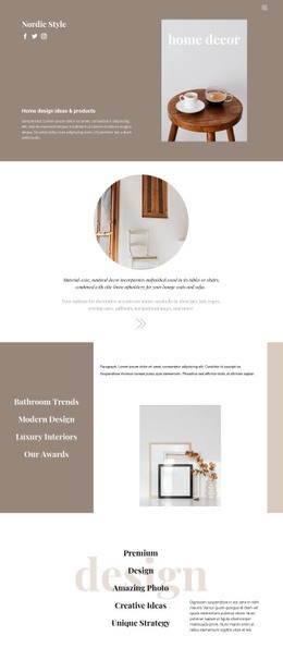
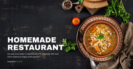
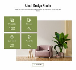
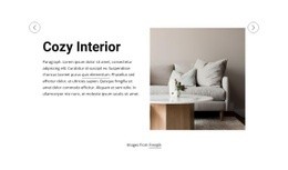
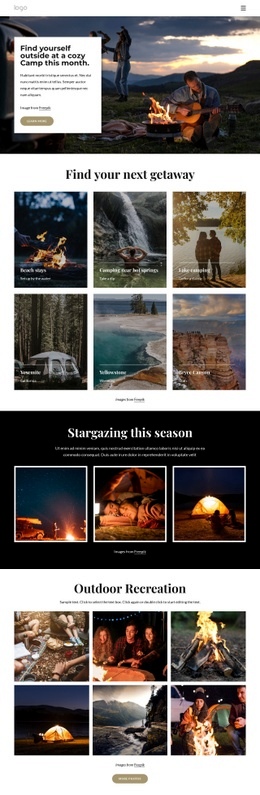
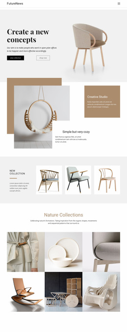
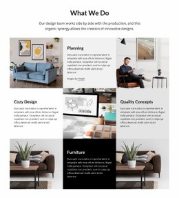
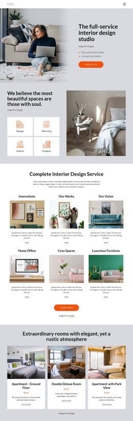
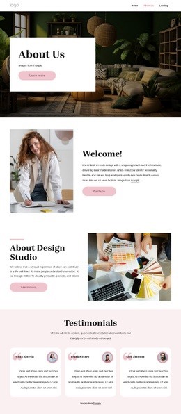
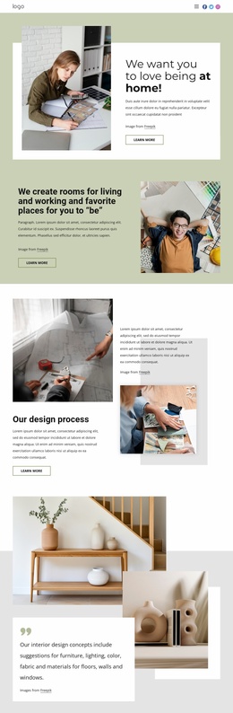
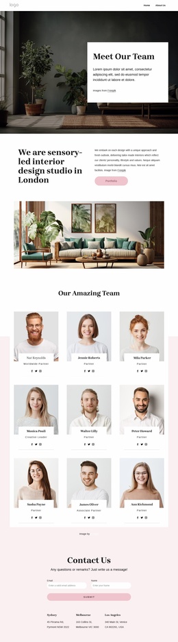
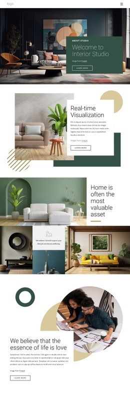
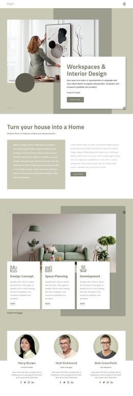
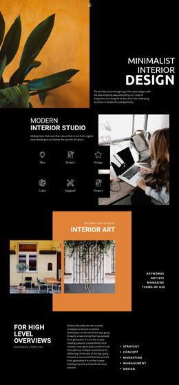
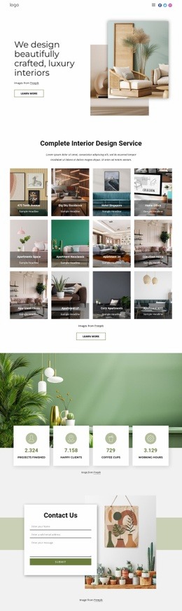
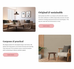
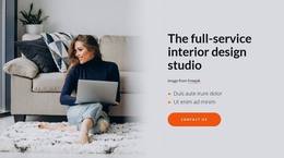
A cozy web page should feel relaxed without making visitors hunt for menus, services, rooms, or contact details. Page composition works best when image scale, spacing, text priority, and actions guide attention in a calm sequence.

More Website & HTML Templates for Cozy



More Web Page Designs from Interior Category





Other Interior Web Page Designs
Contemporary Cozy Web Design for Calm Page Flow
Soft palettes often swallow the parts people came for. The booking button fades into a beige panel, or the rates end up below three screens of atmosphere. Cozy web design keeps the calm while making the next step obvious, mostly through how sections are ordered, grouped, and spaced.
Sequencing Content From Hero Down
Take a few studio apartments for rent in an old building. Guests want to see the place, check dates, and learn where it is, so the page can follow that order:
- The hero holds one interior photo, a short line about the area, and a single "Check dates" button.
- Price and availability appear near the top, ahead of the story about the building.
- Amenities and reviews come in compact groups that are quick to scan.
- A booking form follows lower down, with the button repeated for guests who decide early.
A large photo works as a pause between blocks of information, until it pushes the price below the first screen. Dense content can work as well. A long list of house rules feels relaxed when the type is simple and related lines are kept close.
Spacing Ties Related Details Together
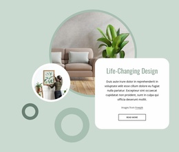
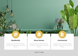
White space should show what belongs together. Gaps between sections should be wider than gaps inside them, or a heading drifts away from its text. On an apartment card, the nightly rate stays beside its button, no matter how roomy the card is. Rounded cards suit a cozy style, but a dozen identical ones in a row resemble a software dashboard. Wider photo sections between them restore the rhythm.
On phones, wide images and tall gaps that feel airy on a laptop turn into endless scrolling. Responsive Modes in Nicepage let you trim image heights and spacing for phones alone.
Clickable Controls on Cream Backgrounds
A cozy button can have rounded corners and a muted tone, yet it needs enough contrast to stand out against cream. Direct labels such as "View apartments" beat poetic ones, since guests should know what happens next. A slim header matches this style, though hiding the menu behind an icon on a laptop costs more than it saves.
Forms cause the most trouble. Input fields on an off-white surface can almost vanish, so they need visible borders, labels above the fields, and as few questions as the booking allows. Paper textures behind inputs only make that worse. Hover and focus states should remain obvious in the same gentle colors. A first-time visitor should understand the offer, find the rate without having to hunt, and see the next step, all on a screen that still feels unhurried.