
Standalone Web Page Designs
A standalone page must explain its purpose without relying on a larger site for context. Strong hierarchy, spacing, content placement, and responsive composition help visitors understand the page from the first viewport through its final section.
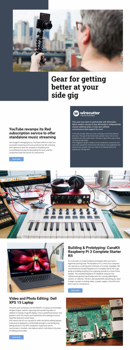
More Web Page Designs from Technology Category
-

-

-
-
-
-
-
-
-
-
-
-
-
-
-
-
-
-
-
-
-
Free Website Builder SoftwareDownload
-
-
-
-
-
-
-
-
-
-
-
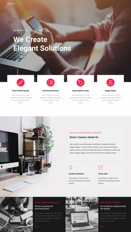
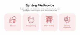


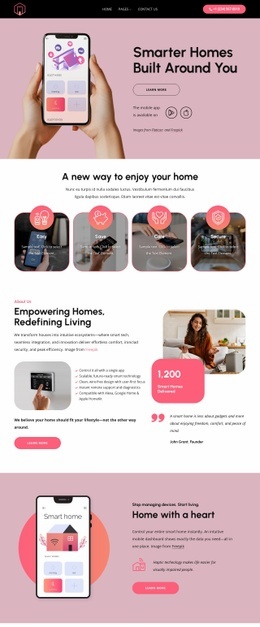
































Other Technology Web Page Designs
Standalone Web Page Design as Visual Composition
A page that arrives on its own has no surrounding menu and no familiar brand context to lean on. The arrangement of type, imagery, and space carries the whole explanation, which is why standalone web page design is judged on composition long before anyone asks how the file was published.
Shape Opening Viewport First
The opening viewport sets expectations for everything under it. A headline establishes the subject, supporting text explains why it matters, and imagery either reinforces that subject or quietly competes with it. Large imagery can establish a subject before the visitor reaches any explanation, which is often a better trade-off than crowding the top of the screen with detail.
Composition decisions in that first screen are few and consequential:
- How much text appears before the first scroll;
- Whether imagery leads the arrangement or supports it;
- How much contrast separates the main statement from secondary lines;
- Where buttons sit in relation to the visual weight around them.
Nicepage Freehand Drag-and-Drop helps at this stage because elements can be moved directly on the canvas until the balance looks right.
Balance Typography Against Generous Whitespace
Type scale and space carry most of the hierarchy on an independent page. Text density is a visual decision as well: a wide measure tires the eye, while a narrow one fragments the argument into slivers.
Rhythm across the scroll usually rests on a handful of relationships:
- Contrast between the headline scale and the body copy;
- Spacing that groups related blocks and separates unrelated ones;
- Breathing room around imagery so it reads as evidence;
- Alignment that holds as blocks change size.
An image-led page and a text-led page solve the same problem in opposite ways. Mixing the two without deciding which one leads is what usually leaves an independent page feeling unsettled, even when every element on it looks fine in isolation.
Recompose Layouts At Narrow Widths
On a phone, the same arrangement turns vertical, so content order becomes part of the visual work. Nicepage Responsive Modes allow the arrangement to be adjusted per screen, and the Responsive Modes guide explains that workflow. Review heading wraps, image scale, and the spacing between stacked blocks, since a composition that felt generous on a laptop can become cramped once everything queues up in a single column.
The test works at any scroll position. If hierarchy, spacing, and imagery still tell a visitor what they are looking at, the composition holds together.