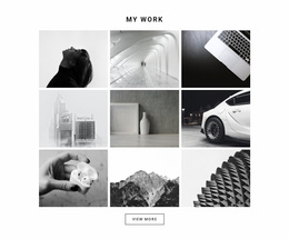
1000 Architecture & Building Homepage Designs
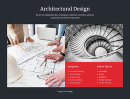
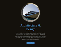





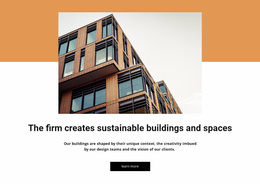









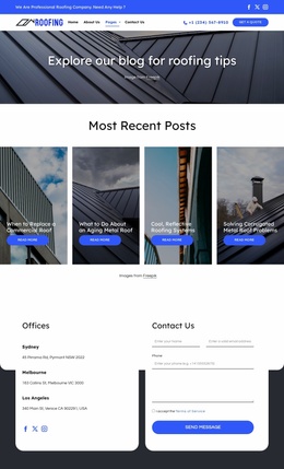
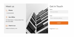

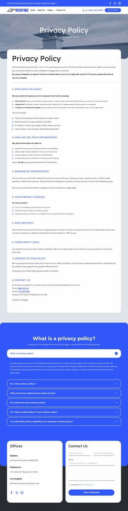

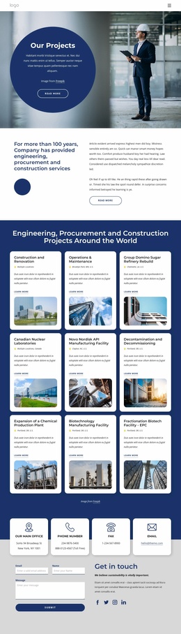






































Unique Architecture & Building Homepage Design
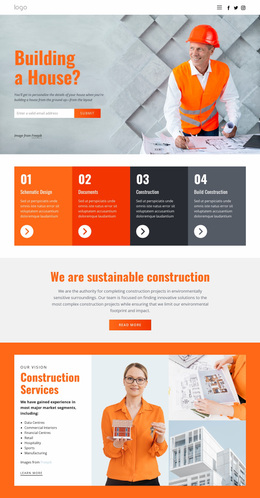
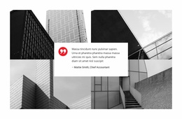
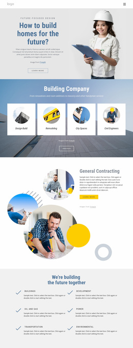
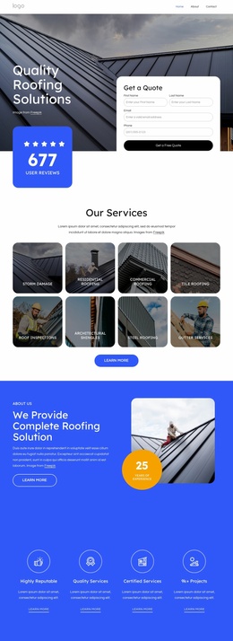
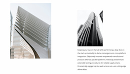
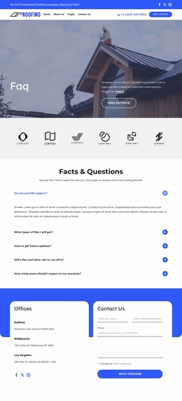
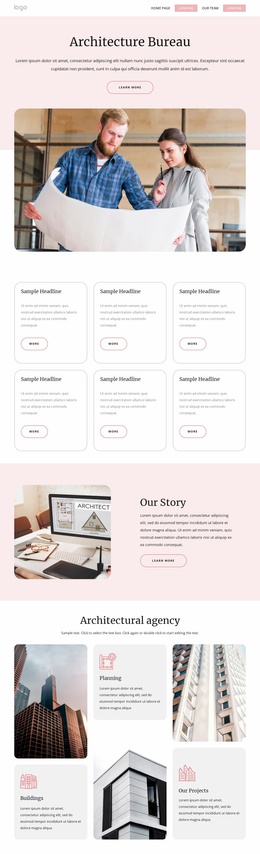
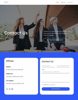
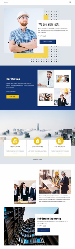
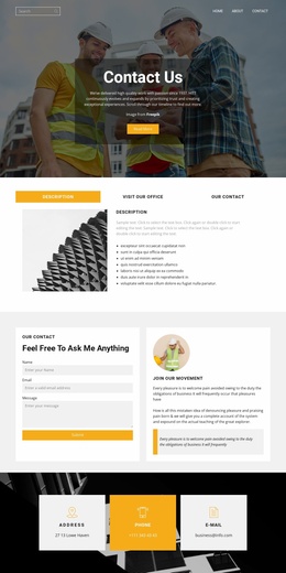
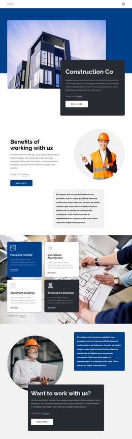
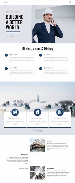
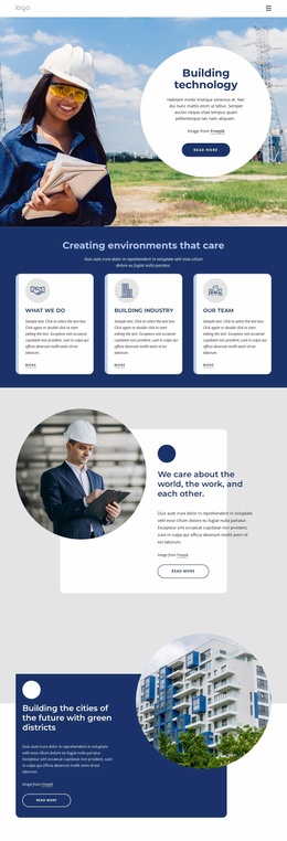
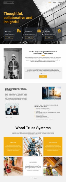
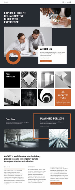
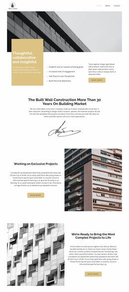
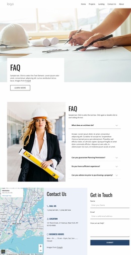
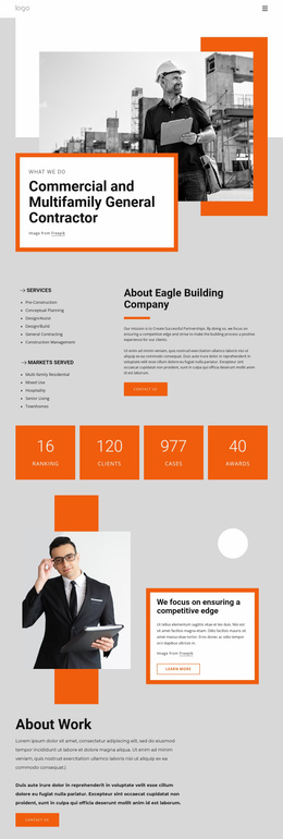
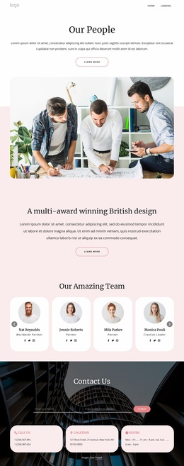
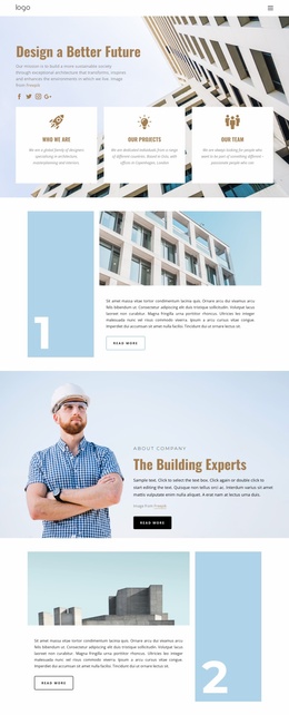
Architecture & building homepage design has one job before anything else: make the first page explain the practice quickly enough that visitors know what kind of work they are looking at and where to go next. A homepage is not a compressed version of every page on the site. It should select the strongest projects, establish the studio's positioning, provide just enough information about services and credibility, and end with a clear route to deeper project pages or contact.
Structure the Architecture Homepage in a Clear Sequence
A useful architecture homepage usually works best in this order:
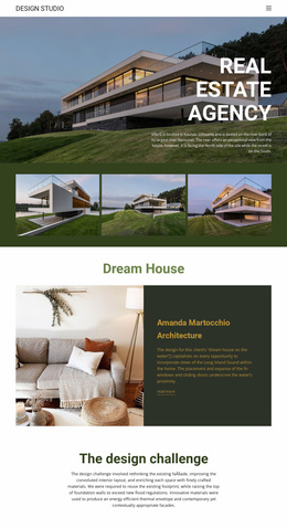
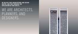
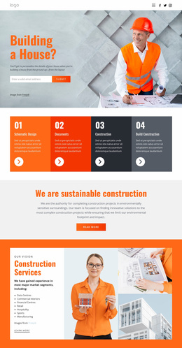
- Hero: one strong project image or visual statement, the studio name or positioning, and one primary next step.
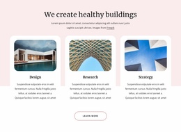
- Featured projects: a small, edited selection rather than the full archive.
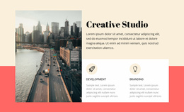
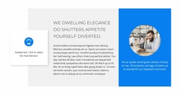
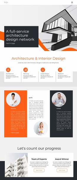
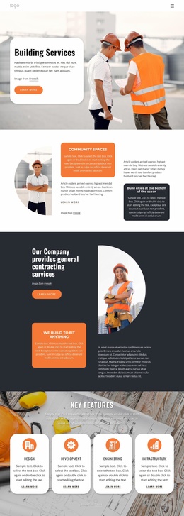
- Positioning or services: a concise explanation of what the practice does, for whom, and at what scale.
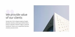
- Proof: awards, locations, years of practice, selected clients, publications, or other evidence that supports the positioning.
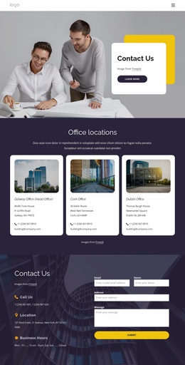
- Contact: a direct path to discuss a project, visit the studio, or open the full contact page.
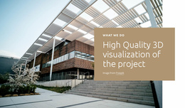
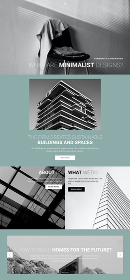
The hero should earn its space. A full-screen image can be effective for a practice with distinctive completed work, but it becomes less useful when the image hides the studio name, service focus, or navigation. Nicepage provides a Full-Width Block Slider for wide introduction blocks, but a slider is only one possible treatment; a single still image with strong type can be clearer when one flagship project deserves the entire first screen.
Decide What Deserves Homepage Space
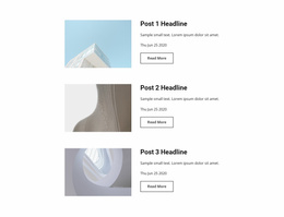
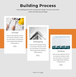
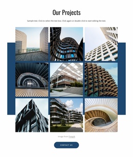
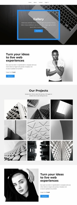
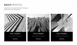
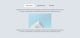
Featured projects should be curated rather than exhaustive. Three to six strong entries are often enough to demonstrate range while keeping the page moving. Each card can show a project name, type or location, and one image; detailed specifications belong on the project page. If every card includes a full case-study summary, the homepage starts competing with the portfolio instead of directing visitors into it.
Studio positioning should appear early enough to explain why the selected work matters. For a specialist residential practice, one or two sentences after the first projects may be enough. A multidisciplinary office may need a compact service block that distinguishes architecture, interiors, planning, or engineering. Proof should then support those claims rather than introduce another unrelated message.
Keep the Homepage Visually Edited
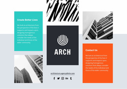
Architecture homepages usually benefit from contrast in scale: a large opening image, tighter project summaries, then quieter text or proof sections. Use negative space to separate major decisions, deliberately vary image proportions, and avoid placing equally loud sections one after another. The homepage should feel like an edited sequence, not a catalog of every component available in the builder.
Architecture Homepage Planning Questions
How many projects should an architecture homepage feature?
Show enough work to establish range without reproducing the complete portfolio. Three to six featured projects is a practical starting point for many studios; the final number should depend on how different the projects are and how much text each card needs.
When should an architecture homepage use a full-screen hero?
Use one when a single project image can immediately communicate the studio's character while still leaving room for a readable name, positioning statement, navigation, or call to action. If the image needs extensive explanation, a shorter hero may work better.
Where should studio positioning appear on the homepage?
Place it in or directly after the opening section, before visitors have to interpret a long project sequence on their own. A concise positioning statement can explain whether the practice focuses on residential work, public architecture, interiors, development, restoration, or another specialty.
How detailed should project cards be on the homepage?
Keep them selective. A title, one useful descriptor such as location or typology, and a strong image are often enough. Move project briefs, drawings, metrics, and longer narratives to the case-study page.
What should appear near the end of an architecture homepage?
Use the final section to guide the next step: open the contact page, request a consultation, view the complete portfolio, or reach the studio directly. Avoid ending with another generic gallery that gives visitors no clear direction.
Edit the Homepage as a First Impression
Review the page from top to bottom without opening the navigation. The hero should identify the practice; the featured work should prove the claim; services or positioning should explain the offer; proof should reduce uncertainty; and the closing section should point to something useful. If one of those steps is missing, improve the homepage sequence before adding more decorative blocks.