530 Interior Homepage Designs
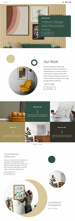
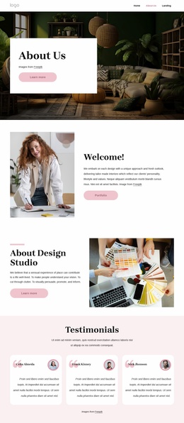
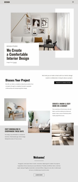
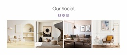
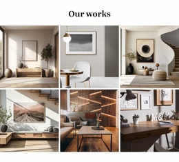
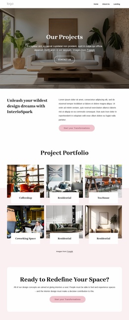
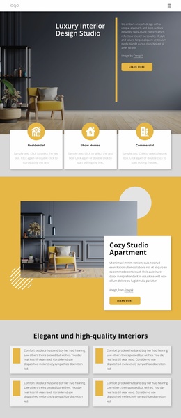
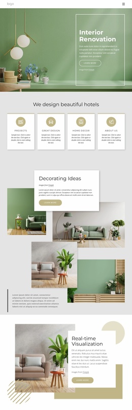

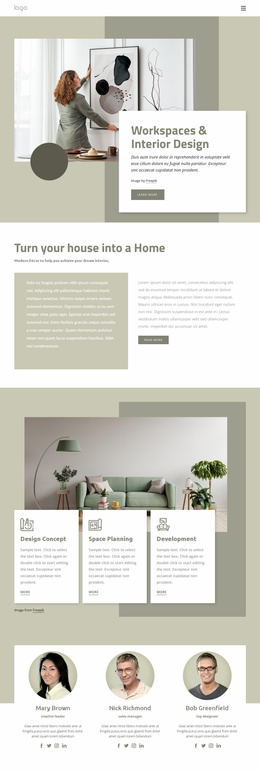
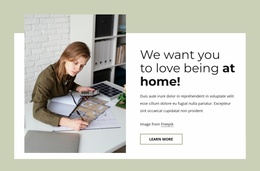
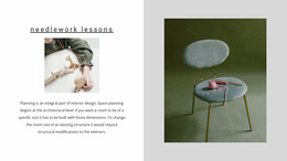
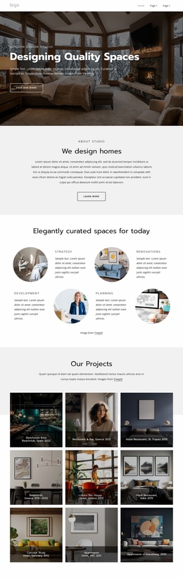

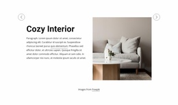
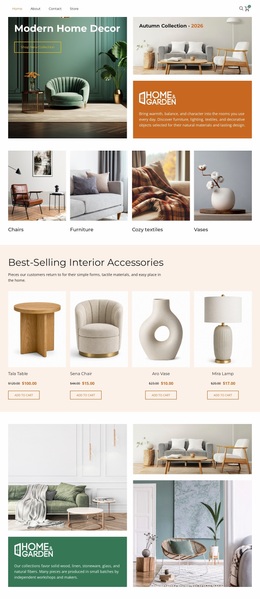
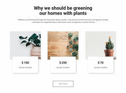

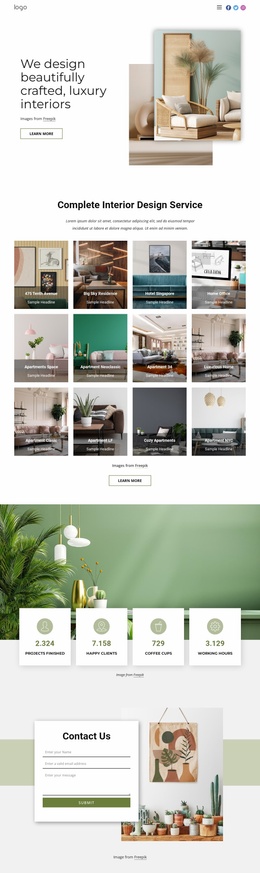
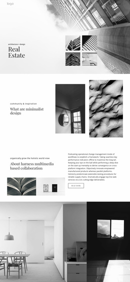
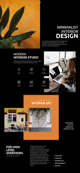

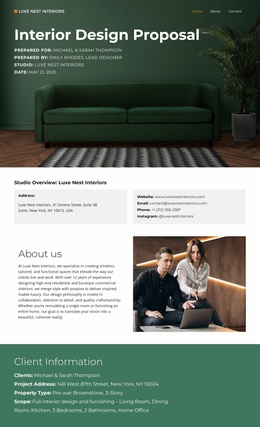
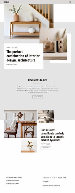
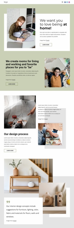
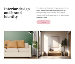

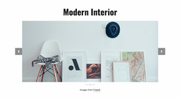
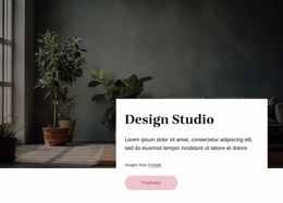
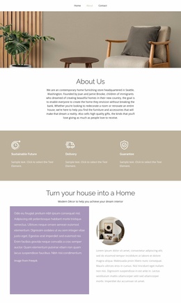
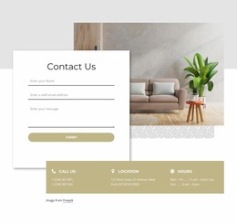
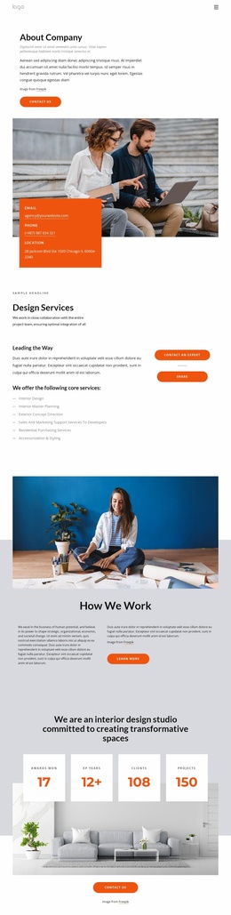
Interior Design Studio Homepage Design for a Strong First Impression
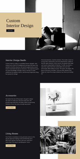
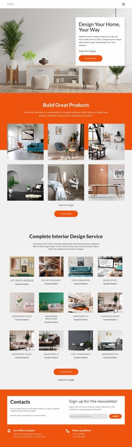
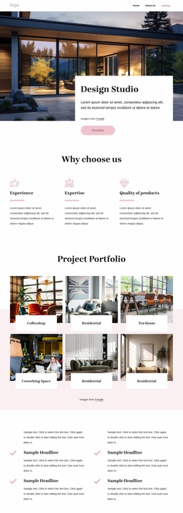
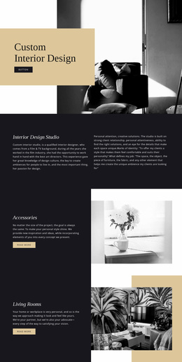
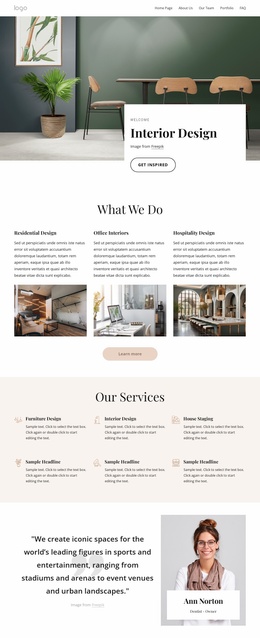
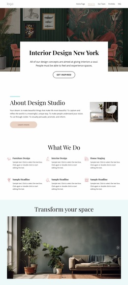
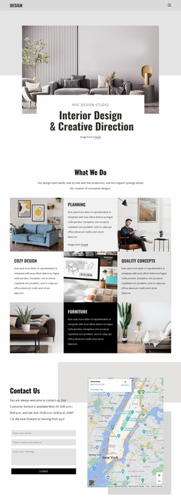
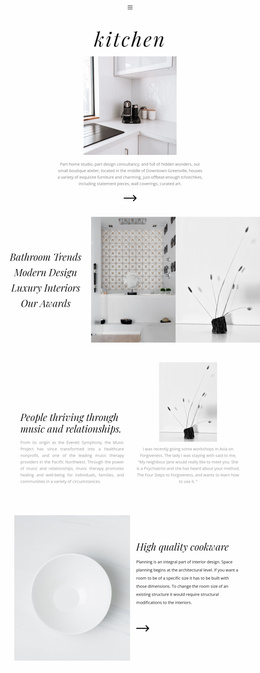
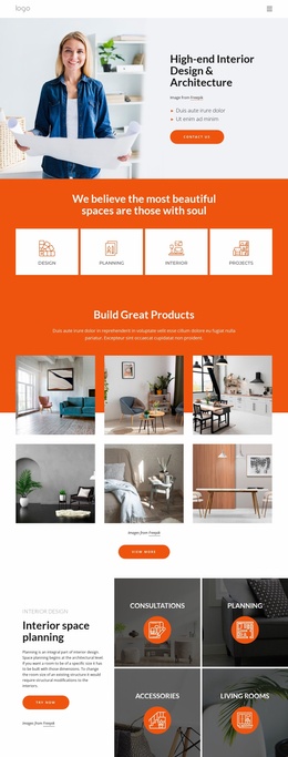
An interior design studio homepage is the front door to the portfolio. It should establish the studio's visual position on the first screen, show sufficient project evidence to build confidence, and make the next choice obvious: explore work, understand services, learn about the studio, or request a consultation. Instead of summarizing every page, the homepage should prioritize the few signals that matter most at first contact.
What Should an Interior Design Studio Homepage Show First?
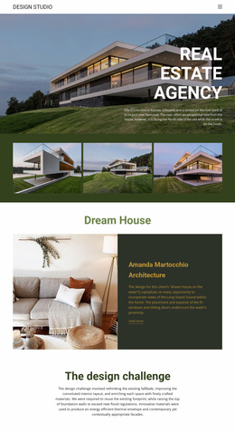
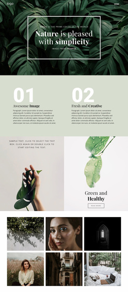
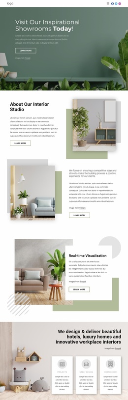
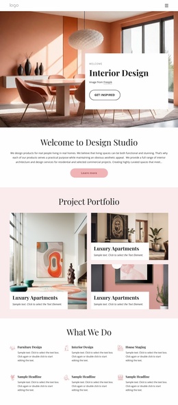
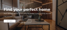
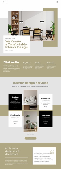
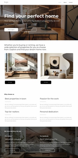
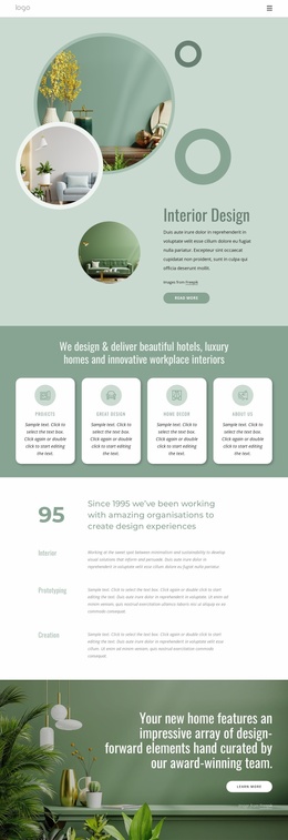
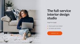
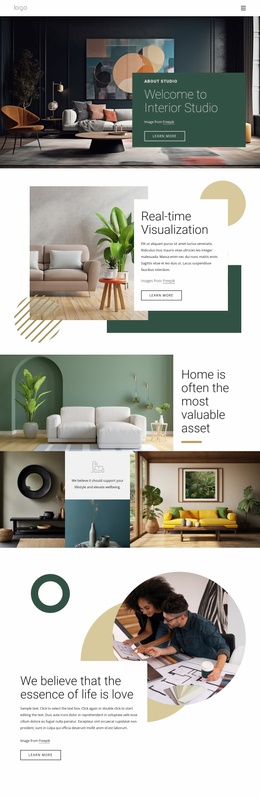
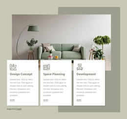
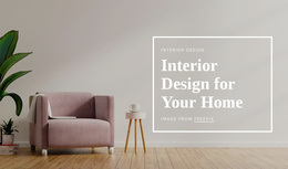
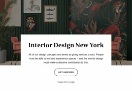
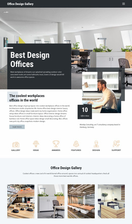
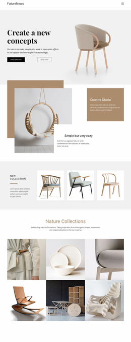
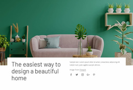
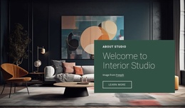
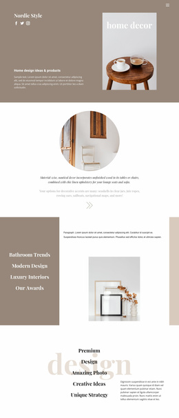
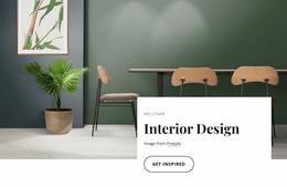
The first screen should quickly answer three questions: what kind of interiors the studio creates, who it works for, and where the visitor should go next. A strong hero may pair a room-scale photograph with a brief positioning statement and a single primary action. The navigation should then favor the sections people are most likely to need, such as Projects, Services, Studio, and Contact, rather than giving every destination equal weight.
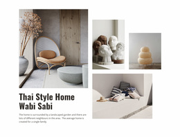
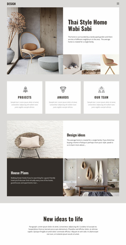
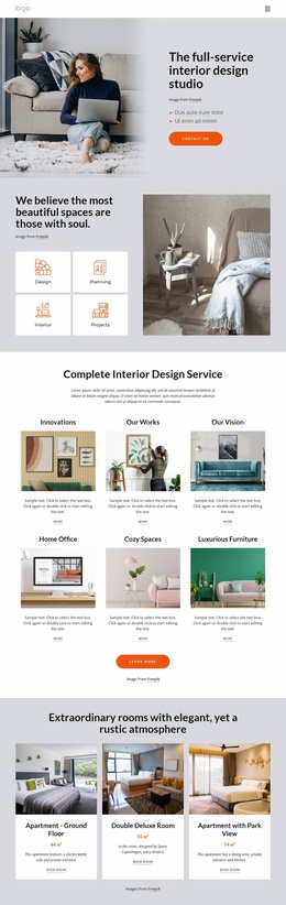
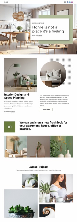
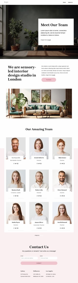
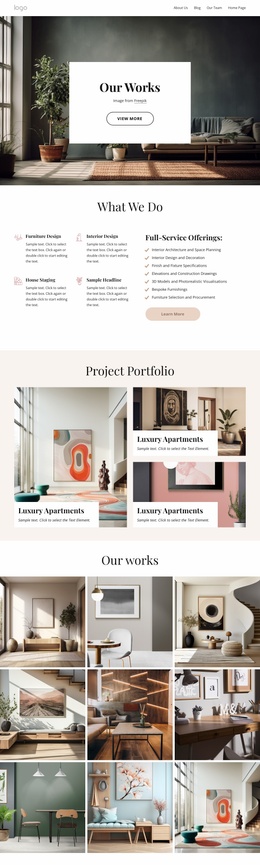
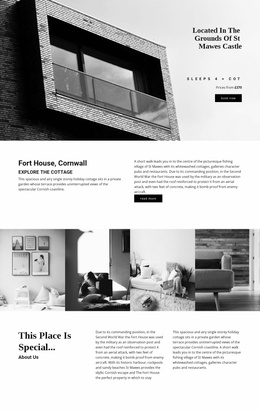
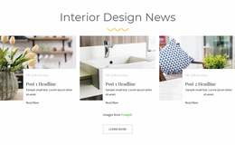
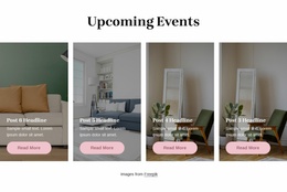
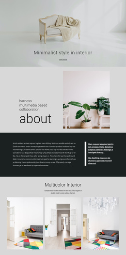
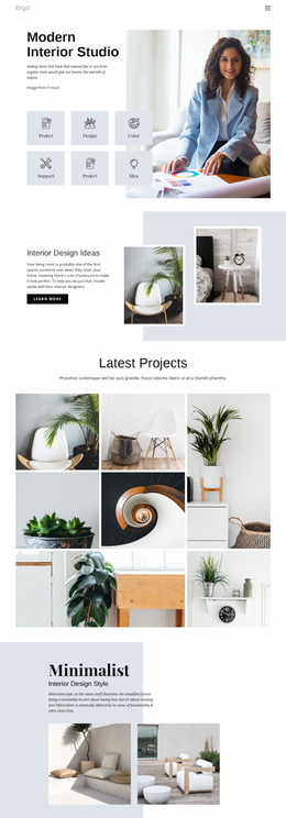
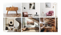
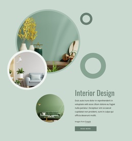
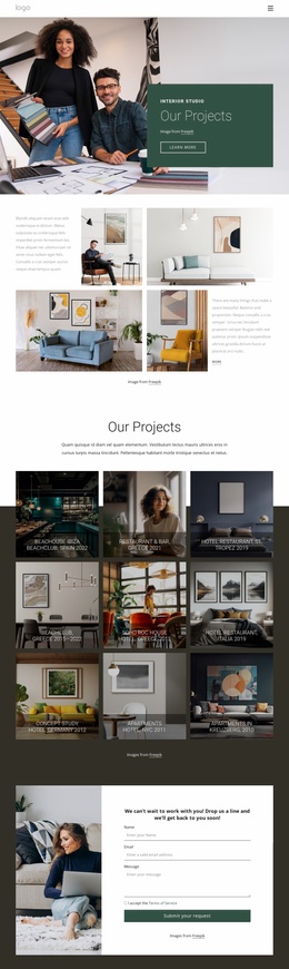
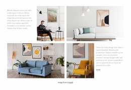
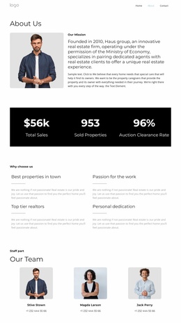
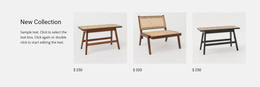
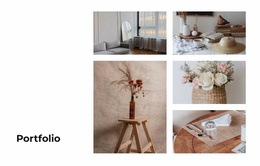
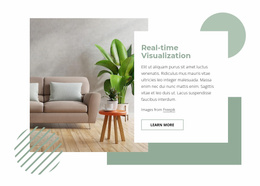
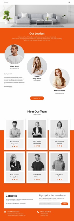
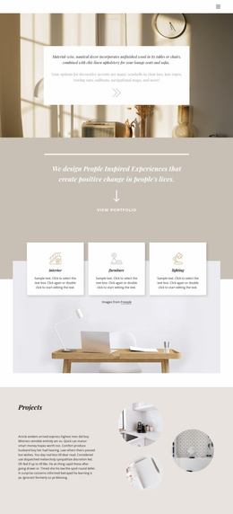
Immediately below the hero, featured projects can establish range without turning the homepage into a complete archive. Residential studios may lead with two or three signature homes; architects can foreground completed spaces and project type; decorators may combine finished rooms with service cues. Studio credentials — awards, years of practice, locations served, selected press, or a concise design philosophy — work best as supporting evidence rather than as a separate wall of text.
Homepage Patterns for Interior Studios
A homepage works well when each block has a clear role in the first-visit journey:
- First-screen positioning: a dominant image, a concise statement, and a clear primary action.
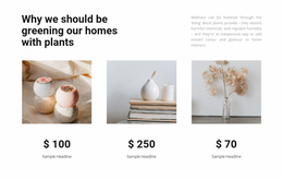
- Featured projects: a selective preview of the portfolio rather than every project category.
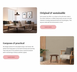
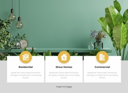
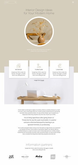
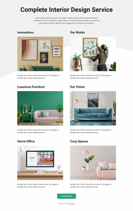
- Service discovery: short routes to residential, commercial, hospitality, renovation, styling, or other relevant services.
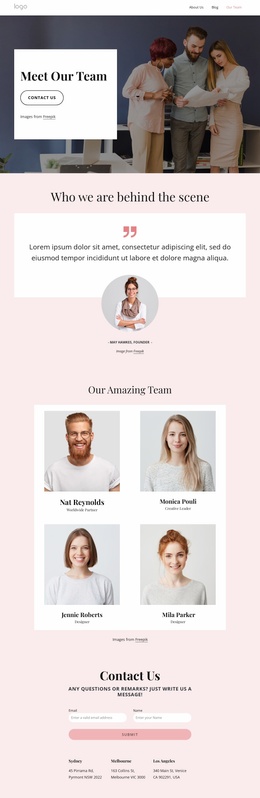
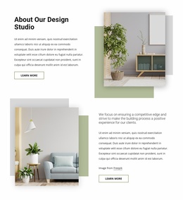
- Studio credentials: compact proof that explains why the practice is credible and distinctive.
- Navigation priorities: direct access to the portfolio and consultation path without burying them in complex menus.
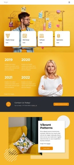
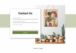
- Inquiry transition: a contact prompt placed after enough visual proof has been shown.
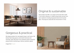
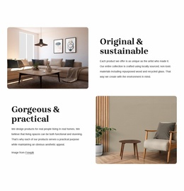
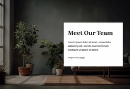
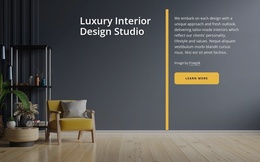
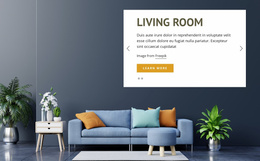
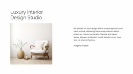
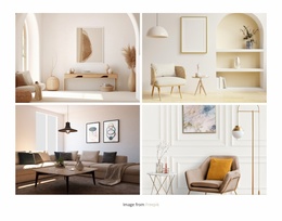
Photography should remain the strongest visual signal. When a living room, kitchen, office, or hospitality project needs to fill the hero area as a background while keeping the surrounding copy, so the image still carries the studio's positioning.
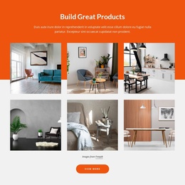
If several signature projects need to appear near the top, the Gallery Carousel Element can show them without making the opening page excessively long. For site-wide consistency, Theme Settings can keep typography and colors aligned with the material palette. Before publishing, review the first-screen composition and navigation behavior in Responsive Modes, because a homepage hierarchy that works on desktop can lose its priorities when the hero, menu, and project preview stack on a phone.
Keep the Homepage Different from the Portfolio
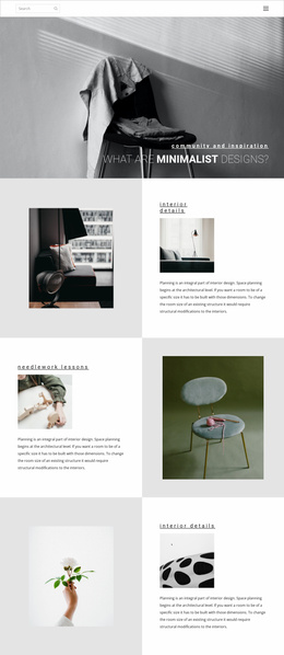
The homepage should curate, not duplicate. A portfolio page can hold the full project archive, filters, detailed case studies, and longer visual sequences. The homepage should instead provide a representative sample and direct visitors to the deeper guide. This more deeply functional approach keeps the first page faster to understand and prevents important credentials or inquiry routes from disappearing beneath too much imagery.
Interior Studio Homepage FAQ
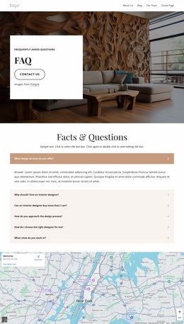
How many projects should an interior homepage feature?
There is no fixed number, but the homepage should show a selective set rather than the entire archive. A few strong projects that represent the studio's main work usually communicate more clearly than a long undifferentiated gallery.
Can I adapt an interior homepage separately for phones and tablets?
Yes. Nicepage supports responsive modes for large screens, desktops, laptops, tablets, and horizontal or vertical phones. Use them to keep the hero, navigation, featured projects, and consultation path prioritized on smaller screens.
Where should studio credentials appear on the homepage?
Place the strongest credentials close to the project proof they support. A concise awards, press, experience, or studio-profile block can strengthen trust without interrupting the visual flow.
How can I keep an interior studio's colors consistent across the site?
Use Theme Colors in Site Settings. A shared color scheme helps the homepage, portfolio pages, service content, and contact areas read as one brand system.
Build the Homepage Around First-Visit Decisions
Start with the studio's clearest positioning statement, choose the few projects that best prove it, and make the navigation reflect the actions a prospective client actually needs. Then refine image scale, typography, credentials, and responsive behavior in the visual editor. A focused interior design studio homepage should feel complete at first glance without trying to replace the rest of the website.