530 Education Homepage Designs
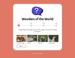

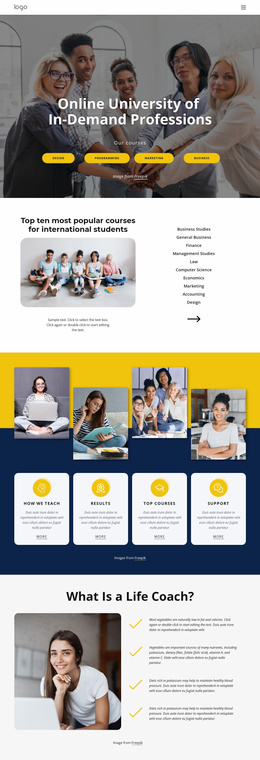
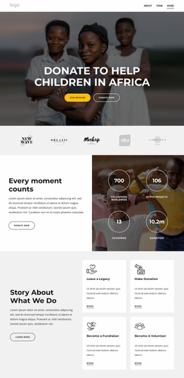
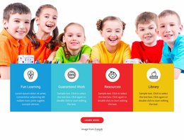
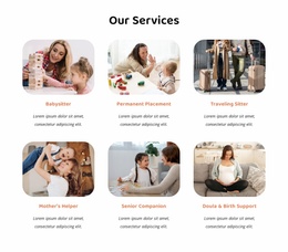
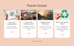
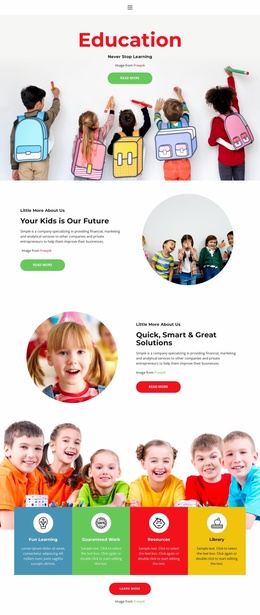
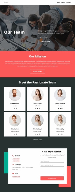
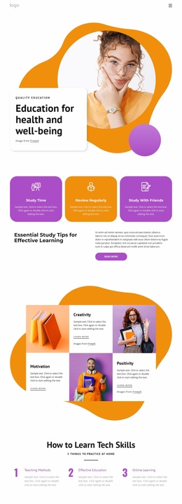
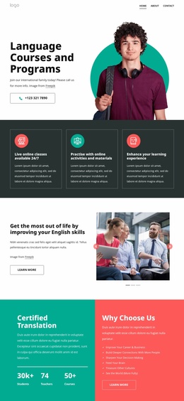
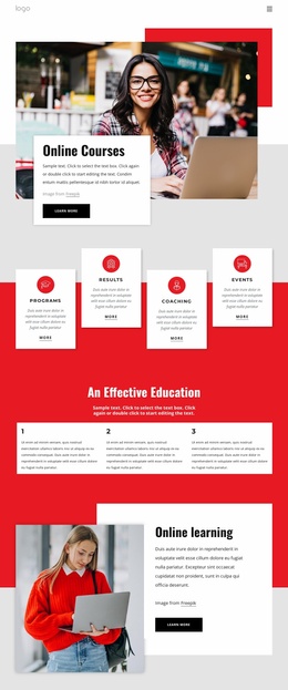
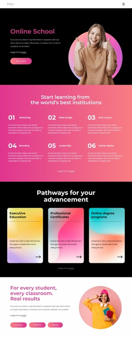
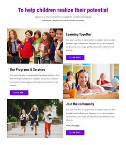
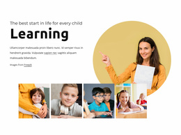
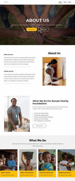

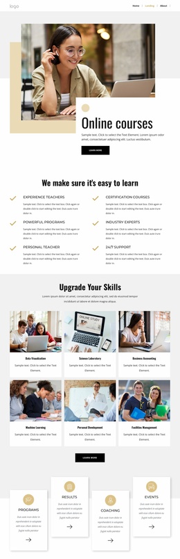


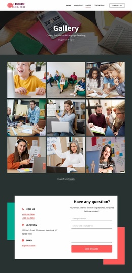

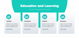
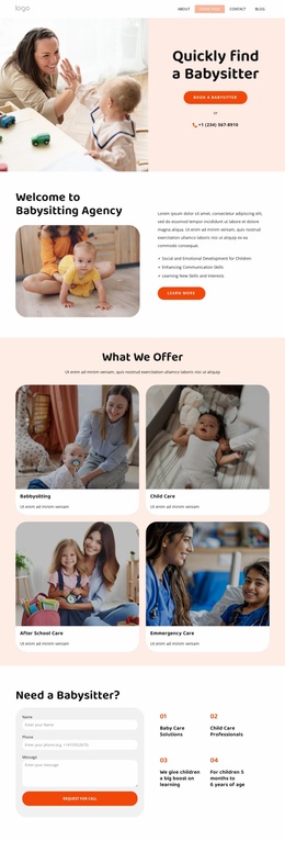

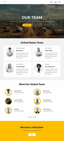


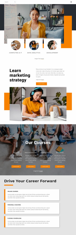

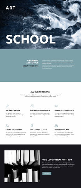
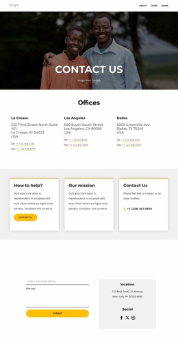
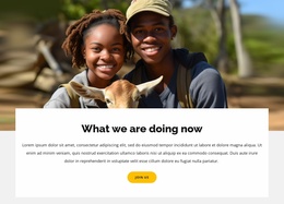
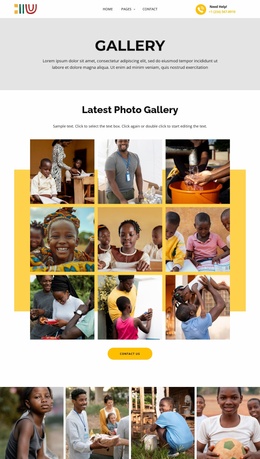
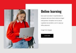
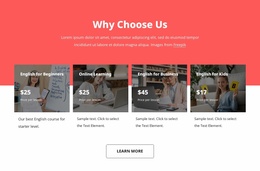
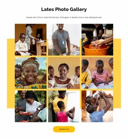


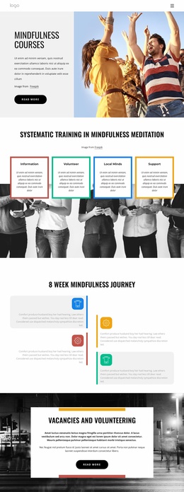

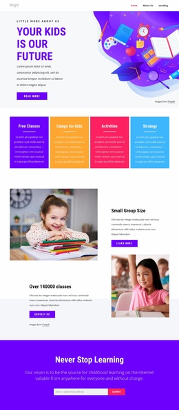



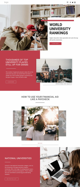
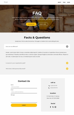
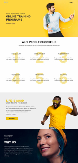
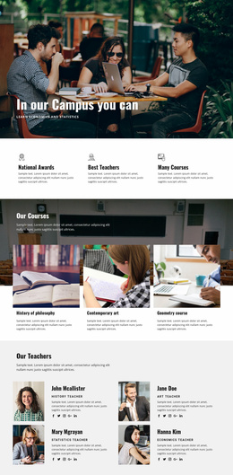

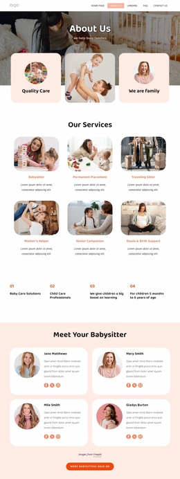

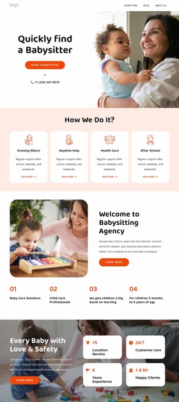
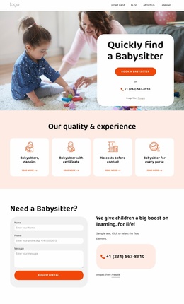
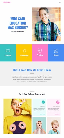
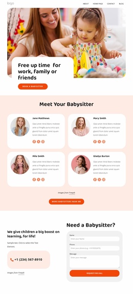
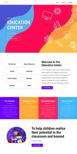

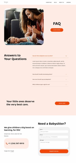
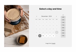

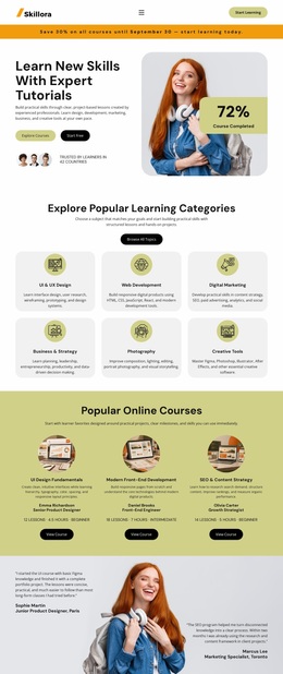
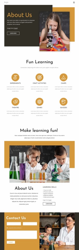
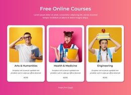

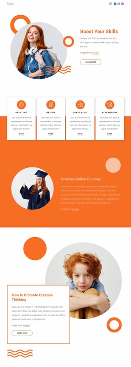



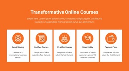

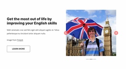








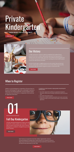
Modern Education Homepage Design for Schools and Courses
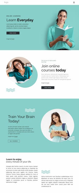
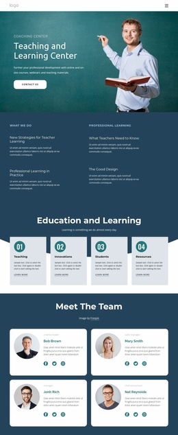
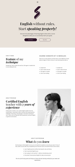
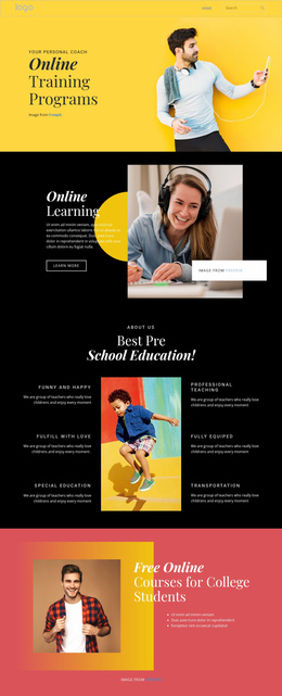
An education homepage must answer several questions before a visitor scrolls far: what the institution teaches, who it serves, why it is credible, and what to do next. For schools, academies, tutors, and course providers, that first page can separate prospective students, parents, current learners, and other visitors into clear paths without turning the opening screen into a directory.
Build the First Screen Around Real Homepage Decisions
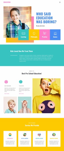
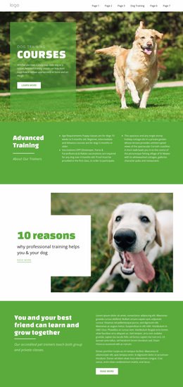
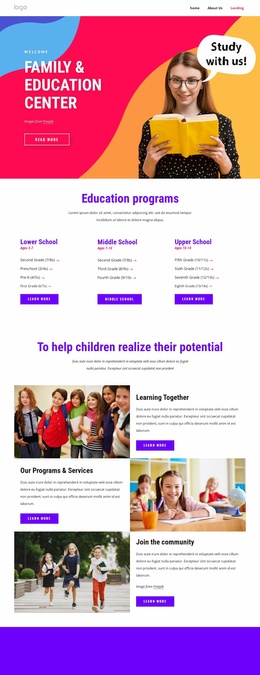
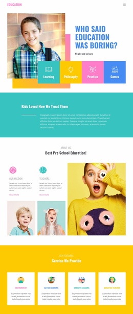
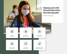
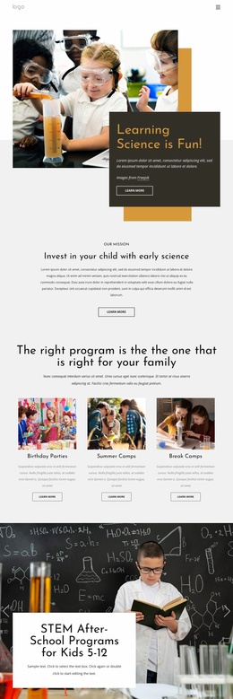
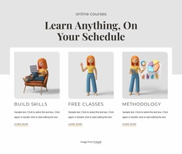
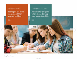
The hero should quickly establish the academic offer. A school may lead with admissions status and an application deadline, while a training provider can pair its main promise with a program finder or a short route into course categories. When different audiences arrive with different goals, use visible entry points such as Programs, Admissions, Parent Information, or Student Resources instead of expecting everyone to follow the same path.
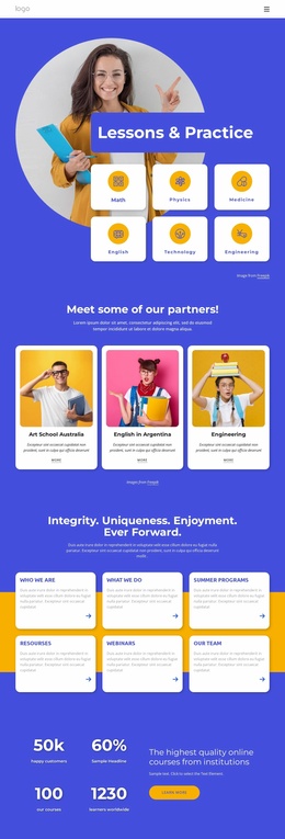
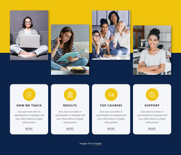
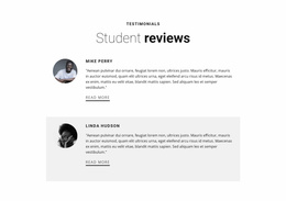
Proof also belongs close to the opening message. Accreditation, graduate outcomes, years of teaching, campus facts, or a concise testimonial can support the claim above the fold when those details matter to the institution. The goal is not to display every achievement at once, but to give visitors enough confidence to keep exploring.
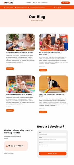
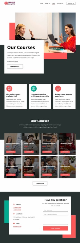
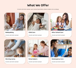
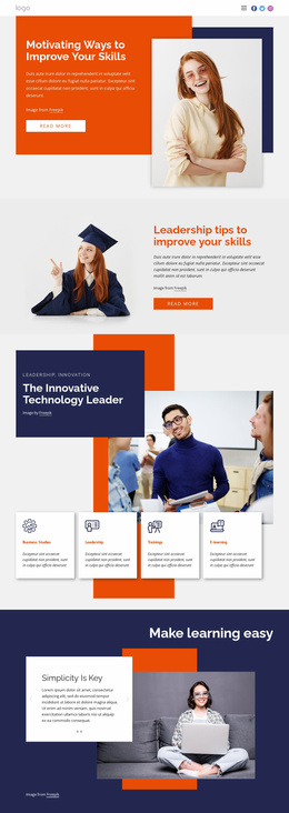
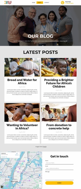
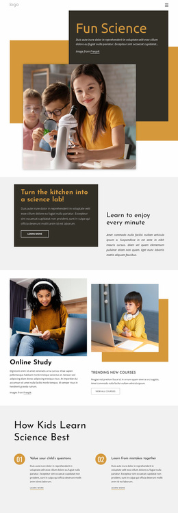
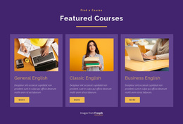
Further down the homepage, program cards, faculty highlights, upcoming events, student stories, and contact options can expand the picture. Keep a clear admissions deadline or enrollment window easy to find, rather than burying it in a news section.
Responsive Tools for Education Homepage Layouts
Nicepage lets you choose a design concept, open it in the visual page editor, and adapt the homepage around the institution’s actual content.
- Freehand Drag-And-Drop helps position the hero message, audience entry points, proof, and primary calls to action without code.
- Edit Mobile Views supports layouts for desktops, laptops, tablets, and phones; the Responsive Modes documentation explains the available screen views.
- Grid Repeater Element keeps repeated program, faculty, campus, or outcome cards aligned; the Grid Repeater element is useful when those items share one structure.
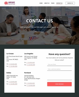
- Contact forms and menu controls can connect the first page with admissions, course discovery, tuition details, events, or general inquiries.
This smaller toolset keeps the homepage focused on orientation and decision-making, rather than turning it into a catalog of editor features.
Advanced Education Homepage Questions
Can I Adjust an Education Homepage for Phones and Tablets?
Yes. Nicepage supports Responsive Modes for Large Screens, Desktops, Laptops, Tablets, and horizontal or vertical phones. You can edit each view separately when a hero, program grid, or admissions section needs a different arrangement.
Can I Keep School Colors and Typography Consistent Across the Site?
Yes. Theme Colors define a global color scheme, while Site Settings let you manage the Fonts Scheme and Typography Styles across pages.
Are Pre-Designed Blocks Available for Education Homepage Sections?
Yes. Nicepage includes pre-designed Elements and Blocks for text, images, forms, grids, and sliders that you can adjust to match institutional content.
How Can a Course Provider Collect Student Inquiries From the Homepage?
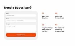
Add the Contact Form Element and adapt its fields for course questions, enrollment requests, or subscriptions. Place it near program information or beside a clear admissions call to action.
Where Should an Admissions Deadline Appear?
Place an important deadline where prospective applicants can see it early, then repeat it near the relevant admissions or application action. The date should support the visitor’s decision rather than compete with the main academic message.
Make the Homepage Earn the Next Click
Treat the homepage as the institution’s routing page, not a compressed version of the entire site. Give each major audience a recognizable path, keep the current admissions or enrollment action visible, and use proof where it strengthens trust. Once those decisions are clear, the remaining design work becomes refinement, not rescue.