100 Wedding Homepage Designs
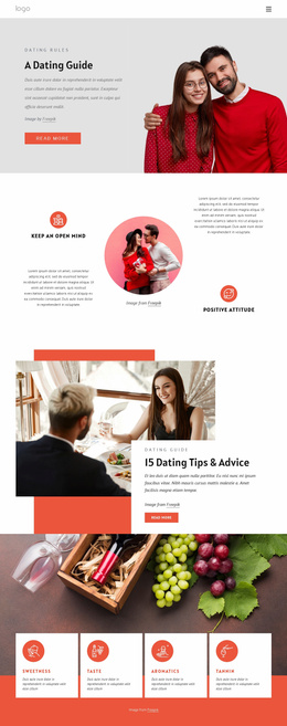
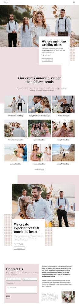
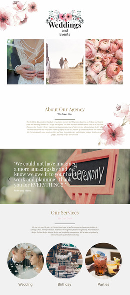
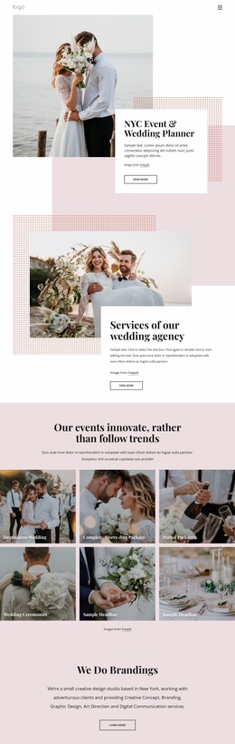
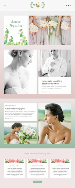
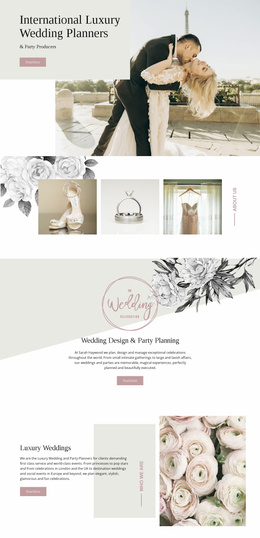
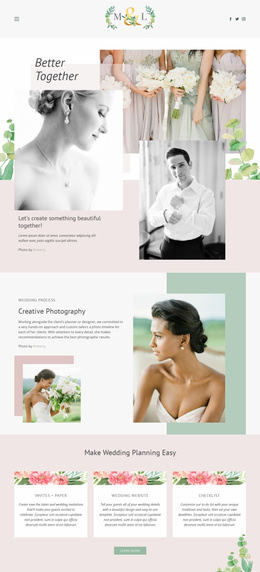

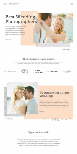


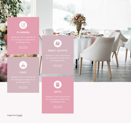
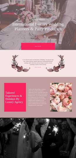
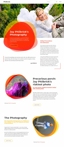
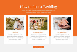

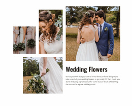
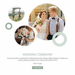

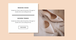

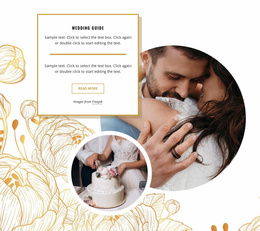
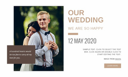
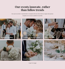
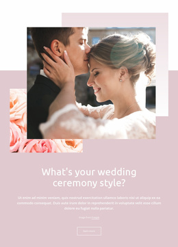
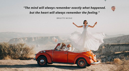
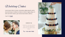

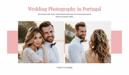
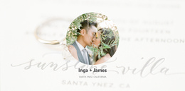




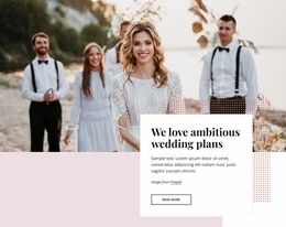
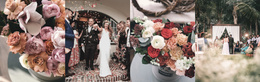
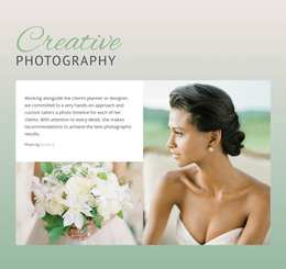
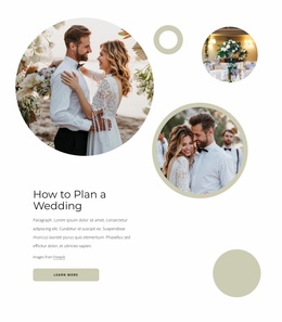
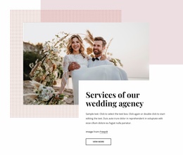
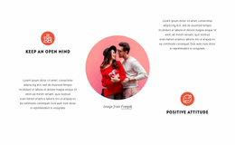
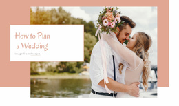
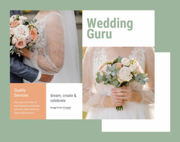
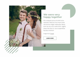
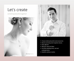
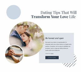
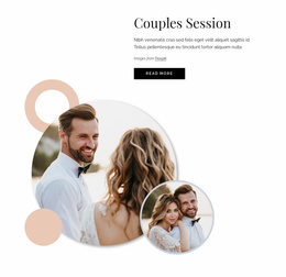

Modern Wedding Homepage Design
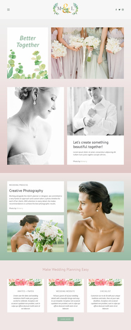
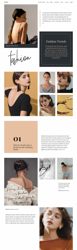
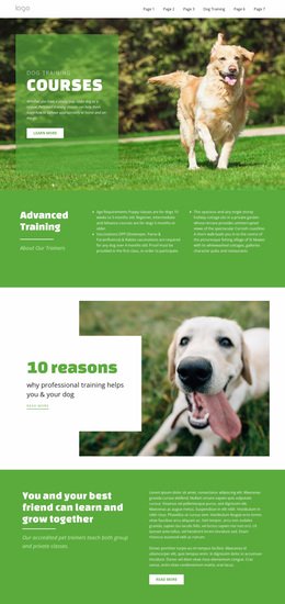
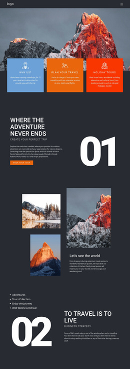
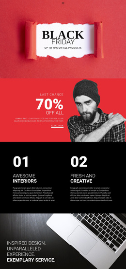
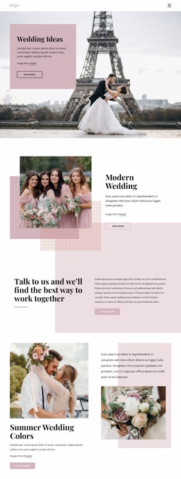
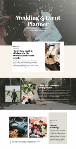
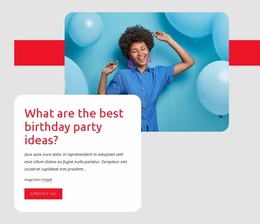
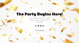
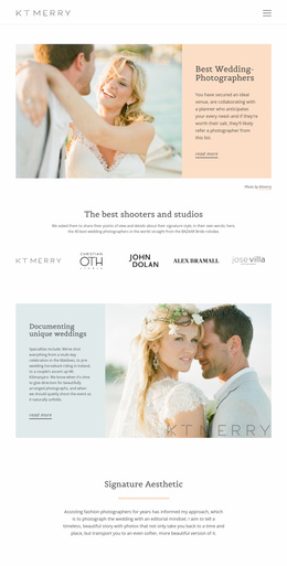
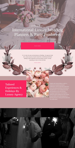
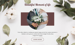
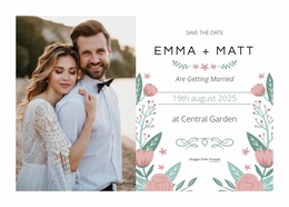
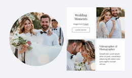
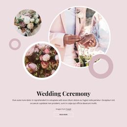
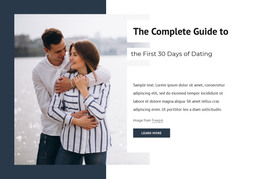
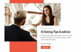
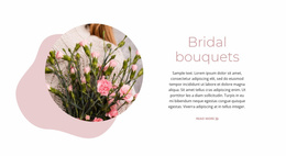
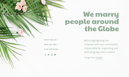
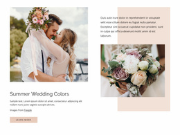
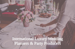
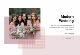
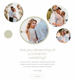
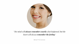
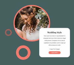
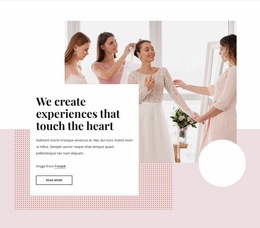
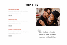
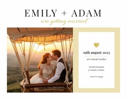
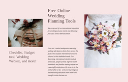
Wedding websites can lose their usefulness when the first screen looks beautiful but gives guests no clear next step. A focused wedding homepage design should introduce the couple and the date, then serve as the main entry point to RSVP, schedule, travel, registry, and FAQ content. Guests should understand both the celebration's mood and where to go next before they move deeper into the site.
Why Choose the Best Wedding Homepage Layout?
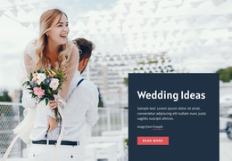
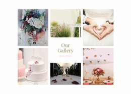
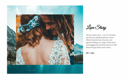
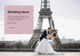
If you want guests to recognize the couple immediately, give the hero area a strong portrait or venue image, but reserve space for useful event cues. A visible date or countdown can reduce uncertainty; the venue name can confirm that guests are on the right page, and a single primary guest CTA can lead directly to the RSVP or the schedule. For destination ceremonies, travel information should be reachable from the homepage without competing with the main action.
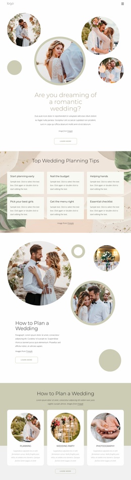
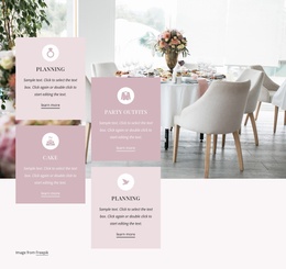
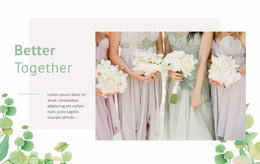
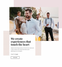
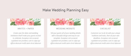
A homepage can also borrow visual cues from marriage website concepts without turning the front page into a complete event archive. Its practical role is to route visitors toward the right destination: RSVP for invitees who have not answered, schedule for guests checking timing, travel for out-of-town visitors, registry for gift information, and FAQ for last-minute questions.
Clean Features for a Wedding Homepage
Guest Entry Points
- Build the opening area around one primary action, such as RSVP or View Schedule, then keep travel, registry, and FAQ destinations visible but secondary.
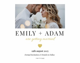
- Place the couple’s names, date, venue, and primary guest CTA inside a Grid Element so the first screen remains easy to scan.
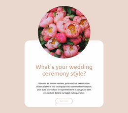
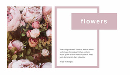
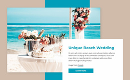
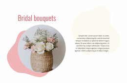
- Apply Expand Image when a portrait, venue photograph, or floral composition should anchor the hero without pushing essential guest information below the fold.
Shared Styling
- Use Theme Colors to match buttons and accents to the wedding palette through Site Colors.
- Set Site Fonts through the global font settings when invitation typography should carry into the homepage.
- Use Edit Mobile Views to make sure the date, venue, and main guest action remain visible and easy to tap on phone screens.
The visual tone can continue through greeting-inspired design ideas, particularly for short welcome messages, monograms, and invitation-like introductory copy. A more personal relationship-focused style can support timelines or story sections lower on the page without competing with the main hero.
Unique Homepage Composition Advice
The homepage should not attempt to explain every part of the wedding at once. Give the first viewport one dominant photograph, a concise identification of the event, the date or countdown, the venue, and one unmistakable guest action. Lower on the page, use short previews to route people toward the schedule, travel guidance, registry, gallery, and FAQ instead of reproducing those sections in full.
Simple Wedding Homepage Questions
How can I keep the wedding color palette consistent across the whole site?
Use Theme Colors in Site Settings. Nicepage applies the selected Color Scheme across the project's pages, helping keep hero accents, buttons, backgrounds, and later wedding sections visually consistent.
Can I use the same invitation fonts across every wedding page?
Yes. Site Settings let you edit the Fonts Scheme and Typography Styles for all pages. Typography Styles can also be adjusted separately for each Responsive Mode.
Can I turn a wedding portrait into a full-width homepage background?
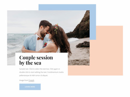
Yes. Use the Expand Image feature to turn a standard image into a background in one click. This works well when a couple portrait, ceremony venue, or floral image needs to anchor the hero composition.
What should the main wedding homepage button do?
Choose the action guests are most likely to need first. Before responses close, that may be RSVP; closer to the event, the schedule or venue details may deserve the strongest placement.
Should travel and registry links appear on the wedding homepage?
They can appear as secondary destinations when they matter to the guest journey. Keep them easy to find without giving them the same visual weight as the primary action.
Simple Control Over Your Wedding First Impression
A generic front page can make a carefully planned celebration feel interchangeable. Shape a homepage around the couple’s own photographs, palette, typography, and event priorities instead. Open the design in the Online Builder or Desktop App, refine each block in the visual design canvas, and publish the finished site when its first impression matches the celebration. You can start for free and keep direct control over every major visual decision.