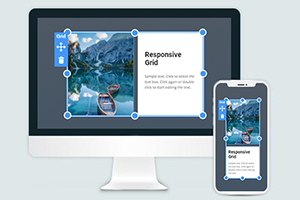
Come capovolgere il layout della griglia per cambiare l'aspetto del blocco
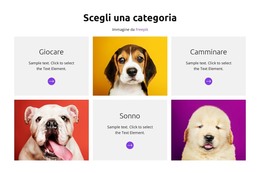
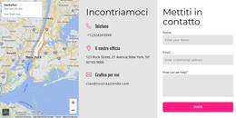
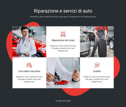
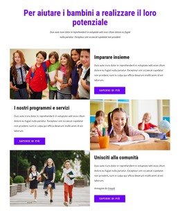
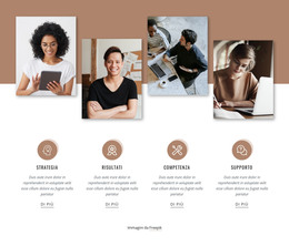
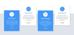
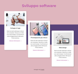
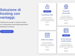
Tutto ciò di cui hai bisogno per creare il tuo sito web gratuito
Utilizza il nostro Website Builder per progettare e creare siti Web senza codifica. Trascina e rilascia tutto ciò che vuoi, dove vuoi. Il Website Creator adatta automaticamente il tuo sito web per dispositivi mobili per renderlo reattivo. Scegli tra più di 15,000 modelli di siti web personalizzabili.
Funzionalità correlate
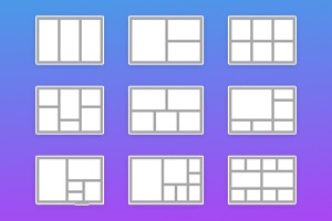
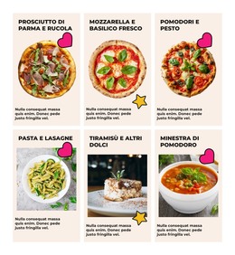
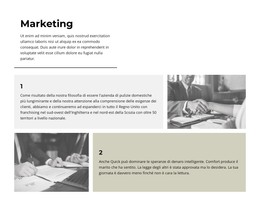
Modelli gratuiti con Elemento griglia
Inizia con i nostri migliori modelli, ideali per qualsiasi attività commerciale. Creali e personalizzali con il nostro generatore di siti Web potente e gratuito senza codice. Tutti i modelli sono ottimizzati per i dispositivi mobili e hanno un aspetto eccellente su qualsiasi dispositivo.


How To Make Flip The Responsive Grid
When you add columns and rows after getting started, you can always flip the CSS Grid layout to change the positioning and overall look of the Grid items and the CSS Grid block. The flip does not affect the space between rows and columns and only affects the positioning. To flip the columns and rows in the CSS Grid layouts, go to the Property Panel, and in the CSS Grid Layout section, you can the Flip or Rotate buttons to make the Grid Cells change places to set up the block look you desire. This function will help you create a responsive Grid without changes in the space between columns and rows.
The CSS Grid template helps to place the content of the CSS grid under pre-designed layouts to make the object fit the current media queries. After you align content within the Grid Layout using CSS grid template columns with pre-installed space between rows and columns, ensure no conflict between your content with various screen sizes. The screen size and media queries go hand in hand, so to make sure the column layout works, learn how to manage the overall space between Grid items.
No matter how many rows and columns you set up, you need to ensure that your responsive layout will make your internal content work and draw attention. Use the right click on the cells to determine will the object-fit after adding it to the Grid layout. Please help us provide the updated navigation to align content. You can set the maximum number of columns and rows inside your block using right-click. Please help us improve our builder with the help of your comments and suggestions.