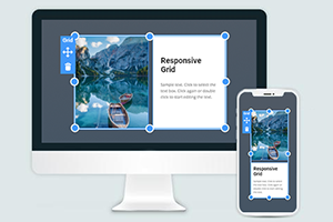
Como inverter o layout da grade para alterar a aparência do bloco
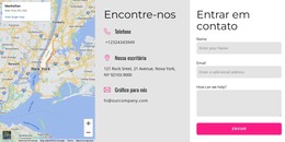
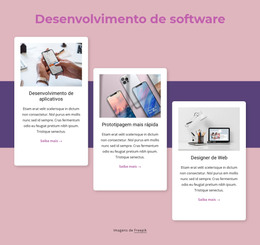
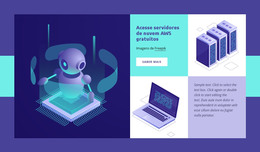
Tudo que você precisa para criar seu site gratuito
Use nosso Construtor de Sites para projetar e criar sites sem codificação. Arraste e solte o que quiser, para qualquer lugar que quiser. O Criador de sites adapta automaticamente seu site para dispositivos móveis para torná-lo responsivo. Escolha entre mais de 9.000 modelos de sites personalizáveis.
Recursos Relacionados
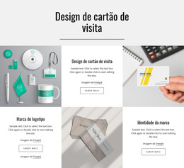
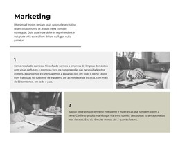
Modelos grátis com Elemento de grade
Comece com nossos melhores modelos, ótimos para qualquer negócio. Crie e personalize-os com nosso poderoso e gratuito construtor de sites sem código. Todos os modelos são compatíveis com dispositivos móveis e têm uma aparência excelente em qualquer dispositivo.


How To Make Flip The Responsive Grid
When you add columns and rows after getting started, you can always flip the CSS Grid layout to change the positioning and overall look of the Grid items and the CSS Grid block. The flip does not affect the space between rows and columns and only affects the positioning. To flip the columns and rows in the CSS Grid layouts, go to the Property Panel, and in the CSS Grid Layout section, you can the Flip or Rotate buttons to make the Grid Cells change places to set up the block look you desire. This function will help you create a responsive Grid without changes in the space between columns and rows.
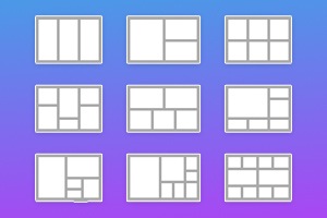
The CSS Grid template helps to place the content of the CSS grid under pre-designed layouts to make the object fit the current media queries. After you align content within the Grid Layout using CSS grid template columns with pre-installed space between rows and columns, ensure no conflict between your content with various screen sizes. The screen size and media queries go hand in hand, so to make sure the column layout works, learn how to manage the overall space between Grid items.
No matter how many rows and columns you set up, you need to ensure that your responsive layout will make your internal content work and draw attention. Use the right click on the cells to determine will the object-fit after adding it to the Grid layout. Please help us provide the updated navigation to align content. You can set the maximum number of columns and rows inside your block using right-click. Please help us improve our builder with the help of your comments and suggestions.