How to build mobile-friendly web design

Support For Large Screen Devices
Since larger screens have become more popular, you can select the Large Devices Responsive Mode for monitors and devices with large screens from 1400px. You can still modify the layouts and designs for all other screen widths. You can switch to Large Devices Mode on the Top Bar.
Change Content Area Width
You can change the width of all Responsive Mode by editing the Content Area Width in the Property Panel. To access the Content Width properties click the Edit link on the Responsive Mode tooltip or the link in the Theme Settings Panel of the Quick Access.

Auto-Adaptation for Devices
Transform Cells and Items automatically to adapt layouts for Responsive Modes. You can use the Grid, List, and Gallery, and other Elements for that.
Edit Mobile Views
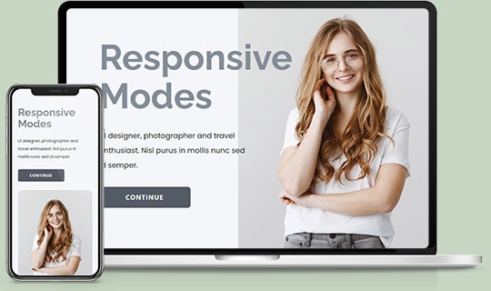
Design your websites for all screens at once. Switch Mobile Views to see how your websites look on Desktops, Laptops, Tablets, and Phones, and edit each Responsive Mode separately.
Customize For Devices
Edit each Mobile View to customize for your needs, move cells, change the size, and make each mode of your site stand out.
Hide On Devices
Easily hide Elements, Boxes, Grid Cells, and Blocks for any Desktop or Mobile Views separately instead of deleting them in Responsive Modes.

Grid For Mobile Devices
Use the Grid Element to make the Responsive Modes easily. On the smaller screens, the Grid Cells move one under another automatically.
How to make responsive web design?
Responsive web design (RWD) is a relatively new direction in the design of web resources, but it is already one of the leading indicators of the site's quality. First, in 2010, Ethan Marcotte wrote about responsive design in his article. Ethan Marcotte describes responsive web design for android devices, PC, mobile phones, tablets, and he made a list apart for flexible layouts, media queries, where he combines all the trendy elements of web design. There are various screen sizes that exist across phones, tablets, "phablets," tablets, game consoles, desktops, TVs, etc. RWD is a practice of creating a website and allows users to work on various screens. The technical part of the responsive design requires that the site design display well across different screen sizes. Responsive design synopsis: the design makes your website content and design adapt to the different screen resolutions and window sizes and is very comfortable for tablets and mobile devices users. Today everybody is constantly resizing their browser window size. RWD suggests a design, which should respond to the mobile and PC user's experience based on screen size, orientation, and platform. Responsive design is an approach to web development that creates various changes to the appearance of a website across multiple screen sizes, forms, and models. RWD is a terminology used to define an approach to design best practices, used to create a mockup that can react to the device used to view the content.
Utilizing the gradient grid, flexible grids, CSS media query files becomes a new trend for mobile users. When the flexible grids were created with programming languages, the design columns will automatically realign themselves to the size of the different devices screen or browser window. Responsive design is just a concept that, if correctly implemented, can enhance the mobile user experience, although not wholly resolved for every user, platform, and device. Media query enables us to target specific devices and inspect the characteristics of the device displaying our work. Using responsive design, you can fit the layout and website content into smaller screens. Responsive design is an approach to website design that makes your website adapt to the different screen widths. The best modern approach to responsive web design examples offers a completely better user experience and makes design elements more flexible. Choosing a method of creating flexible images, be sure to consider all the important elements for responsive web design. Responsive website elements, like Flexible grids and responsive images, are created using CSS. To make a design responsive, you will need to use responsive website elements, as responsive images, multiple media queries, flexible sign-up free icons, etc. One flexible layout approach alone is not enough to make the design optimized for various screens.
The responsive design works with programming languages and plugins to cope with screen size, width, resolution, colors, and other characteristics. New web design tools have features that allow us easy to see how it will look under different breakpoints. CSS media queries with flexible media files help in testing the responsiveness of a website. Using the css3 media queries allows testing the layouts on medium, small, and more significant screen sizes. Fluid grids, bendy images, and media queries deservedly are some of the essential elements when you start to create a responsive design. After installing the media query breakpoints, you will see how your website looks with them. The media query allows seeing how your layout looks on smaller screens under different breakpoints. Modern browsers extensively support media queries, but also some old versions do not work with them. To work with media queries that allow defining "responsive breakpoints" or breakpoints by screen size. Fluid grids, flexible pictures, and CSS media queries are the critical ingredients of responsive design, but it requires a different mindset. Responsive website design with a flexible grid can quickly adapt to different screens, and your content will look more flexible on various screen resolutions. Flexible grids are produced using programming languages. With adaptive practice, responsive web design tools, you can easily change your design style depending on the screen size. It is essential to optimize our website for mobile users and make the site adaptive for the mobile device's screen. By using a flexible grid, flexible images, CSS media queries, and other flexible elements, you will not need to target every device screen and build a pixel-perfect layout for it.