
React Homepage Designs
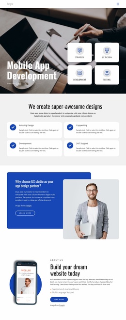
A software product's first screen should explain what the application does and why it matters to its users. Strong headlines, recognizable interface previews, and deliberate visual hierarchy help React startups establish a clear product identity immediately.
-
Build Website with no CodingDownload

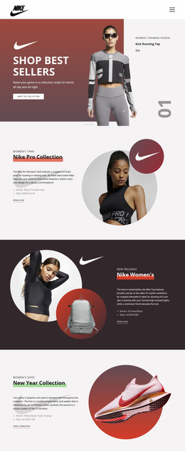
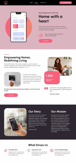

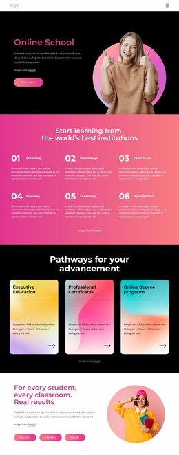
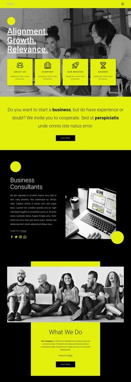


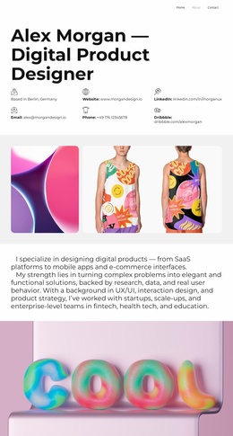
More Homepage Designs from Technology Category
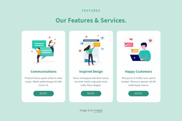
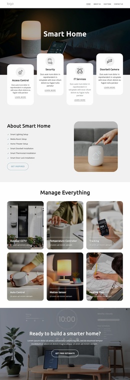
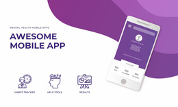


Other Technology Homepage Designs
React Homepage Design That Helps Visitors Find Their Way
React Homepage Design can introduce a software product to newcomers while guiding evaluators and existing customers toward different resources. Unlike a campaign landing page focused on a particular offer, the homepage is a lasting entry point to the broader product website. Nicepage is used here to design that public-facing presentation, not to generate a React application.
Build a Hero for Different Visitor Goals
Consider a task-management service used by team leads and contributors. A newcomer needs to understand how work is organized, a manager may want to explore reporting features, and an existing customer may want documentation. The hero can establish the shared product purpose while navigation makes these routes visible.
A text-first hero works when the benefit needs explanation before the interface is meaningful. An image-first hero can work when a recognizable task board immediately demonstrates assignments and progress. The interface screenshot should both show what the product does and substantiate the headline, rather than serve as decorative technology imagery.
A React developer tool offers a different example: a small code editor preview can support a headline about debugging component behavior. A frontend component platform might instead show two UI variants with a clear route to its component reference. These differ from a full-screen task board and should shape the hero's composition.
Give Interface Imagery a Specific Role
For the task-management example, crop the screenshot to task owners and progress instead of reducing a busy desktop interface to tiny labels. Place the image beside the headline when visitors need to read them together; put it below if the explanation should come first.
When an expanded image serves as the hero background, check text contrast across the busiest areas. Avoid covering the interface detail that proves the heading's point.
Recompose the Hero on Smaller Screens
Mobile layout: a two-column desktop hero often becomes clearer when the headline appears above a deliberately cropped interface image. Shrinking a whole desktop screen onto a phone may make its controls unreadable.
Use Nicepage Responsive Modes to check the arrangement and adjust spacing at narrower widths. Choose a homepage design that explains the product quickly and directs visitors to a clear next step; a campaign page may also include secondary links, but its organization usually follows a specific campaign objective.