Today, it is essential that your visitors can comfortably read the Content of your website on different screens. This demo will demonstrate how to implement Responsive Web Design quickly and easily.
Responsive Concept
What is Responsive Web Design? Responsive Web Design refers to how your website appears on various devices in Mobile Views.

Possible Problems
If one does not follow the rules of Responsive Web Design, websites can be challenging to read due to tiny fonts, small images, and overlapping elements.
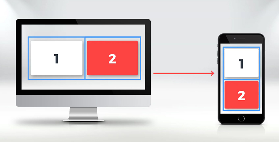
Block Movement
For Responsive Web Design, it is crucial to understand what happens with your data in Mobile Views. Usually, your website width shrinks, and the content Blocks are moved one under another.
Switch Responsive Modes
In the reviewed User Interface of Nicepage, there is a specific area for switching between mobile views. It allows previewing and modifying the design for each particular view. And this is how your website will appear on various mobile devices and desktops.
Let’s review the most popular Mobile Views (Responsive Modes) supported in Nicepage.
Supported Viewports
The first view is the Desktop View, the widest supported viewport. The next is the Laptop View, followed by the Tablet View, then the Phone Landscape, and finally, the narrowest and one of the most popular modern screens: the Phone Portrait View.
The most common question is how to create websites that look beautiful in responsive modes. If the data does not fit on mobile devices in width, you need to use grid layouts or columns, in other words. And we will explain why.

Use Grids
How does the Grid (columns) help with the Mobile Views? There is usually a lot of content data that does not fit on the Phone screen, for example. In Nicepage, grid layouts are created so that if there is not enough screen width, the grid cells are automatically moved one under another. We recommend using the grid layouts to fit your Content on mobile devices at once.

In Nicepage, in the New Block dialog, most pre-designed Blocks already use the Grid. Adding those Blocks, you have no worries, as all Mobile Views are already done correctly, and you do not have to do anything.
- Add a new Block.
- Select Images.
- Select the “Business” thematic category.
- Select a style to the left.
- Let’s add this Gallery Block with three images.
- Click Done.
- Adjust the Block margins a bit.
There is a grid with three cells used in this Block. Switching to the Mobile Views, we see the movement of the cells.
Layouts Without Grids
Add Block
Some Blocks have less Content, for example, the Introduction (or Hero Image) Blocks.
- Add a new Block.
- Select Image With Text.
- Select any Block.
- Click Done.
Use Box
Some Blocks use containers instead of grids. Let’s add an Introduction Block for the demonstration. Decrease the Block height if necessary. Switch the views to see the result.
Blank Block
Now, let’s create a simple Block with two cells to demonstrate that it's fast and easy to create a responsive web design with Nicepage. Here is the Block that we will use as an example.
- Add a new Block.
- Select Blank.
- Increase the Block height.
- Add a Grid.
- Select Add -> Grid.
- In the list, select the Grid with two cells.
- Click Done.
Edit Blocks
Grids are added with the default image background, so it is easy to recognize cells.
- Decrease the Grid Height.
- Align the Grid in the Block.
Add Content
While moving, you see the red magnetic guides and numbers that help you align the Content.
Add Image
Replace the Image in the left cell by dragging and dropping the Image Element from your local folder.
- Select the right cell.
- Disable the Fill for this cell.
Add Texts
- Add the Heading 2.
- Click Add Elements -> Text -> Heading 2.
- Text the width of the Text Block. The magnetic guides and sizes are beneficial again.
- Enter the Heading Text.
- Add the Text.
- Click Add-> Text -> Text.
- Align the Text.
- Change the Text.
Add Button
- Add a Button alternatively.
- Click the small plus in the center of the cell.
- Select the Button.
- Align any Button.
- Modify the Button Text.
- Align the Content in the cell.
Test Mobile Views
Switch the Mobile Views to see the result. You understand that the required layout changes for the Responsive Modes are done automatically.
Full Customization
Please note that all editing features are supported across all Mobile Views.
- Let’s switch to the Phone Landscape View.
- Change the crop of the Image.
- Now, change the size of the Heading.
Hide On Devices
You can hide any layout elements, including the image cell, for a specific view, such as the Phone Landscape. It is also effortless to unhide this element. Switch the places of the cells of the same row, if needed.
Common Mistakes
No Containers Used
We will review the most common mistakes people make while creating layouts. One may prefer not to use the Grid. In Nicepage, it is possible without any limitations. However, it requires much more work and layout modification for each Mobile View.
Adding a Block
Let’s see this.
- Add a Blank Block.
- Increase the Block height.
- Add Image.
- Click Add -> Picture.
- Align the Image and decrease its size.
- Select the Image.
Add and Modify Content
- Add Heading 2.
- Click Add Elements-> Text -> Heading 2.
- Modify the size and the position of the Heading text Block.
- You see, unlike the grid layout, it is more difficult.
- Modify the Textding Text.
- Add Text.
- Click Add Elements-> Text -> TButton 8. Change the Text.
- Add Button.
- Click Add Elements-> Button.
- Align the Button.
- Change the Button Text.
Edit Mobile Views
- Switch to Mobile View. In Laptop Mode, move the Button to the right.
- In tablet Mode, the Button Element is not in place. again
- The worst situation is in the Phone Views.
- In Texthone Landscape, the Text Block overlaps the Image because there is insufficient width.
- Move, resize, and align the text Blocks and the Button.
- Repeat all movements for the Phone Portrait view.
- As a reminder, all editing features are supported.
- Let’s hide and unhide the Image in the Phone Landscape view for this Block.
We are done.
Delete Blocks
So let’s delete this Block.
- Open the Block menu in the Page Navigator to the left and
- Select Delete.
Complex Layouts
There are modern Blocks with complex layouts that do not quite fit into the grid layouts. Additionally, overlapping is a popular trend in Web Design nowadays. In Nicepage HTML Website Builder, grids are not usually used for Blocks with complex overlap. However, the mobile views for such Blocks are also pre-made.
Let’s add a Block with an overlap.
- Add a new Block.
- Go to the Overlapping Category
- Choose a Block.
You see, the layout of this Block is created using containers. Switch the Mobile Views to see how Blocks move.
Preview Site
Finally, preview the page.
We hope you have enjoyed this demo of creating a Responsive Web Design with Nicepage.