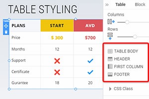
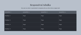
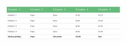
Jak změnit počet sloupců a řádků tabulky
Vše, co potřebujete k vytvoření bezplatné webové stránky
Pomocí našeho nástroje Website Builder můžete navrhovat a vytvářet webové stránky bez kódování. Přetáhněte vše, co chcete, na jakékoli místo, kde to chcete. Tvůrce webových stránek automaticky přizpůsobí váš web pro mobilní zařízení tak, aby reagoval. Vybírejte z více než 9 000 přizpůsobitelných šablon webových stránek.
Související funkce
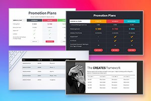
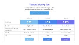
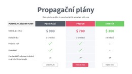
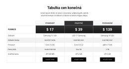
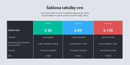
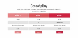
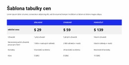
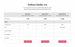
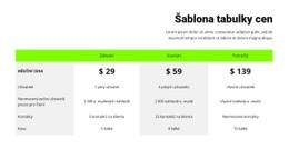
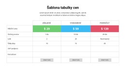
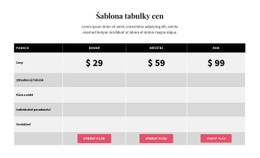
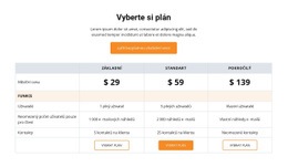
Šablony zdarma s Tabulka Element
Začněte s našimi nejlepšími šablonami, které jsou skvělé pro jakékoli podnikání. Vytvářejte a přizpůsobujte je pomocí našeho výkonného a bezplatného tvůrce webových stránek bez kódu. Všechny šablony jsou vhodné pro mobilní zařízení a vypadají skvěle na jakémkoli zařízení.


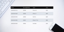


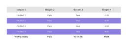

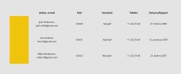

How To Change The Number Of Rows And Columns For Your Tables
After creating a table, you want to change how many rows and columns this table has to fit all the content information you need. Our top site constructor allows you to quickly and easily manage the tables and row and column numbers it contains. After adding the table, please select it and go to the Property Panel on your right. You will immediately see two sliders, one for Columns and one for Rows. Dragging those sliders will allow you to increase or decrease the number of rows and columns inside your tables. You can even leave one row and one column responsive design if it suits the style of your site.
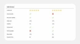
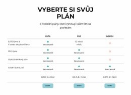
You can not only add the columns, rows, and text elements to your tables but customize the content that is already present in the layout grids. You can customize multiple table lines or text styles as well as text color and the overall background color to make it fit the general layout of your site. Adding tables and multiple HTML tables can help your website design systemize a great amount of information and content you want to provide to your users and potential customers. Customize the background color of any column and the background color border to stress certain text to help users orient easily.
Start forming your layout using simple steps our community provides to make your website design unique and memorable. Adjust the desktop for mobile devices with the proper column width and text size so that your websites would fit any mobile device. Start customizing the grids using the column color border color option. There are many ways grids can display amazing results you can work on to improve to perfection. Experiment with multiple settings to form the best layout for your future websites or create unique designs.