3 Columns layout Template


Three columns give contact content a balanced visual role
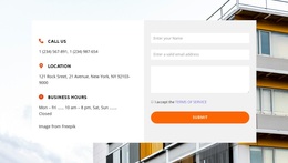
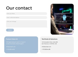
The design’s main distinction is the way it distributes a contact task across three balanced regions. The left column turns phone, location, and business hours into a compact information group instead of placing them beneath the form. The center column keeps name, email, and message inputs together with the Submit action, creating a clear response area. The right column adds a portrait image, giving the section visual presence and preventing the contact content from reading as a plain list beside a form.
That combination is useful when a page needs contact information and inquiry fields to appear together without making either one dominate the entire row. Pale teal, white, and light panels mark the three roles, while the black surrounding background adds contrast around the lighter surfaces. Underlined controls provide a restrained treatment for the form, and the rounded teal button creates a deliberate visual endpoint. Generous spacing allows each column to retain its own identity.
Among ready-made section alternatives, this option suits a contact area that needs both practical details and a supporting image. Its value comes from the relationship between the three information items, the central response path, and the portrait—not from decorative styling alone. The arrangement can therefore remain recognizable when adapted to a broader page with related content before or after it.
Customize with Nicepage
Open this ready-made template in the Template Builder and customize it visually in the Nicepage editor. Replace demo content, edit page sections, and adapt the design to your project without rebuilding the template from scratch.
Edit Template Offline
2. Create a new page or select existing
3. Click Add new block, search for id 2696690 and click enter
Edit Template Online
Create Awesome Websites


Free Nicepage Builder
Keywords
Start With a Ready-Made Template
Choose a Design for a New Page
Use a ready-made template as a starting point instead of creating every page from a blank canvas. When adding a new page in Nicepage, browse available designs, compare different layouts, and choose an option that already fits the general purpose and visual direction of your project.
Browse Different Page Designs
Explore Page Designs using search, thematic categories, Design Sets, and full-page previews. The collection includes layouts for different subjects and page purposes, making it easier to compare alternatives before selecting a design to customize.
Customize the Selected Template
After choosing a design, create the page and continue editing it visually in Nicepage. Replace the demo content, adjust images, typography, colors, sections, and other elements, and adapt the ready-made layout to your own content instead of rebuilding the design from the beginning.
Explore More Design Directions
If the first option does not match your project closely enough, return to the design collection and compare other templates before committing to a layout. This makes the template library useful not only for faster page creation, but also for exploring different visual approaches and finding a suitable starting point for a new project.
This workflow gives you access to a broad collection of ready-made designs that can be selected, compared, and customized according to the needs of each new page or project.