How to use the Tabs element in website design

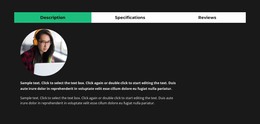
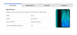
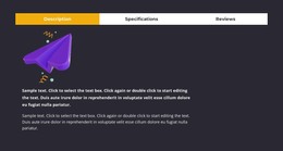
Tabs Block Designs
To start with the Tabs elements, you can use the Tabs designs. You can find them by clicking on the Quick Access panel -> Blue Plus icon to open the Add Menu. Then scroll down to the Tabs element. Click on the Tabs element to open the Panel with presets, designs, and elements. Click any design to add a new Block with the Tabs element.
Move Tabs
After adding the Tabs element and the content into Tabs, you can easily move the Tabs in the Element to organize them the best for your web design needs. Click on the tab and then the left or right arrows on the Context Toolbar to move the Tabs correspondingly.

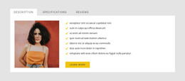
Tabs Colors
Easily change the Colors for the added Tab element, as Color is the key factor for your web design. Select the Tabs element in your Block. Look right to the Property Panel. Click the Colors section link to go to the Colors Panel. Edit the properties to achieve the desired look for your Tabs element.
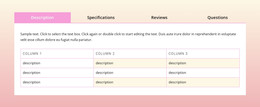
Tab Spacing in Tabs Element
You can change the Alignment and Spacing between Items, Top-Bottom, and Left-Right for Tabs. Select the Tabs Element, go to the Property Panel, and click on the Spacing link. In the opened Panel, modify the corresponding Psacing properties to achieve the best results for your web design.

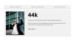
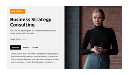
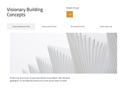
Free Templates with Tabs Element
Get started with our best templates, great for any business. Create and customize them with our powerful and free website builder with no code. All templates are mobile-friendly and look excellent on any device.
-

-

-
-
-
-
-
-
-
-
-
Free Website Builder SoftwareDownload
-
-
-
-
-
-
-
-
-
-
-
-
-
-
-
-
-
-
-
-
-
-
-
-
-


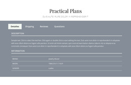


How To Use Tabs Element In Website and Page Builder
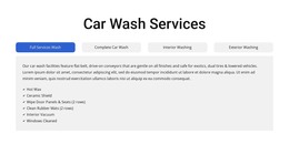
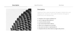
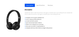
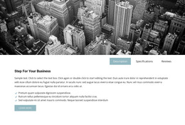
Use the Tabs to define multiple groups of elements placed in the same tab area and see how they will change the look to the template. Element tabs consist of a group of elements displayed for the selected tab. Add new tabs and control their colors, texts, and spacing. You can duplicate tabs elements, and you will have identical items.
The whole tabs element is added with added elements, but if you need to add a tab in the added element, just use the gray plus sign next to the tabs, which adds a tab element. The active tab is not focusing much on the color of the text as well as the background. Tabs allow easy navigation on the page, and visitors can easily skip to content. Use tabs and create a wonderful image gallery for your page. You can put your Google Map element in the tab and make it look nice for users. Adding a help center to your website is in trend, so our editor allows you to add a stylish help center button. It also applies to the progress bar. The tabs element allows displaying a large amount of information in a small area. Don't worry about how many tabs you need to create for your website. The element will satisfy you.
Like the drag and drop builder, our tool allows stylizing the border for tabs element borders and tab rows with properties in the property panel. Similar to the page tabs builder elements, our instrument elements are also editable, and they allow us to set the background for the Tabs and Tab Row. Specify the tab alignment in the spacing section of the property panel for the tab element. Also, you can set spacing for all tabs in the spacing section in the property panel. To change tabs elements, please enter the class element, and change the design. Tabs allow you to add the content area and here put Page Builder elements.
To add a new tab button, open the search bar and find the tab element. The stylish tabs element is perfect for controlling every element style, like the row tabs background color, row border size, etc. With a text editor, you can edit the content and replace multimedia files easily. Some websites need such elements and functions, like add to cart function, submit a ticket button, icon box, social share element, google maps elements, contact form 7, etc. So, tabs will help to stylize them to your taste.