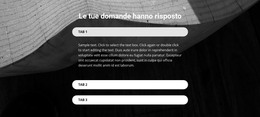
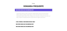
Come gestire le schede nell'elemento Accordion
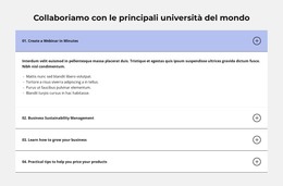
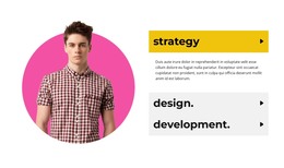
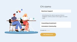
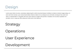
Tutto ciò di cui hai bisogno per creare il tuo sito web gratuito
Utilizza il nostro Website Builder per progettare e creare siti Web senza codifica. Trascina e rilascia tutto ciò che vuoi, dove vuoi. Il Website Creator adatta automaticamente il tuo sito web per dispositivi mobili per renderlo reattivo. Scegli tra più di 15,000 modelli di siti web personalizzabili.
Funzionalità correlate
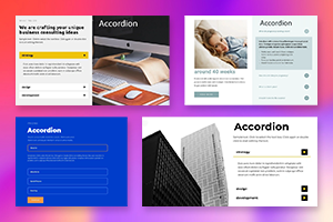
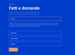
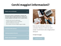
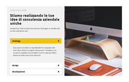
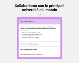
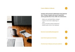
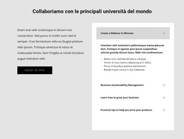
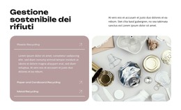
Modelli gratuiti con Elemento a fisarmonica
Inizia con i nostri migliori modelli, ideali per qualsiasi attività commerciale. Creali e personalizzali con il nostro generatore di siti Web potente e gratuito senza codice. Tutti i modelli sono ottimizzati per i dispositivi mobili e hanno un aspetto eccellente su qualsiasi dispositivo.


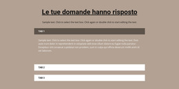


How To Add And Move The Accordion Tabs Easily
Making the modern accordion tabs is a common practice in modern web development. This feature allows moving tabs inside the accordion element just in one click. You only have to press on the arrow icons to move the tabs inside the accordion element. It is a very useful feature when you want to add a new tab inside the accordion menu. Usually, Accordion Tabs are used to toggle between showing or hiding large amounts of the associated content. You can only press on the CTRL plus and move tabs.
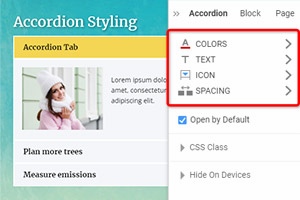
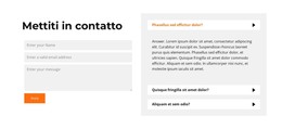
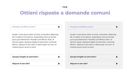
The graphic design incorporates features to make users aware that the accordion offers advanced keyboard navigation features. The vertical tabs on the page are scrolled up when in full-screen mode and back to normal mode. The rendering of Tabs lets you display the content in a layout with tabs, where you can see the content of the one tab simultaneously. The accordion header element also contains a button group, which controls the appearance of its content pane. The style of buttons to be used in the accordion panel to help you move open and close the accordion.
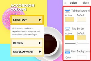
You can put a background color when you click on a key and mouse over it (hover). Many users make Accordion Tabs containing a symbol for every button to specify if the folding contents are open or closed. This is a very common question on how I can open one accordion group when I click to shut down the other accordion group. You must also consider the accordion's whole style, like the background color, button form, and so on. One accordion panel is already expanded in such an implementation, and one panel can only be deployed simultaneously. You can set up the smooth scroll inside the accordion menu, and it will look better.