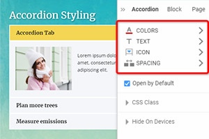
Jak zarządzać zakładkami w elemencie Accordion
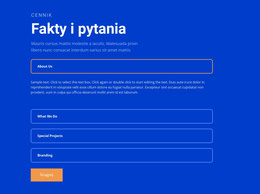
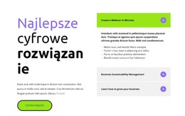
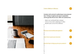
Wszystko, czego potrzebujesz, aby stworzyć darmową stronę internetową
Skorzystaj z naszego Kreatora Stron, aby projektować i tworzyć strony internetowe bez kodowania. Przeciągnij i upuść, co chcesz, w dowolne miejsce. Kreator Witryny automatycznie dostosowuje Twoją witrynę do urządzeń mobilnych, aby była responsywna. Wybieraj spośród ponad 15,000 dostosowywanych szablonów witryn internetowych.
Powiązane funkcje
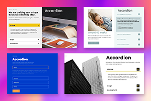

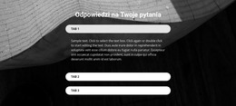
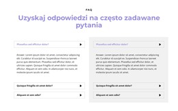
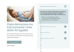
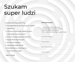
Darmowe szablony z Akordeon Element
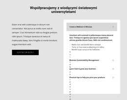
Zacznij od naszych najlepszych szablonów, które są idealne dla każdej firmy. Twórz i dostosowuj je za pomocą naszego potężnego i bezpłatnego kreatora stron internetowych bez kodu. Wszystkie szablony są przyjazne dla urządzeń mobilnych i świetnie wyglądają na każdym urządzeniu.


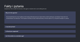


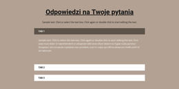

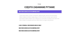

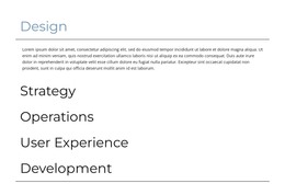


How To Add And Move The Accordion Tabs Easily
Making the modern accordion tabs is a common practice in modern web development. This feature allows moving tabs inside the accordion element just in one click. You only have to press on the arrow icons to move the tabs inside the accordion element. It is a very useful feature when you want to add a new tab inside the accordion menu. Usually, Accordion Tabs are used to toggle between showing or hiding large amounts of the associated content. You can only press on the CTRL plus and move tabs.
The graphic design incorporates features to make users aware that the accordion offers advanced keyboard navigation features. The vertical tabs on the page are scrolled up when in full-screen mode and back to normal mode. The rendering of Tabs lets you display the content in a layout with tabs, where you can see the content of the one tab simultaneously. The accordion header element also contains a button group, which controls the appearance of its content pane. The style of buttons to be used in the accordion panel to help you move open and close the accordion.
You can put a background color when you click on a key and mouse over it (hover). Many users make Accordion Tabs containing a symbol for every button to specify if the folding contents are open or closed. This is a very common question on how I can open one accordion group when I click to shut down the other accordion group. You must also consider the accordion's whole style, like the background color, button form, and so on. One accordion panel is already expanded in such an implementation, and one panel can only be deployed simultaneously. You can set up the smooth scroll inside the accordion menu, and it will look better.