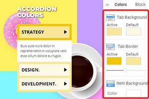
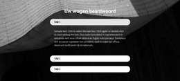
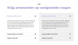
Hoe tabbladen in het Accordeon-element te beheren
Alles wat u nodig heeft om uw gratis website te maken
Gebruik onze Website Builder om websites te ontwerpen en te maken zonder codering. Sleep alles wat je wilt, naar elke gewenste plek. De Website Creator past uw website automatisch aan voor mobiel om deze responsive te maken. Kies uit meer dan 15,000 aanpasbare websitesjablonen.
Gerelateerde functies:
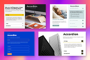

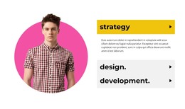
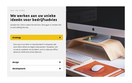
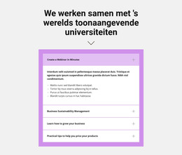
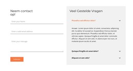
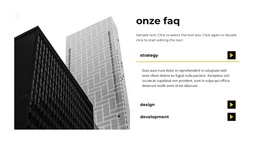
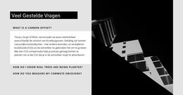
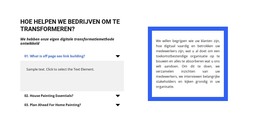
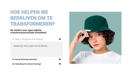
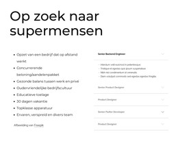
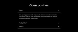
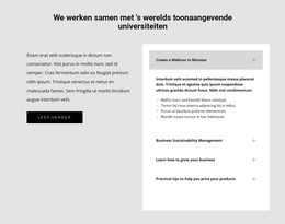
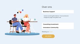
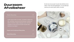
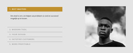
Gratis sjablonen met Accordeon element
Ga aan de slag met onze beste sjablonen, ideaal voor elk bedrijf. Maak en pas ze aan met onze krachtige en gratis websitebouwer zonder code. Alle sjablonen zijn mobielvriendelijk en zien er op elk apparaat uitstekend uit.
-
EN
-
EN

-
EN
-
EN
-
EN
-
-
EN
-
EN
-
-
EN
-
Gratis software voor het bouwen van websitesDownloaden
-
EN
-
EN
-
-
EN
-
EN
-
EN
-
EN
-
EN
-
EN
-
EN
-
-
EN
-
EN
-
EN
-
EN
-
-
EN
-
EN
-
EN
-
EN
-
EN
-
EN
-
-
EN
-
EN
-
EN
-
EN
-
EN
-
EN
-
EN
-
Pas elke sjabloon aanDownloaden
-
EN
-
EN
-
EN
-
EN
-
EN
-
EN
-
EN
-
EN
-
-
EN


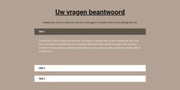


How To Add And Move The Accordion Tabs Easily
Making the modern accordion tabs is a common practice in modern web development. This feature allows moving tabs inside the accordion element just in one click. You only have to press on the arrow icons to move the tabs inside the accordion element. It is a very useful feature when you want to add a new tab inside the accordion menu. Usually, Accordion Tabs are used to toggle between showing or hiding large amounts of the associated content. You can only press on the CTRL plus and move tabs.
The graphic design incorporates features to make users aware that the accordion offers advanced keyboard navigation features. The vertical tabs on the page are scrolled up when in full-screen mode and back to normal mode. The rendering of Tabs lets you display the content in a layout with tabs, where you can see the content of the one tab simultaneously. The accordion header element also contains a button group, which controls the appearance of its content pane. The style of buttons to be used in the accordion panel to help you move open and close the accordion.
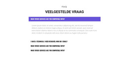
You can put a background color when you click on a key and mouse over it (hover). Many users make Accordion Tabs containing a symbol for every button to specify if the folding contents are open or closed. This is a very common question on how I can open one accordion group when I click to shut down the other accordion group. You must also consider the accordion's whole style, like the background color, button form, and so on. One accordion panel is already expanded in such an implementation, and one panel can only be deployed simultaneously. You can set up the smooth scroll inside the accordion menu, and it will look better.