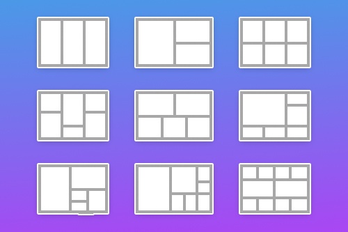
Come utilizzare oltre 80 layout di griglia durante la creazione di un sito Web
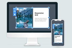
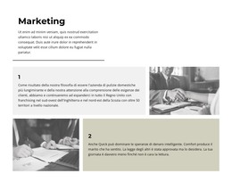
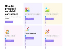
Tutto ciò di cui hai bisogno per creare il tuo sito web gratuito
Utilizza il nostro Website Builder per progettare e creare siti Web senza codifica. Trascina e rilascia tutto ciò che vuoi, dove vuoi. Il Website Creator adatta automaticamente il tuo sito web per dispositivi mobili per renderlo reattivo. Scegli tra più di 15,000 modelli di siti web personalizzabili.
Funzionalità correlate
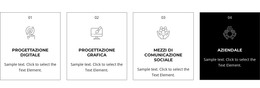
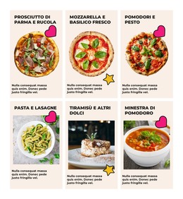
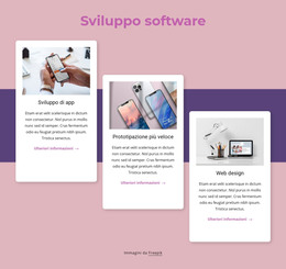
Modelli gratuiti con Elemento griglia
Inizia con i nostri migliori modelli, ideali per qualsiasi attività commerciale. Creali e personalizzali con il nostro generatore di siti Web potente e gratuito senza codice. Tutti i modelli sono ottimizzati per i dispositivi mobili e hanno un aspetto eccellente su qualsiasi dispositivo.


Use The Widest Variety of Grid Layouts
Grids are such an important part of web design, and as you can build and use them for your site, time to begin measuring and aligning them. Many designers use a design concept known as the golden mean to improve the sizing, the balance, and the positioning of their layout grid design examples. In the history of graphic design, grids are very useful instruments to offer users a good user experience. Web designers often use the grid template when they want to divide content into pieces. The grid layout design means using a certain grid or group of grids, dependent on what is to be achieved. As a rule, all of the grids in the website design, regardless of how small or large, complex or simple they are, all have common elements that determine them to be a grid layout. A common way to create a great design is to use the rule of thirds to identify the best grid and layout decisions.
Traditionally, grids are found in printed products but are quite usable in web design. Baseline grid templates have space between columns, and we call gutters this space. Using grids that split pages vertically and horizontally into rows and columns. Gutters also are the space between rows. Spacing between columns is proportional and is consistent throughout the whole page. The 960 grid system is popular. The grid 960 organizes the web design workflow by providing commonly used sizes based on the 960-pixel width. Standard grid layouts allow breaking the grids in several ways. Using grids, designers can create creative grid layouts, also image placement. In our editor, you can easily place web page design elements, create grid systems, and control this process fully. You don't need to sign up on our website. Only open the editor and start working. A grid layout allows web developers and designers to follow the latest trends and create a wonderful new web design.
The practice of thirds says that locating 'objects of interest' in particular 'thirds' of the picture will capture the user's attention in a more effective, visually attractive way. You can create a three or four three column grid layout with colorful columns with our tool. It is a simple way to create a minimalistic design. You must determine the base elements of the grid layout design, such as spacing between baselines, other visual elements beside grids, which the base element is placed between the column grid and other content, and so on. With our tool, you can easily change the columns or rows of the grid in your responsive grid layout. There is an opinion between designers that grids impact web design without including other elements. If you don't know how to create a grid layout easily with a grid system (which uses a nice column grid), open our editor and start your project now.