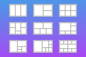
So verwenden Sie das Grid in Responsive-Modi
Alles, was Sie brauchen, um Ihre kostenlose Website zu erstellen
Verwenden Sie unseren Website Builder, um Websites ohne Codierung zu entwerfen und zu erstellen. Ziehen Sie alles, was Sie möchten, per Drag & Drop an einen beliebigen Ort. Der Website Creator passt Ihre Website automatisch für Mobilgeräte an, um sie responsive zu machen. Wählen Sie aus mehr als 15,000 anpassbaren Website-Vorlagen.
Verwandte Funktionen

Kostenlose Vorlagen mit Gitterelement
Beginnen Sie mit unseren besten Vorlagen, die sich für jedes Unternehmen eignen. Erstellen und passen Sie sie mit unserem leistungsstarken und kostenlosen Website-Builder ohne Code an. Alle Vorlagen sind mobilfreundlich und sehen auf jedem Gerät hervorragend aus.
-
-
EN

-
EN
-
-
-
EN
-
EN
-
-
EN
-
-
Kostenlose Website Builder SoftwareHerunterladen
-
-
EN
-
EN
-
EN
-
EN
-
EN
-
EN
-
EN
-
EN
-
EN
-
EN
-
-
EN
-
EN
-
EN
-
EN
-
EN
-
EN
-
EN
-
-
EN
-
EN
-
EN
-
EN
-
EN
-
EN
-
EN
-
-
-
-
Passen Sie eine beliebige Vorlage anHerunterladen
-
EN
-
EN
-
EN
-
-
EN
-
EN
-
-
-
EN
-


How To Use The Grid To Fit Various Screen Sizes In Responsive Modes
Our builder provides a responsive Grid layout constructor that automatically adjusts to any current screen size. You can test it if you use the Responsive Mode at the top of your dashboard. Pick various screen sizes and see how your CSS grid layout changes its responsive Grid design per screen size. However, it is very simple if you want to make personal customizations of how your CSS Grid layout will look on the particular screen size and how your columns and rows will be positioned. Select the device screen size in the Responsive Mode and adjust your Grid system. No matter the number of columns or rows present in your responsive Grid, whether a two-column layout, three-column layout, or even 12 columns, you will be able to position the most important cells and content before other materials.
Feel free to resize no matter the width of your column layout, but make sure to check the Grid columns in the Responsive mode to confirm the correct display of the main content. Be sure o spread the remaining space equally between Grid columns to prevent the users from using the Skip To Main Content button. Using a responsive Grid system, you can apply the media queries code and understand how it works. CSS Grid layout using media queries can organize a one-column layout, three-column layout, or 12 columns layout Grid and set different breakpoints for the responsive design. Using CSS Grid layout in different breakpoints will save you the time of customization of column widths because setting one column width will automatically adjust others.
Set the Grid system layout using the desired number of grid columns and put the required space between layout Grid cells. The layout Grid system will indicate the number of columns and monitor column widths CSS, how it works, and displays the layout Grid container. Using CSS Grid container in the layout Grid system without writing media queries can affect certain media query features you would like to customize in the future so consider it before getting started. Customize rows and columns using all available tools in our builder and make your beautiful Grid layout using your imagination and helpful suggestions. Modify your Grid layout using simple adjustment options in our Property Panel.