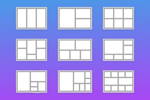
So ändern Sie das Rasterlayout für Ihr Webdesign
Alles, was Sie brauchen, um Ihre kostenlose Website zu erstellen
Verwenden Sie unseren Website Builder, um Websites ohne Codierung zu entwerfen und zu erstellen. Ziehen Sie alles, was Sie möchten, per Drag & Drop an einen beliebigen Ort. Der Website Creator passt Ihre Website automatisch für Mobilgeräte an, um sie responsive zu machen. Wählen Sie aus mehr als 15,000 anpassbaren Website-Vorlagen.
Verwandte Funktionen

Kostenlose Vorlagen mit Gitterelement
Beginnen Sie mit unseren besten Vorlagen, die sich für jedes Unternehmen eignen. Erstellen und passen Sie sie mit unserem leistungsstarken und kostenlosen Website-Builder ohne Code an. Alle Vorlagen sind mobilfreundlich und sehen auf jedem Gerät hervorragend aus.
-
-
EN

-
EN
-
-
-
EN
-
EN
-
EN
-
-
-
Kostenlose Website Builder SoftwareHerunterladen
-
-
EN
-
EN
-
EN
-
EN
-
EN
-
EN
-
EN
-
EN
-
EN
-
EN
-
-
EN
-
EN
-
EN
-
EN
-
EN
-
EN
-
-
EN
-
EN
-
EN
-
EN
-
EN
-
EN
-
EN
-
EN
-
-
-
-
Passen Sie eine beliebige Vorlage anHerunterladen
-
EN
-
EN
-
EN
-
-
EN
-
-
EN
-
-
EN
-


How To Change The Grid Layout Easily
Grid is one of the most important elements of web design. With Nicepage, you can add a website grid at all times. Swap layout for your web page easily. Open the List of the Grid Presets by clicking on the arrow, or you can also press the "Alt+G" keys. You have more than a hundred grids of unalike types. The choice allows you to select the appropriate design for your website. You can also easily edit the Grid in the editor. Similar to the website CSS grid layout, this feature enables you to add the Grid with the different numbers of the row or column. So, getting started with it, you can change the grid layout and grid item with this feature in several clicks, and making grid layouts is very easy. You can also fill the available space on the space by adding the grid item with more row grid lines.
Using this feature, create a grid, modify the grid dimensions (like the CSS grid lines), and change row or column sizes. You can resize the Grid by clicking and pulling the blue resize markers. New grid formatting You can resize grid Items (without any editors) by specifying the exact size. You can add different elements to one Grid by nesting components within the grid child. Each new Grid includes a layout of rows and columns. Grid Items positioning is possible with a percentage layout and direct reference. In the grid child, the automatic position change depends on the arrangement of the parent elements. Like a CSS Grid layout module, it provides a two-dimensional layout system, controlling the layout in rows and columns. This simplifies control of rows and columns layouts, colors, and designs. When specifying layouts and dimensions, it should be noted that there is space between most columns and rows.
To get started creating a custom design for you is very easy. Make sure the grid area matches the overall design. You can check and see how it fits each responsive design's modern trends in working. The grid item can be a slider or a form, and it is possible to focus on specific content inside the Grid. Also important is the hide function, which can define the minimum size and maximum value. Each grid item can be defined background color separately. Columns with the different sizing values will be stretched to fill the available space of your grid container (even if there is no space in a grid container). Similar to the HTML, this feature is also very useful for the new grid formatting context. The values always represent the track sizes of items, the space between them, and represent the grid line. If there is no space between grid items, you can add the space in your grid container. To create the grid layout using this feature (there is no CSS grid), visit Nicepage.