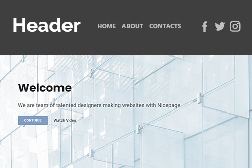
How to stylize the Header Block on a website

How To Stylize Your Header Easily With Nicepage
The Website's Header design is an important element in modern web design. Website headers have different functions according to the target object. As long as you're not designing web pages with a small amount of content, adding a sticky header on your site is likely a good idea. With the modern best website header design, visitors have an easy way to get around the site, ensuring a better user experience. If you want to create an attractive header appearance for the site, make sure, Nicepage will help you. You can stylize the search bar, and the hamburger menu allows to get a more wonderful look to your site. If you don't know how to design the website header, or the home page, visit Nicepage. In the old days, headers were defined as narrow bars at the top of sites that included a logo, contact information details, and a call to action.
The sticky header is meant to dissolve into the background of what's on your site as users scroll down. Creating a great design makes the website header a crucial component of your website design because the header is linked directly to the way users interact with the site. As the header is the topside of your page and contains several essential elements, it should go without question that readability is of the utmost importance. As we know, the header elements (similar to the navigation links) help visitors focus on the necessary content. The contact information, social media icons, and shopping cart visualize with the header. Header design best practices and examples for website visitors have huge importance. A popular option for hidden navigation is a hamburger button or a minimized menu icon.
Hidden navigation and minimized navigation bars are becoming mainstream as more and more sites seek a cleaner header design for mobile devices. The hamburger menu icon includes additional navigation options for the desktop visitor. Make sure that visitors see the Header, which is the first thing visitors see on the page, so best practices are a simple header design that's very smart. Sometimes it is needed to change the entire site's structure to make place for the most important elements and information. Even the usual website header design practices are created to help visitors find needed information. Social media links, search bars, navigation links, and contact details (like email addresses) are crucial for customer relationships. Many sticky headers are reduced in size as visitors scroll down the pages. Therefore they don't end up taking up a lot of space. With Nicepage, you will learn to design your header easily and comfortably.