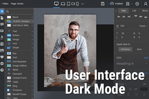
A Sötét mód engedélyezése a Nicepage felhasználói felületén

Convenience for Eyes With Dark Mode
Using UI dark mode colors design and their dark color palette is (WCAG) web content accessibility guidelines for reducing eye strain. Nicepage enables you to use a dark mode for your convenience while working on the website design. You can go to the settings menu, find appearance, and switch to dark mode. User experience with using UI app mode, black dark theme interface, google material design guidelines, and UX design shows us that against a dark background is the best practice for adjusting eye strain. The light and pure white text with dark backgrounds or white (slightly darker) are good tips for creating a dark theme UI design that causes eye strain and is essential to many people. Let’s study some of the edges of using dark themes.
The contrast between both uses, light and dark themes, needs a sense of depth because they create a good contrast ratio. To learn how to make the best dark theme or use material design guidelines, you will make sure the dark background with white text (light text) is good color contrast. Some people always prefer, use and recommend a material design with dark theme black color, or many dark themes, with different interfaces, and some people like light mode with a light theme. Make sure to design UI with a dark theme mode or a dark background color theme with good (sometimes reduced) contrast between dark and light colors.
Create UI design and Design a dark theme with a dark elevated background color. When needing an interface dark theme UI test, make sure that saturated colors will have less contrast, and avoid using both dark and light color palettes. UI design dark theme best practices need a pure black background that works well with light themes. When users create the best dark UI mode design and use dark themes, the interface surfaces reduce eye strain. They use a dark theme which means well reduce eye strain in light or dark UI design mode. Best light and dark UI is not only dark and light mode. It is more than just an option. Both light appearances, bright light, and dark UI designs allow users to save their eyes. Design both light, dark and light UI design save (help) our life. Allow users can switch from a pure black background (to avoid eye strain) to pure light background.