Rácscellák mozgatása webblokkban
Minden, ami az ingyenes webhely létrehozásához szükséges
Használja webhelykészítőnket weboldalak tervezéséhez és létrehozásához kódolás nélkül. Húzzon és dobjon el bármit, amit csak akar, bárhová. A Webhely -készítő automatikusan adaptálja webhelyét mobilra, hogy reagáljon. Válasszon több mint 15,000 testreszabható webhelysablon közül.
Kapcsolódó szolgáltatások
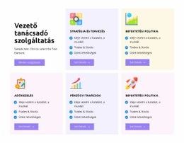
Ingyenes sablonok a következővel: Rács elem
Kezdje a legjobb sablonokkal, amelyek kiválóak minden vállalkozás számára. Hozza létre és testreszabhatja őket erőteljes és ingyenes, kód nélküli webhely -készítőnk segítségével. Minden sablon mobilbarát, és bármilyen eszközön kiválóan néz ki.


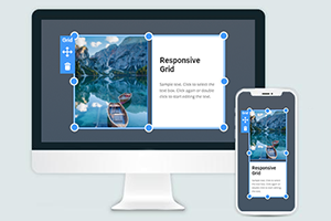
How To Move Grid Cells With Editor’s Drag And Drop
When getting started, add a Grid to quickly set up the layout by building your future web page blocks. The Grid helps easily manage the spacing between columns and rows and the content inside rows and columns like images, text icons, etc. Using our builder, you can also easily move the Grid cells by dragging them through Grid areas where you want them to be. Keep in mind that you can create any order of the cells you wish to, so to ensure that the main content gets the users' attention, these cells must be presented first. The program will automatically set the x and y positioning of multiple cells in the Grid, which is why no matter how many columns and rows are present in the Grid, they will be placed appropriately. You do not need to go to edit to move cells, making the managing swift and effective.
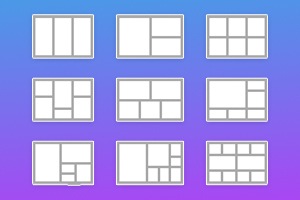
Do not forget about the power of the CSS Grid template, which includes how much space between columns will be present without the need to adjust the screen sizes. Different screen sizes demand a different number of columns set and the spacing between columns. Yet, our Nicepage sites can automatically detect how many both columns and rows should be present at the moment on the screen and how much space between rows and columns should be. Our CSS Grid allows using different types of the actual content in the cells and will make sure that the visitors will not skip the main content. Using CSS Grid template will automatically resolve the question of the space between Grid template areas and the x and y coordinates.
When you start building blocks or managing your Grid template, you will quickly realize how CSS grid things improve the website's construction and overall look. Google Analytics will also consider the space between rows and columns and the number of columns you present. Change these settings if you require more space between columns and rows to make content more understandable or compact. The CSS grid columns can play a crucial role in the site layout, so create your vision of the rows and columns Grid you want to establish.