How to use the Box Element on website projects
Drag Box Items Together
In the Editor, you can select multiple Elements and move them together. However, it is recommended to group Elements as an integrated part of web design, which retains them and their positioning. You can drag and drop the Group and its Elements together, which is convenient and saves time.
Convert Box To Grid Repeater
If you need several columns of the similarly-looking Elements, you can convert a Group to the Grid Repeater. It allows you to stylize the Grouped Elements in Columns similarly, meaning, when you edit an Element placed in one Grid Repeater's Item, all other Elements placed in other Items get the same styling automatically.
Box's Background Types
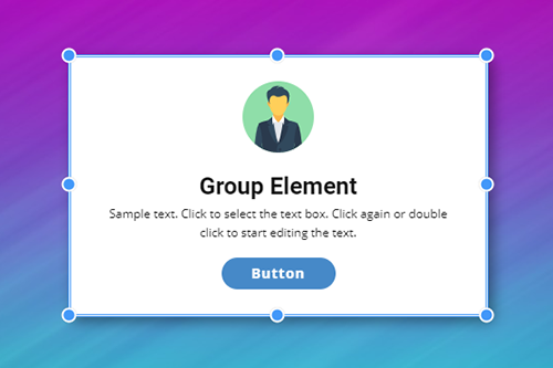
One of the main benefits of the Group Element is that you can stylize it as a single Element. It has limits, and to fill the isolated area, you can set the Background, which can be solid Fill, Gradient, Image, and Video, or you can have no Background, which is applicable if you apply the Border, for example.
Hover Animation On Box
Using Groups, you can animate grouped Elements. At that, you can animate the Group itself. For example, you can change the Background and Border for a Group. For the inner Elements, while hovering a Group, you can apply other Animation Effects, like Scale, Rotate, Shift, etc., creating amazing interaction to attract your visitor to stay on the website longer.
Box Image Background Hover Animation
Similar to Grid Cells, you can apply the Hover Animation Effect to The Image Background of a Group. You can use several presets out of the box, like Zoom, Resize, and Slide. In addition, you can fine-tune the Hover Animation to adjust for the need of your website idea.
Box To Hover Slider
You can use the Hover Slider when there is a need to show a different set of Elements for a Group on Hover. For that, select a Group and enable the Hover Slider in the corresponding section of the Property Panel.
Box Border Property
The Outline is a very popular effect used in modern web design. Designers use Outline for Icons, Buttons, and Rectangles behind Elements. In Nicepage, there is no need for additional rectangles, as you can create the Outline around Elements by setting the Border property for a Box.
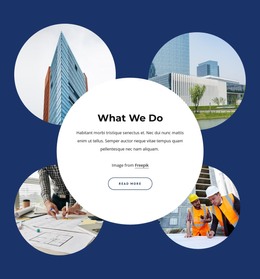
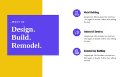
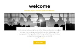
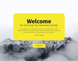
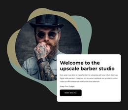
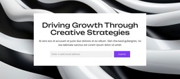
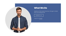
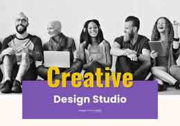
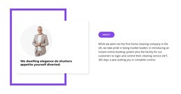
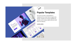
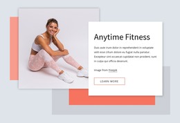
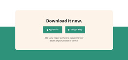
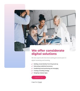
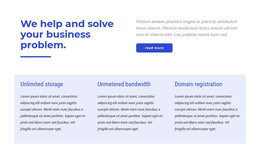
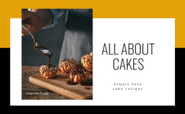
Free Templates with Box Element
Get started with our best templates, great for any business. Create and customize them with our powerful and free website builder with no code. All templates are mobile-friendly and look excellent on any device.


How To Use The Group Element In Website Designs
Design is always based on the main content and on the elements that will set up this content to provide the best exclusive experience to the visitors. Every inexperienced creator wants to learn how designers create responsive websites that you can quickly and efficiently change. Some web designers use one set of elements they developed themselves, and others use the program or application they are used to. A great example of how can Nicepage help designers, especially new ones, is the group container element.
Group container element is an example of setting websites and improving the process optimization for the layout design that can work well on all platforms. Using containers, you can build a responsive design to quickly adjust container layouts to the screen sizes, using CSS presets, change color and style, and skip to main content without the fear of damaging the responsive web design. Skip to the main menu of your dashboard and click on the element tab to create a new container. Make sure to check the container element presets like bordered, circle, etc., which will suit all screen sizes. After deciding how the final layout container will look, you can start filling the container with a content element you desire.
Group container as an element can show one column or be transformed into a slider element with repeated column design inside. Using different container preferences, you can make an image-based container for different screen sizes to quickly adjust how you like. Using our example preset can help you get acquainted with the possibilities of the container, screen sizes applied, how to set containers according to your layout, and how using a combination of elements can develop websites to become the most popular on the internet.