Web sitesi tasarımında Sekmeler öğesi nasıl kullanılır?

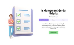
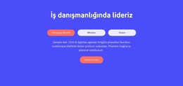
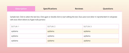
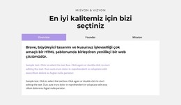
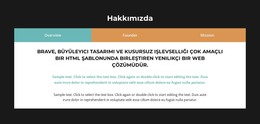
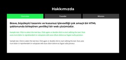
Sekmeler Blok Tasarımları
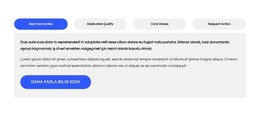
Sekme öğeleriyle başlamak için Sekme tasarımlarını kullanabilirsiniz. Ekle Menüsünü açmak için Hızlı Erişim paneli -> mavi Artı simgesine tıklayarak bunları bulabilirsiniz. Ardından, Sekmeler öğesine gidin. Ön ayarlar, tasarımlar ve öğeler içeren Panel'i açmak için Sekmeler öğesine tıklayın. Sekmeler öğesiyle yeni bir Blok eklemek için herhangi bir tasarıma tıklayın.
Sekmeleri Taşı
Sekmeler öğesini ve içeriği Sekmelere ekledikten sonra, Web tasarımı ihtiyaçlarınız için en iyi şekilde düzenlemek için Sekmeleri Öğedeki kolayca taşıyabilirsiniz. Sekmeleri uygun şekilde hareket ettirmek için sekmeye ve ardından Bağlam Araç Çubuğundaki sol veya sağ oklara tıklayın.

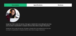
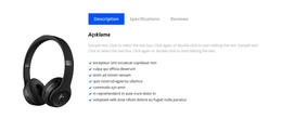
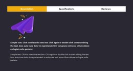
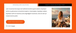
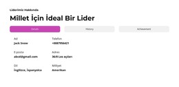
Sekmeler Renkler
Renk, web tasarımınız için temel faktör olduğundan, eklenen Sekme öğesinin Renklerini kolayca değiştirin. Bloğunuzdaki Sekmeler öğesini seçin. Sağdan Özellik Paneline bakın. Renkler Paneline gitmek için Renkler bölümü bağlantısını tıklayın. Sekmeler öğeniz için istediğiniz görünümü elde etmek için özellikleri düzenleyin.
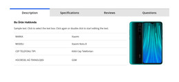
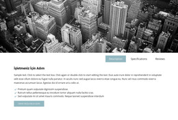
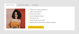
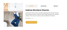
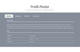
Sekmeler Öğesinde Sekme Aralığı
Sekmeler için Öğeler, Üst-Alt ve Sol-Sağ Arasındaki Hizalamayı ve Boşluğu değiştirebilirsiniz. Sekmeler Öğesini seçin, Özellik Paneline gidin ve Aralık bağlantısına tıklayın. Açılan Panelde, web tasarımınız için en iyi sonuçları elde etmek için ilgili Psacing özelliklerini değiştirin.

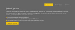
Sekmeler Öğesi ile Ücretsiz Şablonlar
Her işletme için harika olan en iyi şablonlarımızla başlayın. Bunları, kod gerektirmeyen güçlü ve ücretsiz web sitesi oluşturucumuzla oluşturun ve özelleştirin. Tüm şablonlar mobil uyumludur ve her cihazda mükemmel görünür.
-
EN
-

-
-
-
-
-
-
-
-
EN
-
Ücretsiz Web Sitesi Oluşturucu Yazılımıİndir
-
-
-
-
-
EN
-
-
EN
-
-
-
EN
-
-
EN
-
-
-
-
EN
-
-
-
-
EN
-
-
-
-
EN
-


How To Use Tabs Element In Website and Page Builder
Use the Tabs to define multiple groups of elements placed in the same tab area and see how they will change the look to the template. Element tabs consist of a group of elements displayed for the selected tab. Add new tabs and control their colors, texts, and spacing. You can duplicate tabs elements, and you will have identical items.
The whole tabs element is added with added elements, but if you need to add a tab in the added element, just use the gray plus sign next to the tabs, which adds a tab element. The active tab is not focusing much on the color of the text as well as the background. Tabs allow easy navigation on the page, and visitors can easily skip to content. Use tabs and create a wonderful image gallery for your page. You can put your Google Map element in the tab and make it look nice for users. Adding a help center to your website is in trend, so our editor allows you to add a stylish help center button. It also applies to the progress bar. The tabs element allows displaying a large amount of information in a small area. Don't worry about how many tabs you need to create for your website. The element will satisfy you.
Like the drag and drop builder, our tool allows stylizing the border for tabs element borders and tab rows with properties in the property panel. Similar to the page tabs builder elements, our instrument elements are also editable, and they allow us to set the background for the Tabs and Tab Row. Specify the tab alignment in the spacing section of the property panel for the tab element. Also, you can set spacing for all tabs in the spacing section in the property panel. To change tabs elements, please enter the class element, and change the design. Tabs allow you to add the content area and here put Page Builder elements.
To add a new tab button, open the search bar and find the tab element. The stylish tabs element is perfect for controlling every element style, like the row tabs background color, row border size, etc. With a text editor, you can edit the content and replace multimedia files easily. Some websites need such elements and functions, like add to cart function, submit a ticket button, icon box, social share element, google maps elements, contact form 7, etc. So, tabs will help to stylize them to your taste.