Hur man gör texten automatisk eller fast bredd på en webbsida
Everything You Need To Create Your Free Website
Använd vår webbplatsbyggare för att designa och skapa webbplatser utan kodning. Dra och släpp vad du vill, till vilken plats du vill. Webbplatsskaparen anpassar automatiskt din webbplats för mobilen för att göra den lyhörd. Välj bland mer än 15,000 anpassningsbara webbplatsmallar.
Related Features

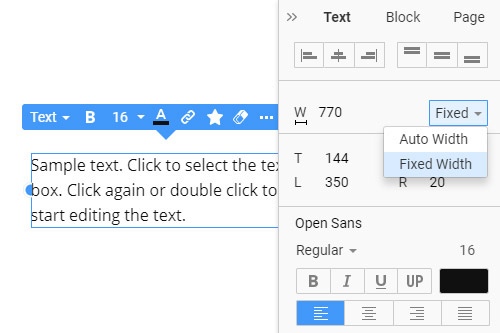
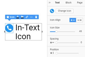
How To Make The Text Auto Or Fixed Width
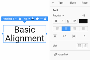
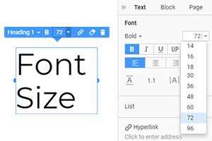
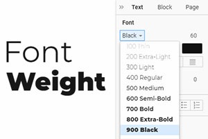
Many elements on your website and individual elements require your personal customization to provide a unique and memorable UX design. To make it easy to design layout text congeneric after getting started, our Property Panel has two great options to make text width the way you need it to be. The first option is Auto Width which will automatically apply the container's width to all-new text you will put into it. The second is Fixed Width which will use the exact width you chose for all text in the layout. Those width options will be active despite how large or small your text resizes or whether it is in the right or left positioning.
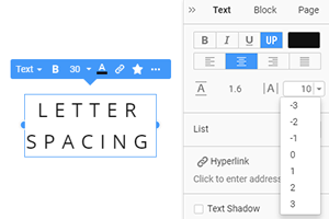
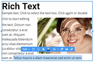
Consider the screen sizes when deciding how to create and customize related content. The text width will also affect the image layout and background image, emphasizing all the positive and negative aspects of the overall layout. So how to create a great text styling and positioning using design layout options? Remember to resize your current text and adjust styling and width to minimize the difference between related articles. The marketing content should be as unified as possible.
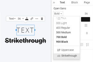
Different screens suggest that the screen sizes may require you to change the font size manually. Yet our code editor minimizes the number of aspects you need to focus on. How do different approaches impact how to create a unique web design atmosphere and make any article helpful? We provide everything you need and know how to create a layout using a simple yet effective toolkit. Sign up and look through our articles if you need help with your design.