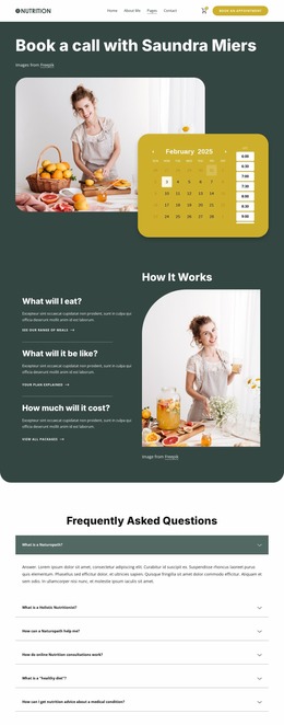
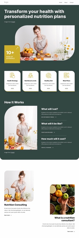
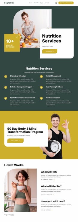
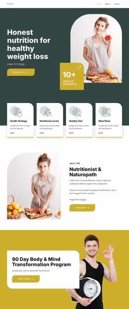
Your wellness journey begins here Website Mockup
Edit Template Offline
2. Create new page and search for id 6439970
Edit Template Online
Create Awesome Websites


Free Nicepage Builder
Keywords
The Split Hero and Four-Column Footer Need Careful Visual Review
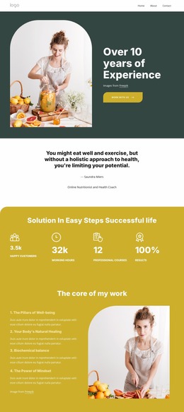
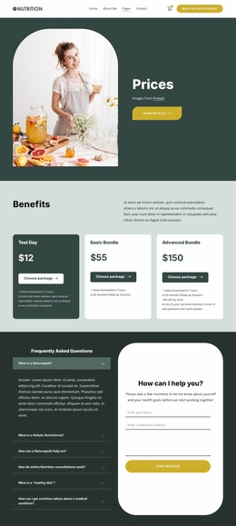
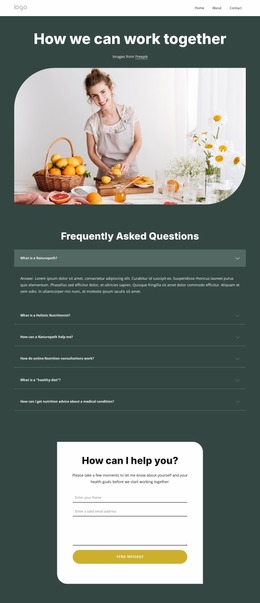
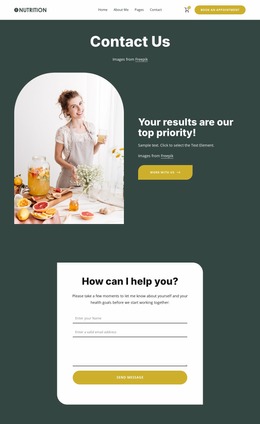
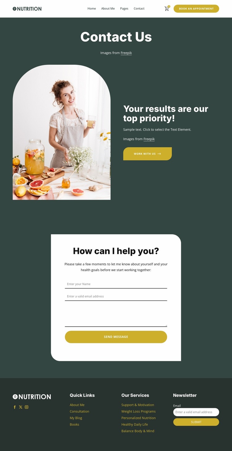
The split hero is the first responsive-sensitive area to examine. Its rounded lifestyle image and adjacent text depend on a clear relationship between image scale, available width, and the space needed for the Contact Us heading, results-focused statement, and Work With Us action. On narrower screens, the balance may change as the two columns stack or become more compact. The image should remain a useful visual introduction without reducing the accompanying copy to an awkwardly narrow region.
The centered contact card presents a different review point. Its white surface must remain visually distinct from the dark teal background while retaining comfortable space for the name, email, and message fields. The form heading and Send Message action also need enough width to remain readable when the page shifts from a broad desktop presentation to a phone-sized view. Rounded corners and generous spacing should continue to support the intended friendly tone rather than create excessive vertical density.
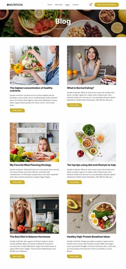
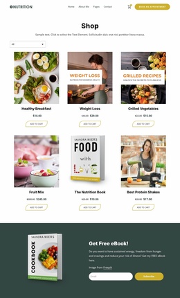
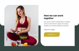
The header and footer deserve separate attention. Navigation, the shopping cart icon, and appointment button occupy a compact horizontal line that may need a different arrangement on smaller screens. At the bottom, four footer columns contain several labels, social links, and a newsletter form; their spacing and order should be reviewed carefully as they become stacked groups. These concrete areas make the design useful to evaluate as a responsive visual presentation, not simply as a static desktop image.
Customize with Nicepage
Open this ready-made template in the Website Mockup Builder and customize it visually in the Nicepage editor. Replace demo content, edit page sections, and adapt the design to your project without rebuilding the template from scratch.
Preview and Refine This Website Mockup
Review the Design Across Devices
Use Responsive Modes to see how the website design appears on Large Screens, Desktops, Laptops, Tablets, and Phones. Switch between the available views to compare the same layout at different screen widths and review how typography, images, spacing, navigation, and other content adapt to each device.
Adapt the Mockup for Different Screens
Nicepage provides responsive web design tools for adjusting individual device views when the initial layout needs refinement. You can customize Mobile Views separately, change element sizes and positions, adapt Grids, Lists, and Galleries, and hide selected Elements or Blocks on particular screen sizes. This makes it possible to develop a responsive website mockup instead of evaluating the design at only one fixed desktop size.
Preview the Website Without Editing Controls
Use Live Page / Preview to review the design with the editing interface removed from view. Instant Preview can hide the Page Navigator, Property Panel, selections, and frames, making it easier to evaluate the overall presentation, content hierarchy, and responsive layout as a visitor would see them.
This workflow makes the template useful as a responsive website mockup for visualizing, comparing, and refining how the same website design will appear across different screen sizes.

Design Set (30)
-

-
-
-
-
-
-
-
-
-
-
Customize Any TemplateDownload
-
-
-
-
-
-
-
-
-
-