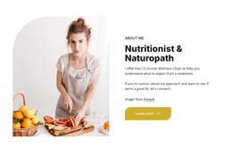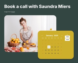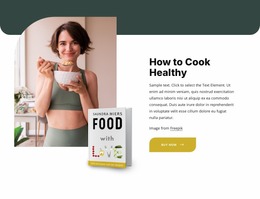
Nutritional therapy services Website Mockup


The Overlapping Card and Food Photograph Are Key Responsive Review Points
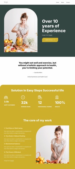
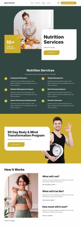
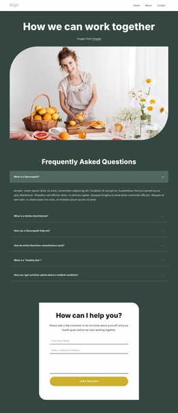
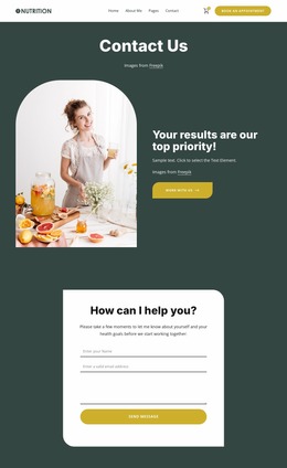
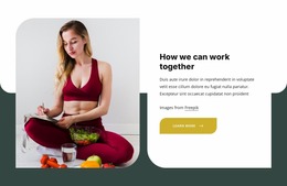
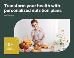
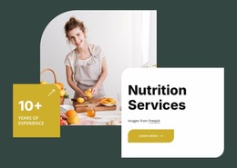
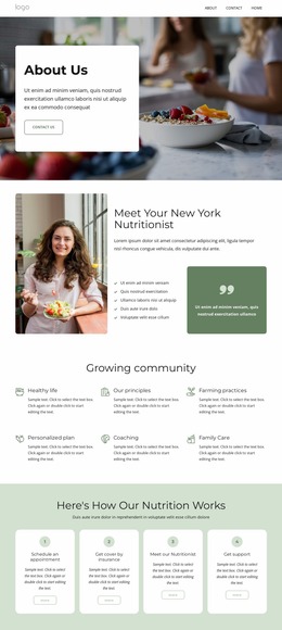
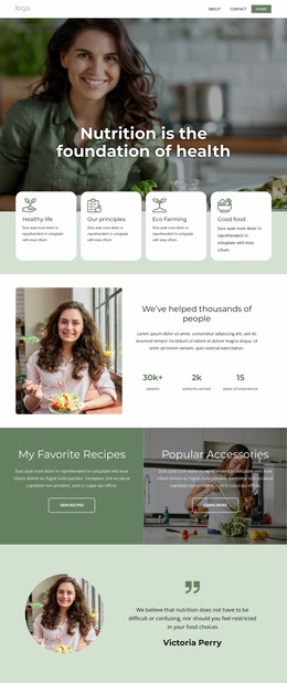
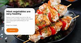
The block’s visual balance depends on the large food-preparation photograph and the white rounded card occupying related but distinct areas. On a wide presentation, the image can carry the main visual weight while the card places the “Nutrition Services” heading, supporting copy, attribution, and “Learn more” action over the dark green field. The separate “10+” experience badge adds another positioned element, so its distance from the image and card matters to the overall reading order. Rounded corners and mustard accents should remain visible without making the composition feel crowded.
When evaluating this block as part of a website mockup, review how the image and card stack or reposition at narrower widths, how the heading and supporting text wrap, and whether the button retains a clear relationship to the message. The experience badge also deserves attention: it should remain legible and visually connected to the section without obscuring the photograph or card content. Because the interaction is static, the main review concerns are spatial rather than behavioral. The aim is to preserve the introductory hierarchy across screen sizes, with the image, service message, action, and experience highlight still understood as one coherent section.
Customize with Nicepage
Open this ready-made template in the Website Mockup Builder and customize it visually in the Nicepage editor. Replace demo content, edit page sections, and adapt the design to your project without rebuilding the template from scratch.
Edit Template Offline
2. Create a new page or select existing
3. Click Add new block, search for id 6435407 and click enter
Edit Template Online
Create Awesome Websites


Free Nicepage Builder
Keywords
Preview and Refine This Website Mockup
Review the Design Across Devices
Use Responsive Modes to see how the website design appears on Large Screens, Desktops, Laptops, Tablets, and Phones. Switch between the available views to compare the same layout at different screen widths and review how typography, images, spacing, navigation, and other content adapt to each device.
Adapt the Mockup for Different Screens
Nicepage provides responsive web design tools for adjusting individual device views when the initial layout needs refinement. You can customize Mobile Views separately, change element sizes and positions, adapt Grids, Lists, and Galleries, and hide selected Elements or Blocks on particular screen sizes. This makes it possible to develop a responsive website mockup instead of evaluating the design at only one fixed desktop size.
Preview the Website Without Editing Controls
Use Live Page / Preview to review the design with the editing interface removed from view. Instant Preview can hide the Page Navigator, Property Panel, selections, and frames, making it easier to evaluate the overall presentation, content hierarchy, and responsive layout as a visitor would see them.
This workflow makes the template useful as a responsive website mockup for visualizing, comparing, and refining how the same website design will appear across different screen sizes.

Design Set (30)
-

-
-
-
-
-
-
-
-
-
-
Customize Any TemplateDownload
-
-
-
-
-
-
-
-
-
-