IMPORTANT! This functionality is deprecated.
Please contact support if you still consider it useful.
Summary
- Overview
- Build From Images
- Customize Pages
- Edit Blocks
- Edit Grid
- Add Elements
- Responsive Modes
- Publish
Overview
Nicepage is available online as a Windows Application and as a Plugin for WordPress or Joomla. In the Windows version, you can export WordPress and Joomla.
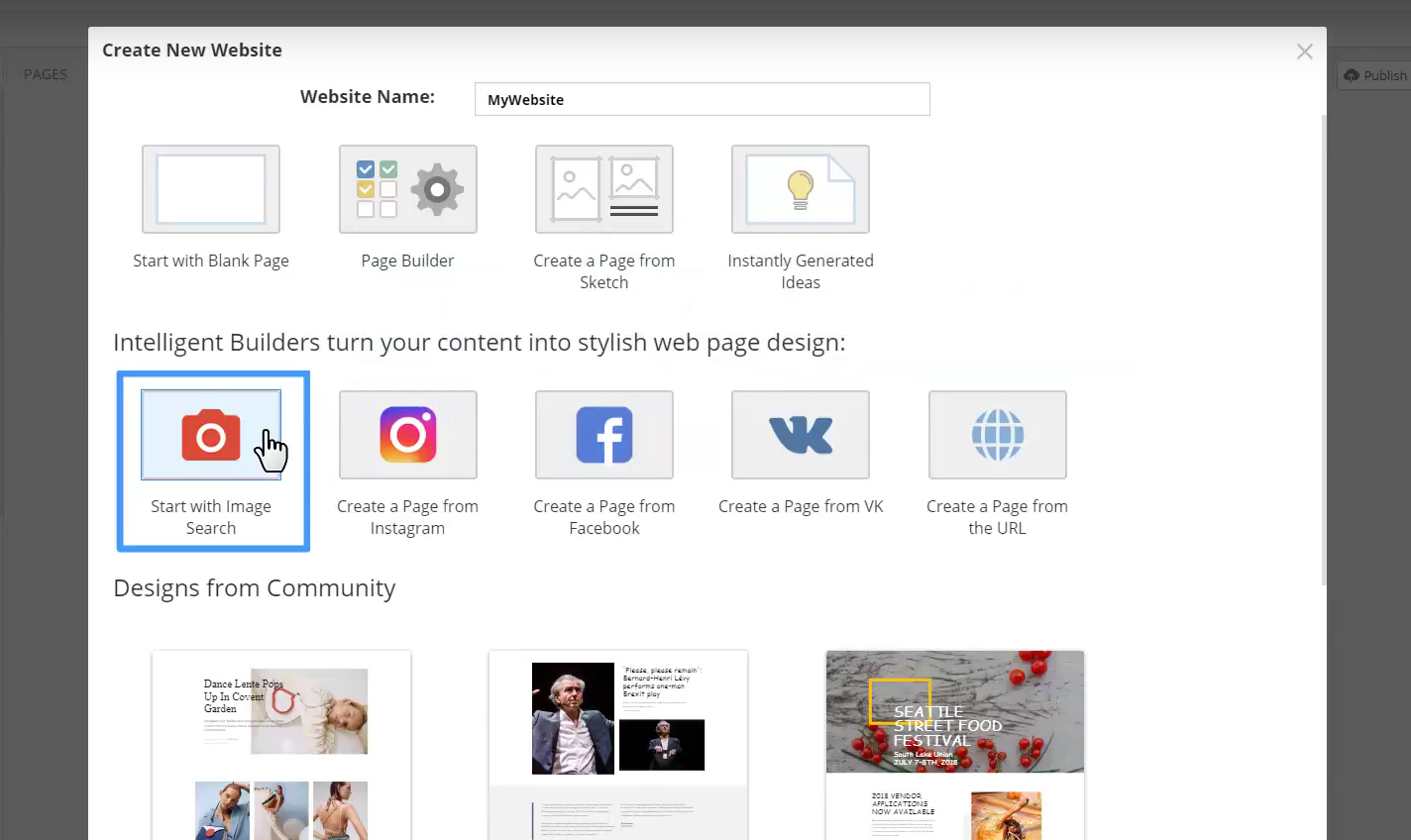
You could provide images and text, and Nicepage could design a website. If you can use Microsoft PowerPoint or Apple Keynote, you can use Nicepage.
Build From Image
Building From Images You can start with a blank website or use almost any source. For example, start with the Image Search. Enter or select a keyword. Choose any auto-generated design.
Build From Instagram
Another example, you have an Instagram account with your favorite photos. Login to your account. You see, there are some nice pictures here.
Select images. And now, let Nicepage HTML Website Builder do the Magic!
Do you recognize those photos? Nicepage Intelligent Design Service used the Instagram posts and turned them into Blocks. It's easy to use and fast, and each newly built design is unique. It saves time and, therefore, money!
Build From Facebook
Let's use Facebook. Select post images. Select a design. Voila!
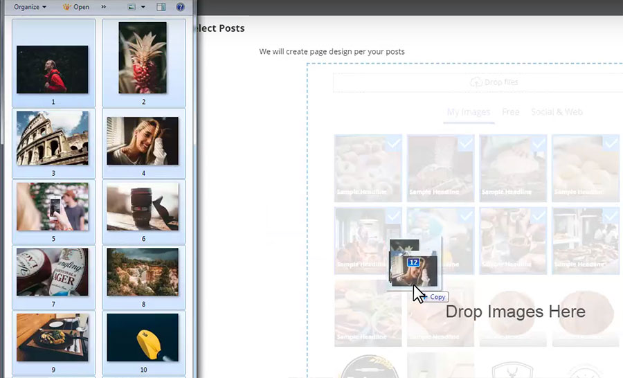
Build From A Folder
What if you have images in your local folder? Run Builder. Upload images by dragging them into the Nicepage Builder. Click Next.
Build From Uploaded Images
You will see designs built from the uploaded images. The designs you see are not pre-made templates, and everything is created on the fly in seconds. Unbelievable, isn't it?
Select a page design, then click Next.
Customize Pages
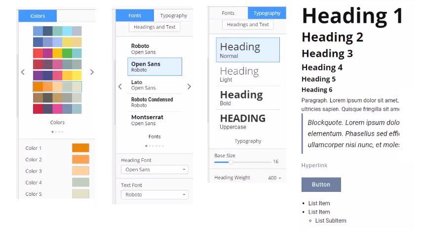
Select Colors for a page. Hovering Color Palettes and Coloring allows previewing changes immediately. Select a Font Scheme and a Typography. Click Done to add a page to the Website.

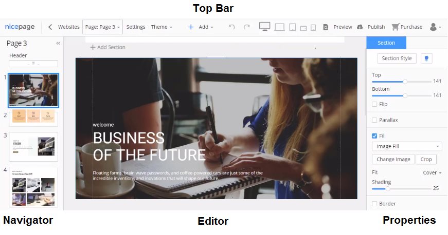
User Interface
Let's briefly review the user interface of Nicepage. A Top Bar contains a Page List, Website Settings, Theme Settings, Add Menu at the center, Responsive Modes, Preview, and Publish to the right.
Let's add another page. Open Pages -> Add Page. Besides Builders, there are many pre-made examples provided by our designer community.
Theme Settings
Select Color Palette in the Theme Setting at the top. Select a Font Scheme.
The font was selected based on statistics for the most popular Google Fonts and combinations. Select a Typography. The fine-tuning is done in the Headings and Texts.
Page Navigator
The Page Navigator to the left allows operating Blocks. Blocks are the building blocks of modern web design. Click any Block to select.
Block Menu
Each Block has a menu. Select Duplicate to copy the current Block. Move this Block by dragging it under another one. If you don't need this Block, select Delete from the Block Menu.

Working with a Block in the Navigator is similar to working with slides in Microsoft Powerpoint or Apple Keynote.
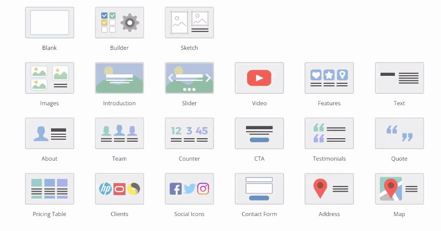
Edit Blocks
Now let's add several Blocks. Nicepage allows building Blocks from scratch, using pre-designed Blocks, or generating Blocks with the Builders.
Block Builder
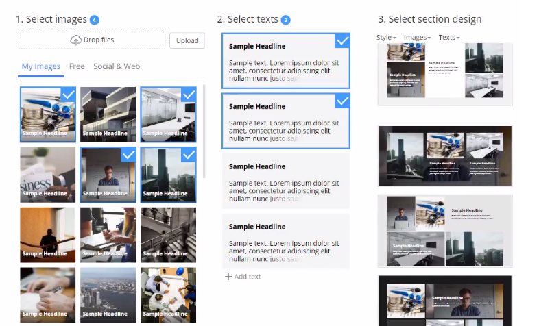
Add a New Block. Select Builder.
Again, you can search for images online and use images from social accounts or your local folder for the Block. Let's add images from a local folder. Select images for the Block. Select texts. Then select a style from auto-generated variants.
Finally, add this Block to your web page.
Pre-Designed Blocks
Add a New Block.
Over a thousand pre-designed Blocks are available, and all those Blocks have a unique design and layout. Select a Thematic Category at the top. Then choose a Block Style to the left. Categories and styles filter the output results.
Click "Done" to apply. If you change your mind or dislike the style you just selected, you can easily choose another one.
Block Editor
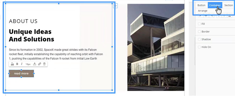
The Block Editor is the center of Nicepage. Here you can add, move, position, and align various controls. Clicking elements in the Editor, we see the Properties change in the Panel to the right. Altering the parameters modifies a selected element.
Add more "Spacing."
Panel Tabs
In the Panel, you can switch tabs to navigate to a Container or a Block. Again, using Nicepage is very simple; it's similar to working in Microsoft PowerPoint or Apple Keynote. At that, you get the clean code and the responsive HTML in the output.
Build Blocks
Let's assume you don't like variants built with Builders and the pre-designed ideas are insufficient. You have the Block you drew in a graphic editor, for example, Adobe Photoshop. Let's use this Block as an example.
Content Area
Add a blank Block. Change the Block Height. Readability is essential for a web page. The Content Area is called "Sheet," marked with dashed lines. It is recommended to place the content between these lines.

Add Menu
All added controls are found in the Add Menu. Open the Add Menu. There are Containers, Basic and Functional Controls.
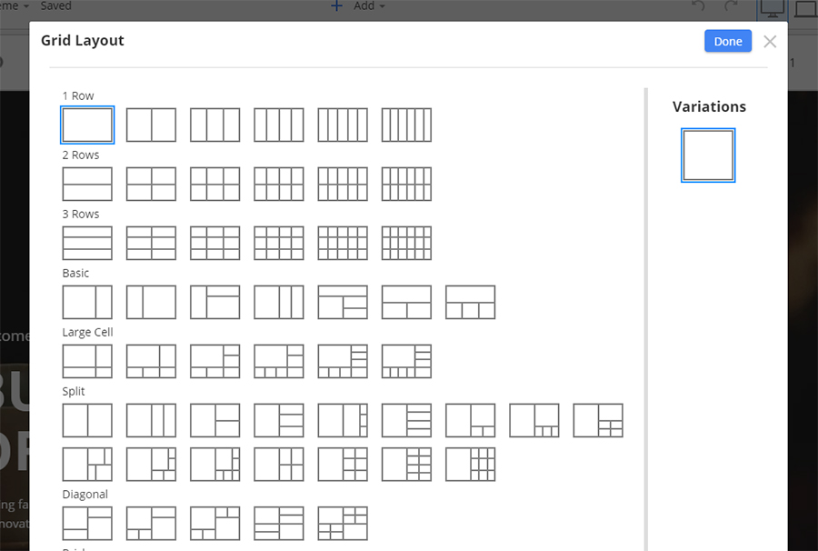
Use Grids
To create a Block with cells, we need a Grid. Grids are flexible and very useful for Responsive Modes. As for smaller screens, the cells are reorganized one under another automatically. Select "Grid." Shrink the Grid Height. Move the Grid up. While moving, you see the snapping guides and sizes in boxes that help to align.
Edit Images
Replace the images by dragging them from your local folder. Add Spacing to separate cells visually. Select the Cell to the left. Change the cell background from Image Fill to Color Fill. Select another cell. Change the Crop of the background image. Collapse the image to make it a part of the content, and expand it back to the cell background. Switch cells by dragging one Cell over another.
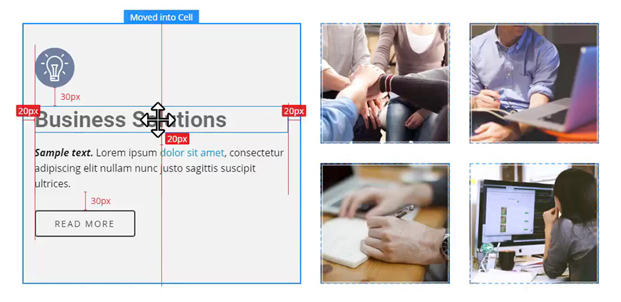
Edit Cells
The destinations: a cell, a container, or a Block; are highlighted with the borders. Also, there is a tip above the Destination Cell. Copy the Cell by dragging while holding the CTRL key. If you change your mind, to clear the content, select the Cell, then click the DELETE key. Enable the Cell Fill in the Panel, and modify the Fill Color to Light Gray.

Add Elements
Click "Add" and select "Icon." In the dialog, enter "Idea" into the search field. Select the linear Lightbulb icon. There are many icons presets. Select the circled one. Note that the colors used in the presets are from the palette selected in Theme -> Colors.
Add Texts
Add Heading 2. Modify the Heading text. Change the text size and the Spacing between letters. If needed, undo the changes by selecting the default text style from the list in the Panel. The styles in this list are set in Theme -> Heading and Texts. Add a text, click Add-> Text -> Text. Select a part of this text and make it Bold and Italic. Select another part, then add a Hyperlink.
Add Button
Add Button Alternatively, click the small plus at the top right in the cell corner. Buttons also have presets. We need the bordered one. Colors used in the presets are selected in Theme -> Colors. Make all letters in uppercase, smaller and bold. Modify the Button Text.
Alignment
Alignment and Consistency are important design principles. Note again guides and sizes help to follow those principles while moving. Also, a reminder, dragging elements, there are highlighted cells with the above tips clarifying the control placing.
Align In Cells
Auto-align the content vertically. The results are achieved easier and quicker than drawing this Block mockup in Adobe Photoshop. We have finished adding Blocks.
Responsive Modes
No modern design is considered complete if it's not responsive for modern devices, mainly for mobile ones. Now, here's the Magic! Clicking the Responsive Mode icons, the page looks NICE in all modes. It was all done automatically! Amazing, isn't it?!

In all Responsive Modes, all editing features are supported. Let's change the Сrop of the image, then the Heading size. You may hide any cell, let's say, for this Phone View, then show it back in one click.
Preview and Publish
After you've made your changes, click Preview to preview the page. If you are satisfied with everything, you can Publish your Website to show it to a client or see it yourself.
Click "Publish." After the publication, open your Website, clicking the generated URL.
Using Nicepage is simple; it's like working in Microsoft PowerPoint or Apple Keynote. The results are clean code and fully responsive HTML. As a reminder, you can export WordPress and Joomla to the desktop version.
We hope you have enjoyed this introduction to Nicepage.