Using the Step Progress feature on Multi-Step Forms, you can show progression to your users and visitors, making the communication process much more user-friendly and building trust.
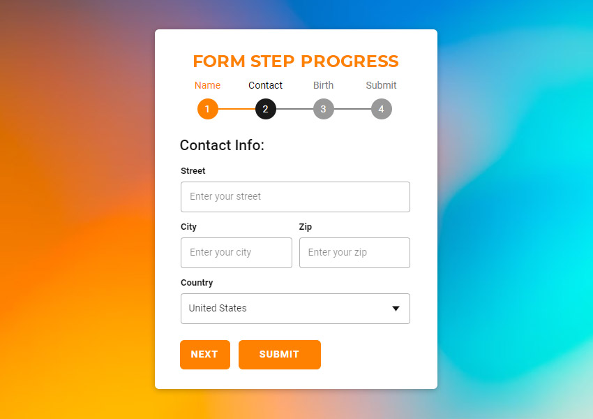
Enable Form Step Progress
Add steps to a Contact Form, then go to the Property Panel. Check the "Progress" checkbox to enable the display of progress indicators for the current Form.

Step Progress Panel
Clicking on the Progress link below the checkbox opens the Progress Panel, where you can edit the Form Step Progress style properties.

Progress Spacing / Width
Modify the Width of the Step Progress area and specify the Spacing before and after the component.

Progress Step Icon
The Numbers are shown for the Form Steps by default. You can show the Steps as Icons on the Form Progress.
Default Step Icon
You can set the Default Icon for all Steps shown on the Form Progress.
Done Step Icon
You can also set the Icon for the done steps, making the submission process more informative.
Custom Step Icon
You can also upload custom icons in PNG, JPG, and SVG formats to be used as the Default and Done Step Icons.
Progress Step Icon Style
You can change the Size, Background, and Color of the Step Progress Icon. The Background and Color can be set for the Icon States.
Progress Text Position
You can modify the Progress Text Position of the Steps to show above or below the Icons.

Progress Text Color
And also, you can modify the Color of the Progress Text. In future updates, you will be able to stylize the text fully.

Progress Bar
You can enable the Progress Bar by checking the Bar checkbox. For the active Progress Bar, you can change the State Color and Width by dragging the Size slider or entering the value.
