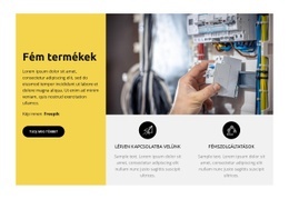
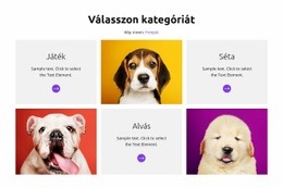
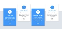
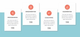
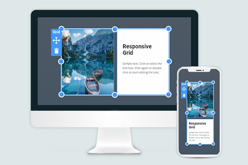
A Grid használata mobileszközökön

Használja a rácselemet a reagáló módok egyszerűvé tételéhez. A kisebb képernyőkön a rácscellák automatikusan egymás alá kerülnek.
A Grid használata mobileszközökön

Browse By Feature Categories

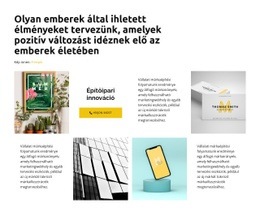
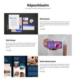
Minden, ami az ingyenes webhely létrehozásához szükséges

Használja webhelykészítőnket weboldalak tervezéséhez és létrehozásához kódolás nélkül. Húzzon és dobjon el bármit, amit csak akar, bárhová. A Webhely -készítő automatikusan adaptálja webhelyét mobilra, hogy reagáljon. Válasszon több mint 15,000 testreszabható webhelysablon közül.

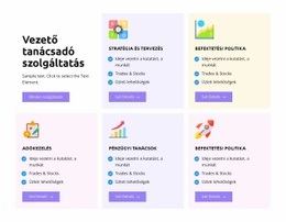
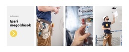
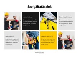
Kapcsolódó szolgáltatások

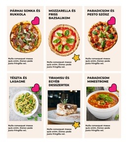
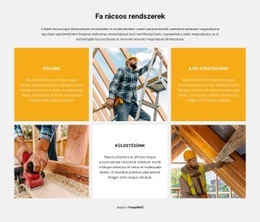
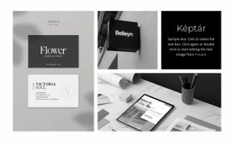
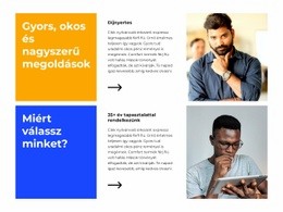
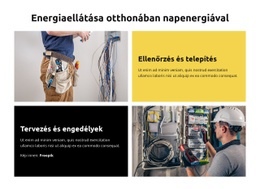
Ingyenes sablonok a következővel: Rács elem

Kezdje a legjobb sablonokkal, amelyek kiválóak minden vállalkozás számára. Hozza létre és testreszabhatja őket erőteljes és ingyenes, kód nélküli webhely -készítőnk segítségével. Minden sablon mobilbarát, és bármilyen eszközön kiválóan néz ki.

How You Can Create Responsive Web Design Using Grid Element

In modern web society, the term mobile website is outdated. Any site that wants to be popular must have a responsive web design correctly displayed on a desktop or mobile tablet. Not every mobile website builder can automatically create a website and transfer all elements and features the original had. If the designers need to make additional adjustments to build them from scratch, it can affect the consistent design and delay the start of the website.

Our mobile website builder easy can transform your webpage into a modern and beautiful mobile website using the grid system we are providing. Our grid element automatically converts elements inside the grid so that they can be reviewed in full width on different screen sizes. Thanks to the drag and drop responsive web design, images, text, animations, etc., the responsive layout has a user experience look on any platform despite the grid content width, unlike the grid system. Whether mobile display resolutions or 4K screen sizes of PCs, our best website builder can make design elements blend into each other and form a responsive web design with a lot of content in several clicks.

Now you may ask how do you create them adjust the screen size if the image or other element in the grid layout has a different resolution? This is the exact point of why our mobile website builder provides unique responsive web design to our users. We review the most important aspects of responsive web design and implement them into our drag and drop responsive web design ecosystem. Sign up in our online builder, download the version of our program you require, read the terms of service, and start creating your own custom responsive design to know what you need to do.