Introduction
We love web design, and it is our passion. Web design is a part of our life. Since 2000, we have watched what is happening in the web design world every day. We are involved in the web design process, and there have been millions of web pages designed with our active participation. And now, we would like to share some of our exciting ideas with you.
For the first time, this article shares the secret about how to create the trendiest web designs in the world. You will learn the basic rules of modern web design to create world-class websites, blogs, and themes. You will find out how to become unique, how to stand out from the competition, and how to attract the attention of your customers.
This article consists of several chapters:
In Chapter 1, we will find out how web design is changing. Also, you will learn about the birth of the new generation of web designers, who are designing web pages in Web Design 3.0.
In Chapter 2, we will talk about website builders that are lagging behind the trends and slowing down the web design evolution.
In Chapter 3, you will learn how to create modern web designs quickly and easily in a new way.
Chapter 1. Web Design Is Changing
The first thing we will talk about is web design. It is changing rapidly. To understand this, you need to review the web design evolution: from first sites to trendy websites of today. We will try to predict what kind of web designs will be popular in the nearest future.
There are three stages of the evolution of web design. In the picture below, we have colored each stage and added years to the timeline.
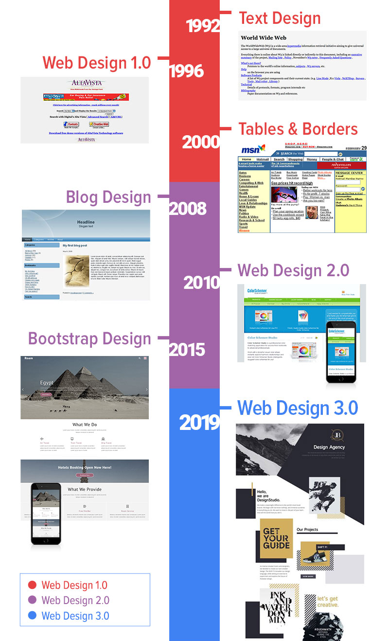
Web Design Evolution
First Websites
The first websites were text-based. And it is hard to say that they had any web design.
Transition To Web Design 1.0
Later, there was the transition to Web Design 1.0. Some graphical elements appeared on websites, which became more attractive. Web pages got tables. Then, tables transformed into Layouts and Grids. Tables gave some flexibility, but they were not mobile-friendly, and it was not required at that time.
Many people created their own Content Management Systems (CMS). So, webmasters did not have to edit the HTML files or upload them to servers. But it was possible to modify the content online in real time.
The evolution of web design and the spread of mobile phones led to new changes.
Transition To Web Design 2.0
The next transition was to Web Design 2.0. Web pages got Grids, and web designers could arrange elements with Layouts.
Bootstrap accelerated the speed of Web Development. It simplified the process and made it more convenient. Bootstrap supported mobile devices from the beginning with Grids.
Bootstrap's Grid stretched automatically to the full width of screens. It reduced the developer’s time significantly spent on coding to support desktops, laptops, tablets, and phones.
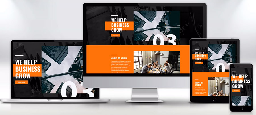
Modern website on various devices
WordPress, Joomla, and Drupal became the most popular Content Management Systems. They replaced the self-written systems, which were imperfect and expensive to write and to maintain and which also had limited functionality. Thanks to WordPress and Joomla, anyone could create a blog or website. And today, more than 20% of sites are built using those systems.
WordPress and Joomla always supported themes and templates, which made it possible to modify the design without changing the content. It was possible to create themes manually or buy ready-made ones. Also, webmasters could use Theme Builder. There is a mass of themes and templates available.
In 2008, Artisteer arrived. It became the most popular Theme Builder at that time. With Artisteer, anyone could create themes and website templates in minutes. Millions of websites use themes designed in Artisteer.
Is Web Design Dead?
It would seem that everyone should be happy: web designers, web developers, and users. However, there was a new problem. Web designers began to ask one question: "Is Web Design dead?". You can find articles asking the same question on all known platforms, such are Medium, Mashable, SmashingMagazine, Quora, and Reddit. Since 2015, web designers have been asking the same question.
In the picture below you can see the Google search results for this phrase.
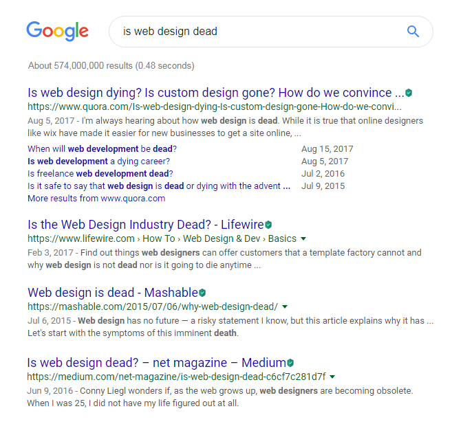
Search results on Google
Why is this happening? Bootstrap reached the height of its popularity in 2015-2016. You can see this in the chart below.
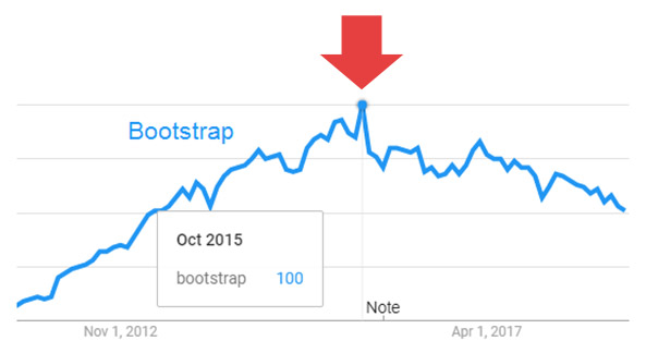
Bootstrap in Google Trends
The main cause of this problem was in Bootstrap and analogs. Bootstrap's web designs looked so similar to one another it was as if they were made with one template. Many website builders worsen the situation, having Bootstrap as the core of their systems. A Bootstrap's website design starts with a big picture, and other parts fit into the two-, three-, and four-cell structure. Many themes and templates in Bootstrap boosted the distribution of this problem.
See in the image below.
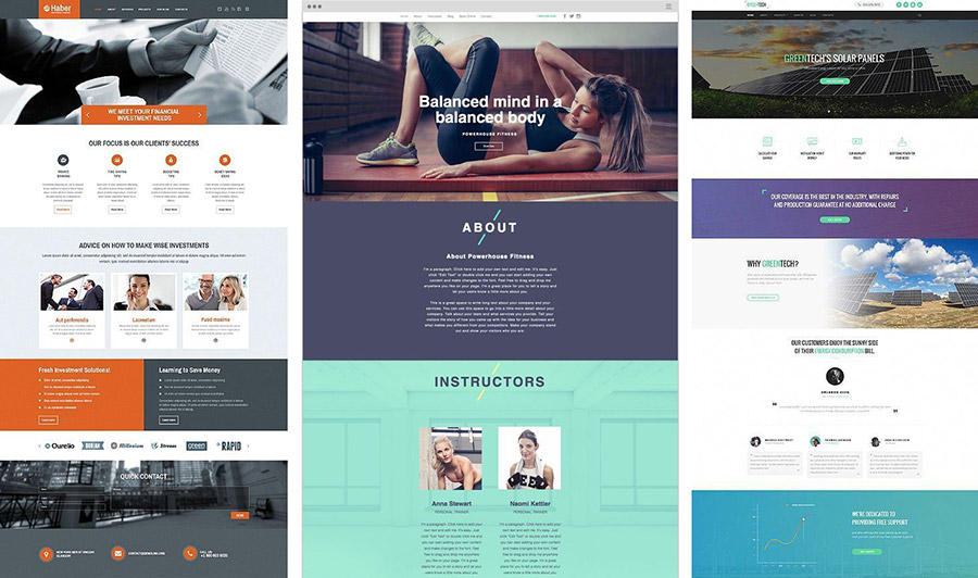
Pinterest results for "web design bootstrap”
In 2015, Ben Hunt published the book titled “Web Design Is Dead.” The main idea of the book is that the popularity of 50-dollar themes and templates almost killed the demand for the web designer's work. A custom web design costs much more because it requires time, knowledge and skills. Besides the design, it requires custom HTML and CSS coding.
Is this still a problem today? Yes, it is. After four years, the problem is still unresolved. In the picture below, you can see the Google search hints. People continue to ask this question today.
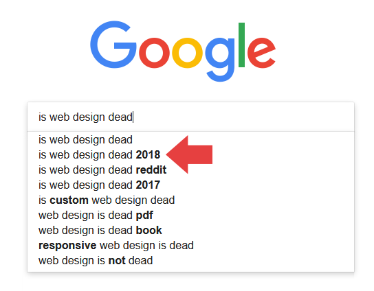
Search hints on Google
Web designers started to find solutions. They could not stay away and watch web design, the passion of their lives, get stuck in progress. There are always designers who want to make the Web a better place. Steve Jobs once said, "Think different," about such kind of people. These people always seek new ideas.
Print Design
Web design is very young. It is about two decades old. Print Design came long before web design, and it has hundreds of years in history.
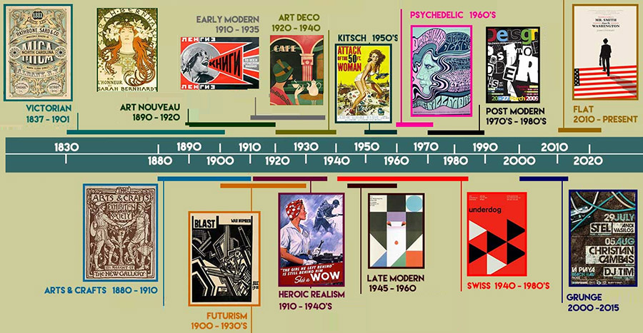
Evolution of Print Design. Copyright of onlinedesignteacher.com
Print Design tools always allowed creatives to place items freely. Designers were not limited in their creativity. And publishers were always free in their ideas. They did not have to think about HTML, CSS, or mobile devices.
The Print Design formula:
FREE POSITIONING + CREATIVITY = MODERN PRINT DESIGN
Print Design on Pinterest
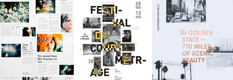
Nowadays, many publishers have reduced print runs significantly and gone online. Printed pages have become web pages on the Web. But those web pages lost the creativity and freedom of Print Design. Designers did not want to lose the print ideas they have collected for years. They began to design with print ideas online.
The Birth of Web Design 3.0
Starting in 2016, we began to notice ideas from Print Design appearing regularly on web page designs on Pinterest, Behance, and Dribbble. Those new web designs differed with:
Free positioning.
Element overlapping.
Breaking the limitations of Bootstrap-like Grids.
It meant the birth of Web Design 3.0!
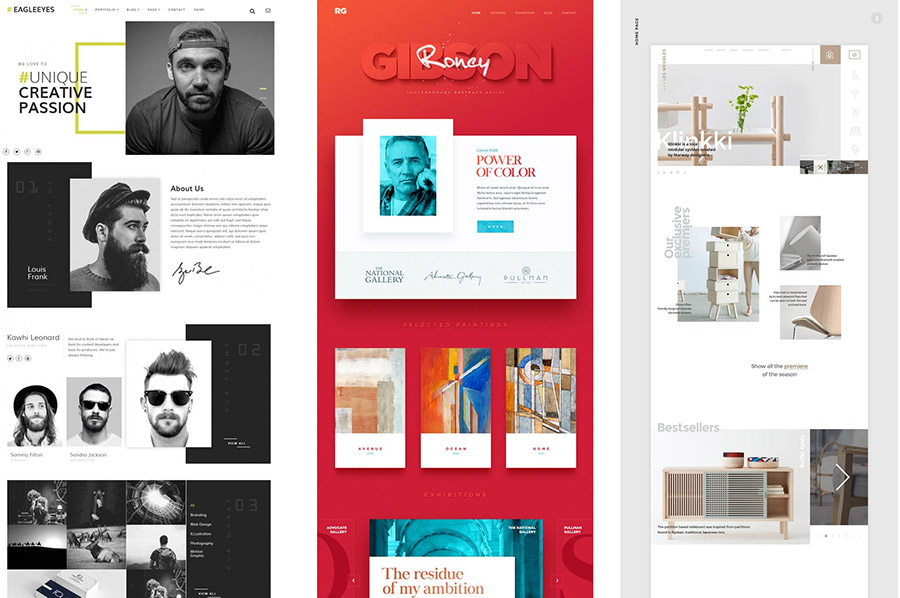
Web Design 3.0 is about the designer's freedom
Modern web designs from Pinterest
In the summer of 2016, 83 Oranges (https://83oranges.com/) presented the article titled: “Web Design Trends.”
The author identified the following emerging styles in website design:
- Text Over Image
- Overlapping Images
- Vertical Text & Super Clean Layouts
- Uneven Grid Galleries
- Here Images with Big Headlines
- Abstract Brand Elements
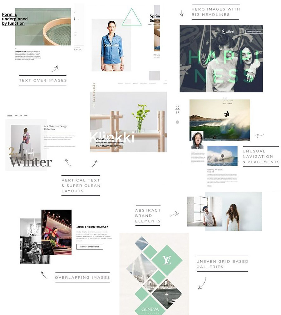
83 Oranges on Pinterest
In Chapter 3, we will take a closer look at styles and how you can create websites in Web Design 3.0.
Removing Table Constraints
What does it mean to remove table constraints? Let's use the example, the image below which shows the typical photos on the wall. They look similar to the Grid.
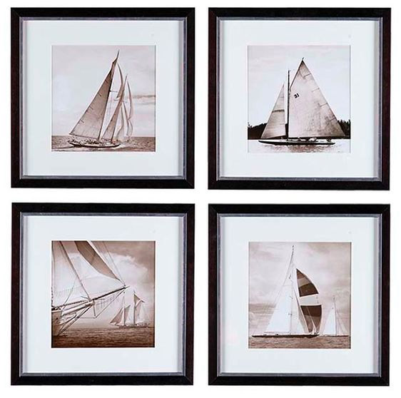
Example from Pinterest
If you search for “picture wall” on Pinterest or Google now, 90% of the results will look like those in the picture below. You notice the dramatic changes in Design in general nowadays. Design has seen rapid progress in all areas.
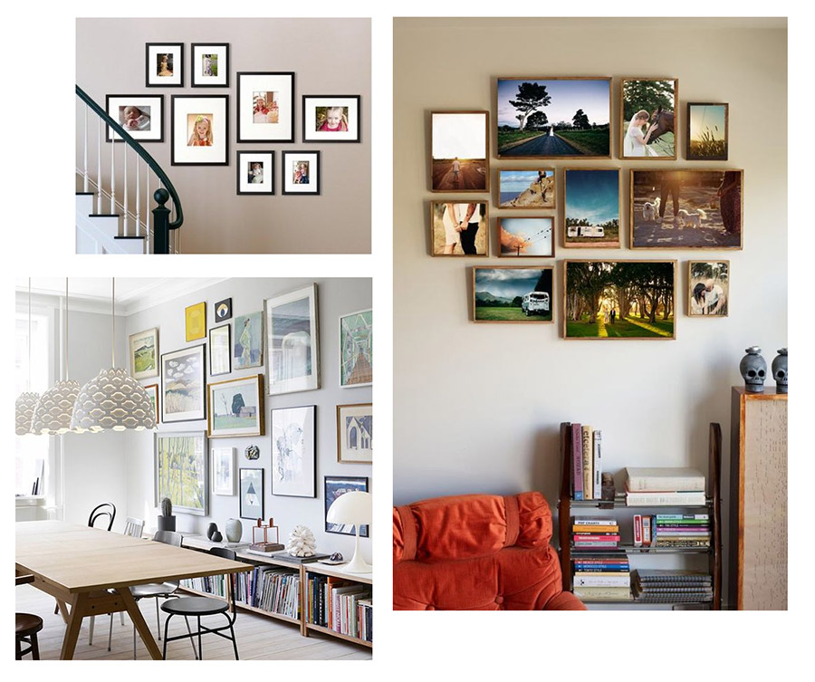
Example from Pinterest
Agree that these examples look like modern Print Design and Web Design 3.0? Why is this happening? Nobody wants to see boring Grids from the past on their walls. People want to impress friends with unique ideas. Everyone wants to express their emotions with design.
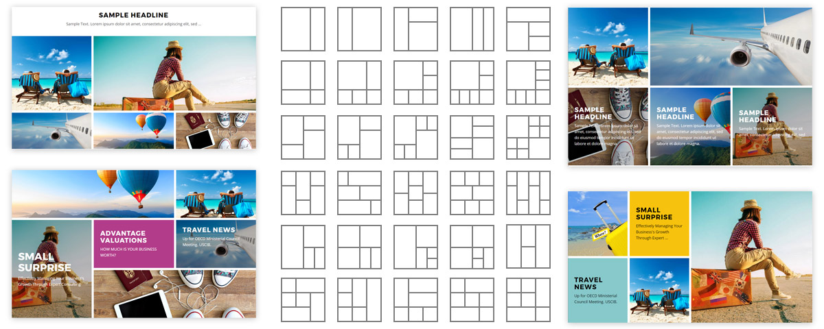
Modern Grid Layouts
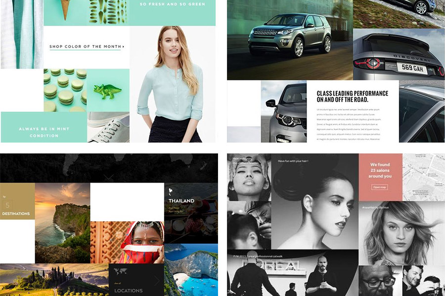
We see more use of complex grids in web design. And the CSS Grid has become more popular.
Web Design 3.0 Trends
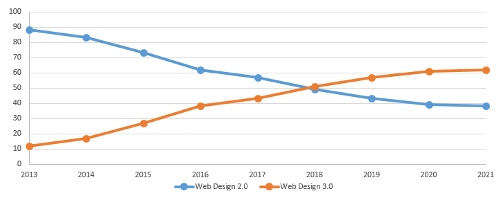
Trendy designs breaking stereotypes are becoming more popular. In the chart, you can see that every year more designers discover the world of Web Design 3.0. This chart displays the results on the topic of "web design" on Pinterest, Behance, and Dribbble. We forecast that this trend will continue in the future.
Web design trends from Pinterest, Behance, and Dribbble.
Web Design Research
Every day we do the research and tests with new web design ideas. We upload our designs to Pinterest. We watch how users react by saving designs on their boards. We were very impressed with the results. Websites of web design 3.0 get ten times more feedback than 2.0 ones.
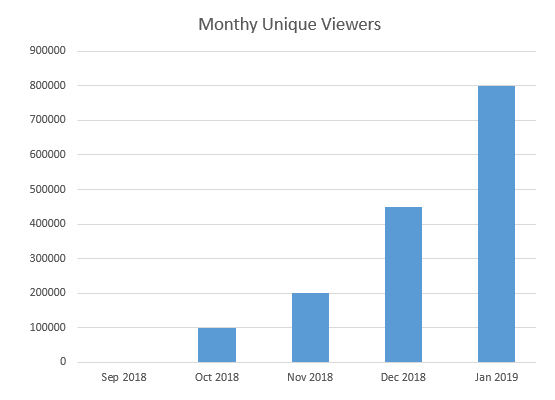
The actual data confirms these research results. In several months, we got about 800K unique monthly viewers. It says a lot about the growing popularity of pages in Web Design 3.0.
Audience growth on Pinterest
If you want to make your web design ideas noticeable on Pinterest or Behance, there are no alternatives. You need to design websites in Web Design 3.0. If you have not started, you should hurry up! We will help you to understand what exactly you need to do.
Our Goal
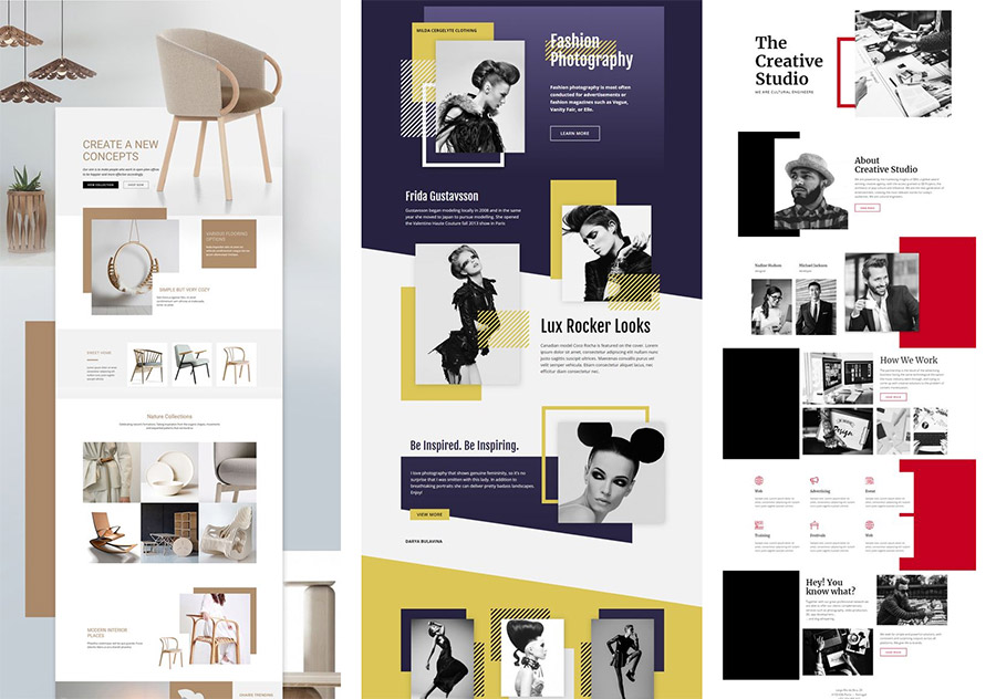
Our goal is to tell web designers about the newest web design trends. We want to explain the difference and how to create sites in Web Design 3.0. We try to spread our ideas. We love sharing our experience on how to become the most popular web designers in the world. We want to be the main driving power of Web Design 3.0 in the industry. We are always looking for people thinking differently. Together, we can change the web design industry.
Web Design 3.0 ideas on Pinterest
Site Builder Are Not For Creative People
You may ask, where are websites in Web Design 3.0? Why we still see a few of them on the Web as working websites? There are several reasons.
Designers do not have convenient tools to create HTML or WordPress pages in Web Design 3.0. And existing website builders lack free positioning. Designers still have to use Graphic Design tools like Adobe Photoshop, Adobe XD or Sketch App to realize ideas. To share ideas with the world, they upload ideas as images to Pinterest, Behance, and Dribbble. Web designers are unable to create working web pages. If they want to turn mockups into web pages, they need to write the HTML and CSS code by hand. But it is a long and expensive process.
There are no resources, where you can see the current trends in web design. Yes, there are Pinterest, Behance, and Dribbble. But to understand the trends, you need to monitor the changes every day. In every industry, there are resources where you can find out what is trending today: in movies, in music, on YouTube. Trends show everything, but not web design. It creates a lot of speculation on trends in web design. There are a lot of "experts" talking about trends. But we need a resource with data on web designs. Then it will be possible to understand today's trends in one click.
Due to the lack of real data and trusted authoritative opinions, designers continue to design in old styles.
There is a mismatch between designs and tools. Website builders are unable to create modern web designs. It slows down the growth of Web Design 3.0 significantly. We are strongly against the fact that designers are limited in the freedom of creativity. Designers should have a choice in which style to build their websites. Modern web designs should come off the podiums of fashion shows on Pinterest and Behance to become working websites.
Modern web designs should come off the podiums of fashion shows on Pinterest and Behance to become working websites.
Summary
Web design is young, but it is progressing rapidly.
Transition 1 is the appearance of graphics on the Web. It made the Web more attractive and interesting and allowed the Web to conquer the world. The use of graphics allowed the Web to become a new independent way of information distribution.
Transition 2 is the appearance of blogs, grids, and support for mobile devices. The use of Bootstrap and the spread of website templates made web design boring.
Transition 3 is the most significant. It led to Web Design 3.0. Publishers going online and users transitioning to mobile devices. Designers taking ideas from Print Design to the Web. They want the freedom of creativity, free positioning, and removing table constraints.
Chapter 2. Website Builders Are Behind Trends
The second part is about popular website builders, their evolution, and what they need to have to match Web Design 3.0.
Are website builders based on Bootstrap behind modern web design trends? Unfortunately, it is true. Every day the lag becomes more obvious and more visible. Let's find out why it is happening in detail.
The Evolution of Website Builders
Similar to web design, let's take a look at the history of web design tools. There were also three transitions. In the picture below you can see some of the popular tools for web design.
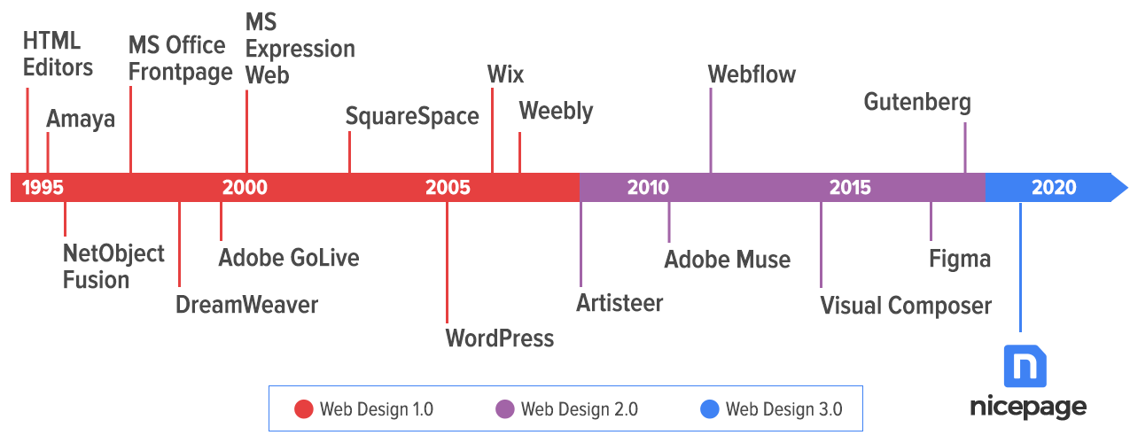
Timeline of Website Builders
Let's review these transitions in detail.
Transition To Visual Editors
Webmasters edited the web page content in text editors. Those editors allowed to write the HTML code. At most, they offered convenient code coloring, automatic code formatting, and error highlighting in the HTML code. Transition 1 was from text to visual editors.
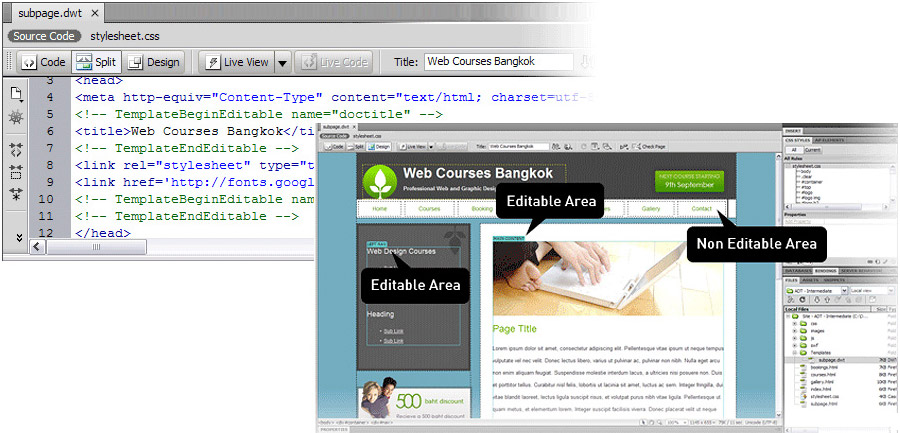
Transition to visual editors
Transition To Bootstrap
Transition 2 was the rise of blog systems like WordPress and Joomla and tools for creating themes, for example, Artisteer. People designed millions of themes in Artisteer. But in several years, Artisteer theme designs became outdated.
There were some popular website builders and WordPress plugins released: Webflow, VisualCompuser, Elementor, Divi, and others. Most of them are Bootstrap based. They are good for Web Design 2.0.
What are they missing for Web Design 3.0? These website builders and plugins do not have free positioning and layers. Also, they do not offer the simplicity and convenience of Graphic Design tools, which designers need.
Recently Bootstrap changed the main illustration on the home page. As you see below, it has layers. Perhaps Bootstrap is working on layers and free positioning.
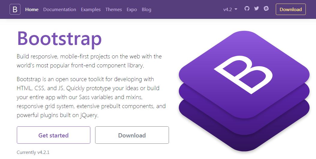
Bootstrap home page
Here are other examples. If designers need white space, they have to add empty elements and rows. To create an overlapping of elements, they have to specify the negative values for margins. It turns the web design process, which should be fun, into complicated and boring work.
Transition to Web Design 3.0
The current ongoing transition is to Web Design 3.0. And it is happening now. Unfortunately, many website builders are not ready for modern designs.
We believe that urgent action should be taken to prevent web design's progress from being stopped. The changes should be in the right direction. There are many variants of how to simplify website builders and to add more creativity to web designs. But not all variants are good enough.
We will review the following cases: the lack of creativity, Wix, and Gutenberg.
Lack Of Creativity
It is impossible to believe, but sometimes developers move in the opposite direction. Some "new-fangled" tools, such as Wix ADI, GoDaddy Site Builder, and Mobirise have a fixed set of pre-made templates. Users can only change text and images, not the layout. Do developers want all websites to look the same? What kind of creativity and evolution of web design is that?
It is true that tools can be easy to use, as you cannot modify the design. Perhaps, some users agree to have simplicity without the ability to change the design. But our goal is to have the simplest builder and at the same time to keep the maximum freedom for creativity. We need a revolutionary breakthrough in tools.
Gutenberg
Here is one more example. As you know, WordPress released a new article editor - Gutenberg. What is the reason for its appearance? It looks like WordPress developers wanted to create the same article editor that Medium.com has. Also, they wanted to have features of tools like VisualComposer. They made both, the article editor combined with the simple website builder. It would seem that everyone again should be happy. But in fact, we see the opposite. Users did not like this WordPress innovation. Please see the picture below.
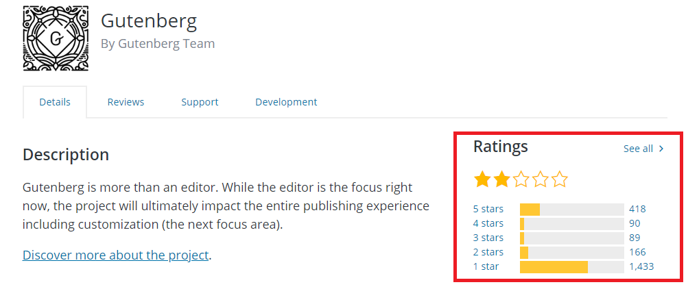
Screenshot from WordPress.org
Why did this happen? The Gutenberg editor seems to be complicated for a simple article editor. At the same time, it has weak features for a website builder. Moreover, web designs generated by Gutenberg are not even in Web Design 2.0. They are more like Web Design 1.5 of 2010.
They could provide a convenient API to make it easier for developers to create their own website builders inside WordPress. Instead, they released another competitor for existing website builders. They also did not give any premade designs.
Perhaps over time, some developers will accept this. There is no alternative to WordPress. But it does not help us to get closer to the primary goal. We need the simplest editor to build websites in Web Design 3.0.
WIX
Wix tried to become a tool for Web Design 3.0. Wix's problem is that its HTML does not meet the standards adopted by website developers. The element positioning is absolute. As a result, the HTML is not editable, and it is difficult to maintain mobile devices. Wix supports only desktops and phones. In practice, there is usually support for five types of devices. Wix recalculates the positioning with JavaScript, not HTML5 and CSS3. There is also no Property Panel like in all popular Graphic Design tools used by designers.
It seems that Wix is mostly for end users, not for designers and developers. For example, see the comments under the popular YouTube video, titled “How to Make a Website - Web Design Tutorial” on the “Draw with Jazza” channel. The discussion under this video is still going.
Screenshot from YouTube
Wix tried to simplify the website development and created Wix ADI. They removed the ability to edit the design completely. You can only modify the text and images. So, with ADI they went even farther away from Web Design 3.0.
No Progress In Website Builders
Why is it so hard to create new tools that the web design industry needs?
Difficulty. Website builders are quite complex systems requiring significant investments and time into the development. It also requires a great idea that can change web design.
Monopoly. It is difficult for new tools to enter the existing market of website builders. The current tools have a large user base accumulated over the years. For new tools, it is difficult to inform a large number of users. Therefore, we need your help and support to spread information.
Passivity. Developers and users of existing website builders are very passive. Changes are always related to certain risks and extra efforts. People prefer not to change anything, as they think it will be like that forever. Please do not be passive!
Progress Is Going On
As we have already seen, progress does not stand still and goes on. No one can stop it. At the same time, the new always meet difficulties on its way. Our common goal is to support the innovators of Web Design 3.0 to change the Web.
For example, electric vehicles continue to conquer the market, despite the enormous resistance of oil monopolies and manufacturers of traditional gasoline cars.
Similarly, it may seem that current Web Design 2.0 and website builders are the only options. It is not like that. Our task is to give a chance to something new. Together we can spread the word about Web Design 3.0 and the tools of the new generation!
CSS Grid
The CSS Grid has become the newest standard for building layouts.
New Dimension In Web Design
The positioning of elements also has its evolution.
Web Design 1.0 is "one-dimensional." The design elements are mostly arranged sequentially one after another.
Web design 2.0 is "two-dimensional." There are Grids for placing elements in cells, which gives more freedom.
Web design 3.0 is the new dimension. It has the free positioning of elements, overlapping, and layers like in Graphic Design tools. It opens the new prospects for web design. And it is the beginning of the new web design era.
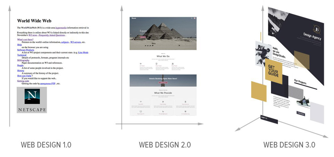
Dimensions in Web Design
The new dimension is like LEGO bricks vs. mosaics.
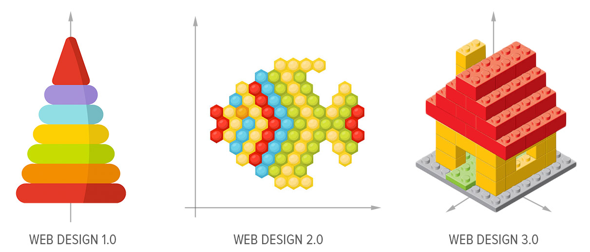
Web design generations
Removing Table Constraints
As said, Web Design 3.0 requires free positioning and removing table constraints. The unique positioning of elements makes the web design itself unique. Unlike two-, three- and four-column designs which look very similar to each other.
Free positioning of elements makes web design unique
In the picture below you can see free positioning of elements in Web Design 3.0. The freedom of positioning makes a big difference for designers.
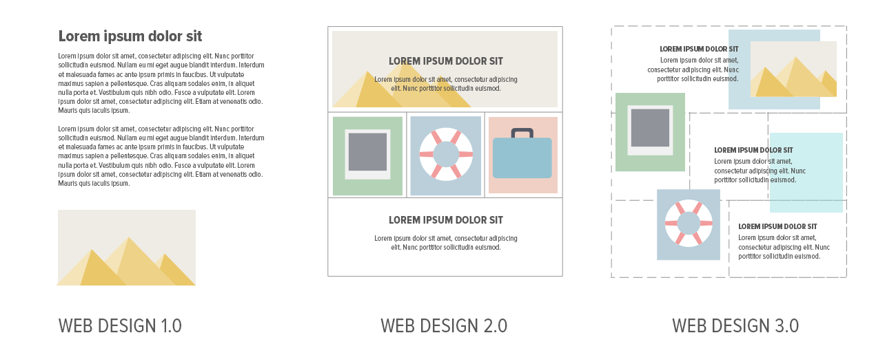
Limited vs. Free Positioning
In Web Design 3.0:
You can position elements freely. You can leave white space, if necessary.
You can resize elements freely.
You can overlay elements and Grid cells.
Of course, your web pages must be mobile-friendly.
These features are standard for Graphic Design tools. In Chapter 3, we will discuss how to apply these features in practice to create pages in Web Design 3.0.
Free positioning and element overlapping gain popularity in all types of Design.
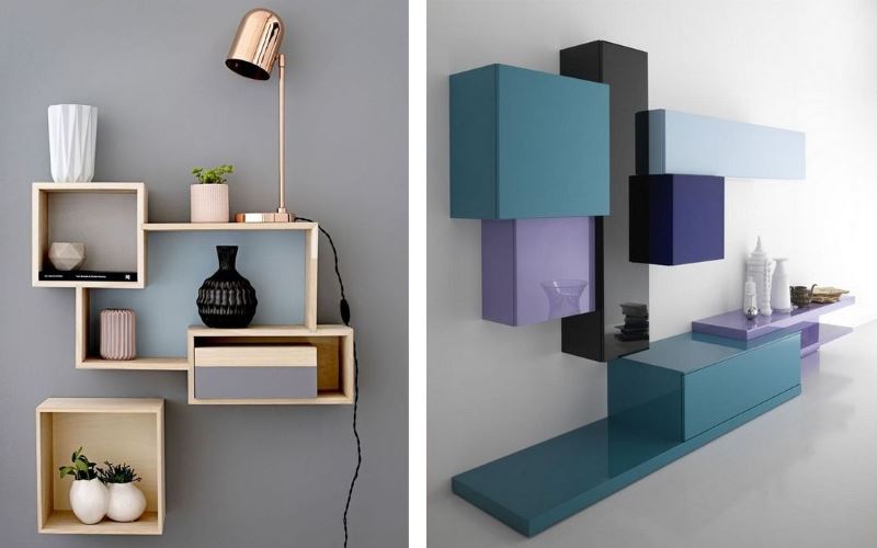
Free positioning in interiors
Limited vs. Free Positioning
What do existing website builders offer? In the picture below you can see the example of a two-cell Grid. You see the text in the left cell. Imagine, you want to improve your design, so you wonder where to put the text.
There are two ways. The first one is to the left in the picture. You see the red lines. Those are placeholders supported in current website builders of Web Design 2.0. Usually, you can place elements between other elements in the Grid or into other cells. This is the limited positioning.
Seriously? Does anyone believe that such restrictions in the current website builders allow for the creation of truly unique and modern web designs? The answer is the limited positioning makes it almost impossible to build websites in Web Design 3.0!
However, there is the second way, which is to the right. As you see, there is an unlimited number of positions. You can put the text anywhere you want, not only where it is possible. And this is the way for new website builders of Web Design 3.0, the free positioning.
Popular website builders claim to have free positioning, or freehand. However, their freehand elements are positioned absolutely. Absolutely positioned elements are not mobile-friendly, and they must be repositioned manually in each mobile view. In Web Design 3.0 elements are positioned relatively and mobile-friendly.
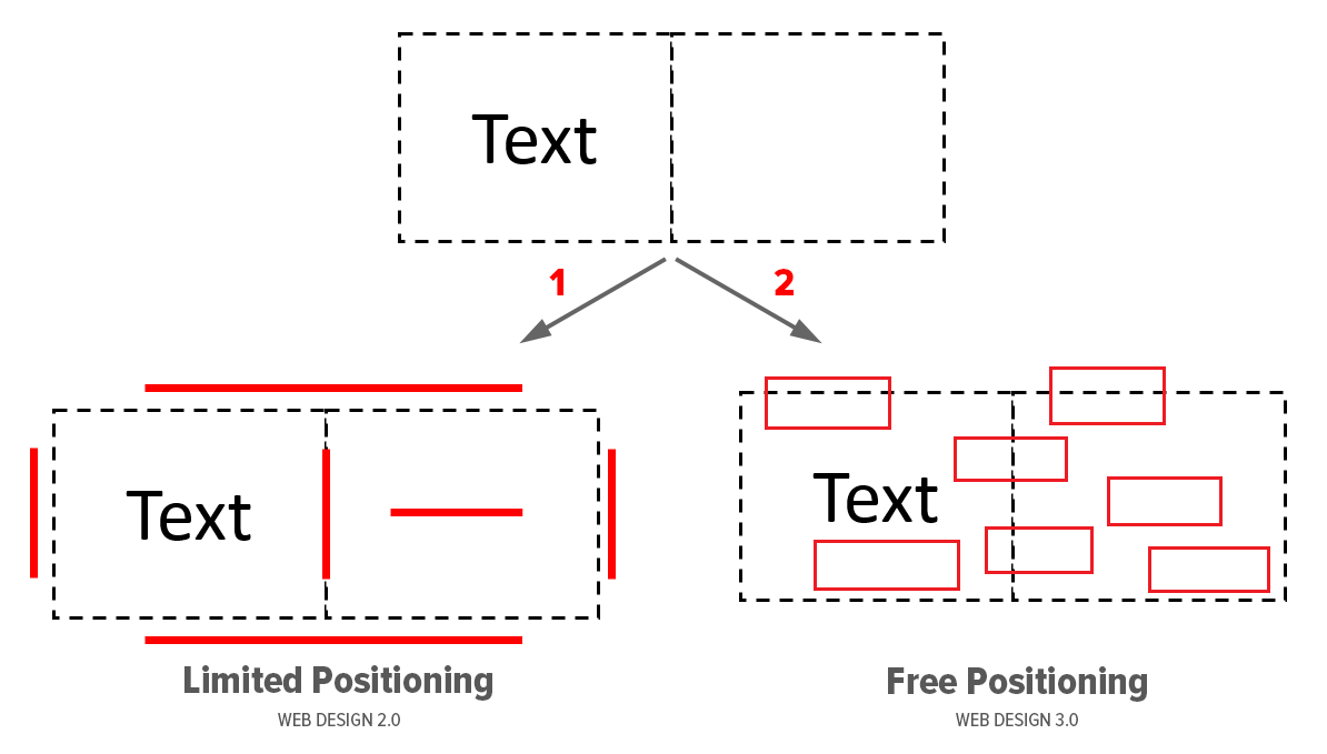
Positioning in web design
For example, you travel in Washington, DC. You have two options to move around the city. You can use public transportation or drive around the city by car or taxi.
In the picture below, you see the map of public transportation to the left. The road map for driving by car is to the right. Do you feel the difference? It is very similar to the free positioning in Web Design 3.0. You have much more freedom of choice.
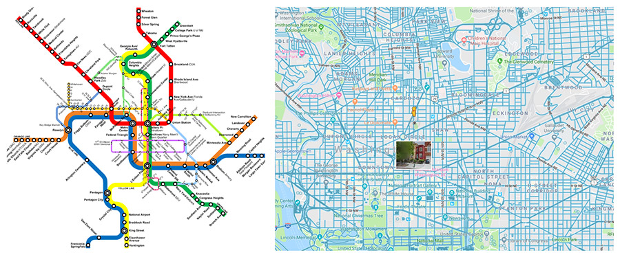
Maps of Washington DC
Another example: this article was edited in Microsoft Word. It has limited positioning similar to Web Design 2.0. The MS Word features are enough to write an article. But MS Word is not enough to design a presentation. We have Microsoft PowerPoint for that. Do you feel the difference? In MS PowerPoint, you can place elements freely. It gives you much more freedom for creativity in design. See the difference in the following picture.
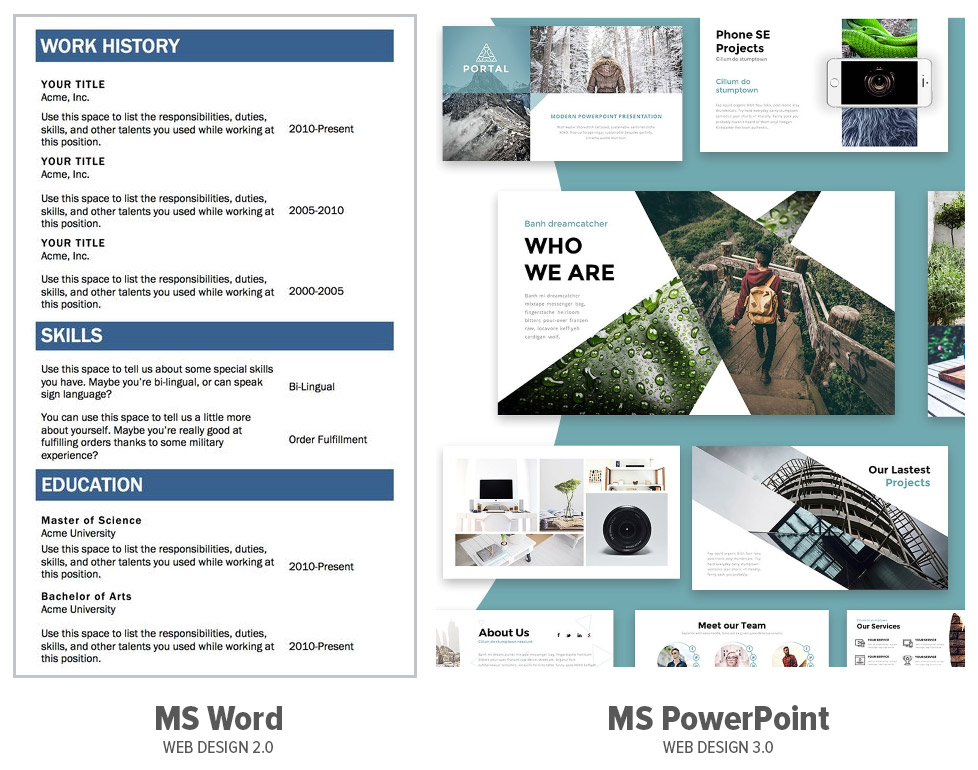
Microsoft Word and Microsoft PowerPoint
Building web pages in Web Design 3.0 using current website builders is similar to creating presentations in Microsoft Word. All these years, designers have been forced to use very limiting tools to design web pages. There was no one to tell and to give designers the alternatives.
Separate Markets
Let's have a look at the market of current Graphic Design tools. Designers use these tools for creating ideas in web design 3.0. At the same time, there is another market for website builders. Webmaster use builders to create working websites. So, these are two broad separated markets.
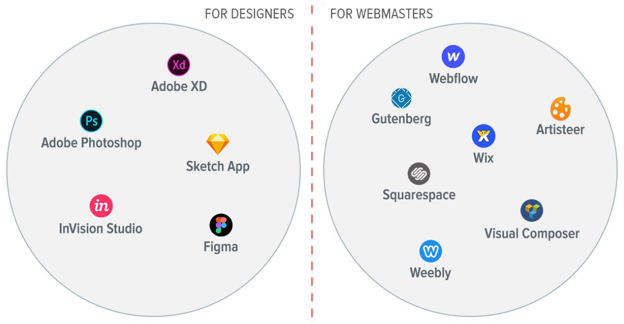
Markets of tools for web designers and webmasters
You see popular Graphic Design systems to the left. Designers always use these tools to design mock-ups in web design 3.0. All these tools have free positioning, element overlapping, and layers. But you cannot use them for creating working websites since they save only images.
There are some current popular website builders to the right. Designers use these platforms to build websites. But it is very difficult or almost impossible to design modern websites in Web Design 3.0 in these website builders.
Once we found an interesting web page in Web Design 3.0, we were very curious about its HTML coding. In the browser inspector, we found that the whole design was as one large image.
Are there any buttons or links? Yes, buttons are clickable image areas in the HTML. We see that this page was designed in the Graphic Design tool and was uploaded to the website as an image because there is no suitable and easy-to-use website builder for Web Design 3.0.
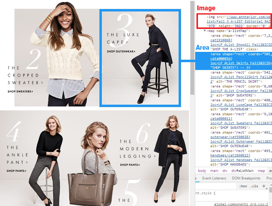
Web Designers need:
- Free positioning
- Removing table constraints
- Layers
- Property Panel for elements
- Support for Windows and Mac OS
Webmasters need:
- Clean HTML and CSS
- Mobile device support
- WordPress and Joomla support
- Building websites online
As we can see, these requirements are different. To create websites in Web Design 3.0, we need Revolutionary Changes.
Summary
Website builders are lagging behind the rapidly changing web design world.
The history of web design tools has involved several transitions. However, progress has stopped. There are numerous signs that the new transition must happen.
There are separate markets for web designers and webmasters. Popular website builders do not support the main features of Web Design 3.0: free positioning, modern grids, and layers.
Chapter 3: Tools for Web Design 3.0
Do you think it is possible to create Web Design 3.0 using only one tool? Yes, but it is difficult. It is like using a one-wheel bike. It is easy with two wheels working together, like in a bicycle.
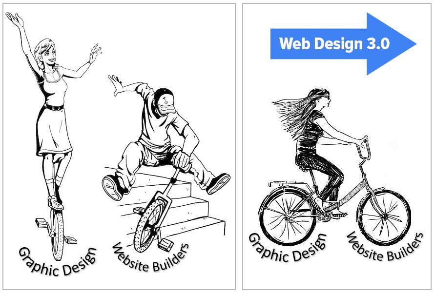
The new formula of the modern web design looks like the following:
WEB DESIGN + WEB MASTERING = WEB DESIGN 3.0
The new tools will have features of both web design and webmaster tools. At that, the support for responsive web design is a must. Web Design 3.0 builders are in the intersection blue area in the picture below.
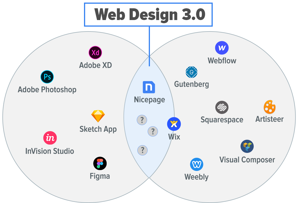
The intersection of markets for web designers and webmasters
Do such tools exist? Yes, they do.
For example, Nicepage is a system for building pages in Web Design 3.0. It combined the features of a Graphic Design tool and a website builder. It is suitable for web designers and webmasters. It supports free positioning, element overlapping, mobile devices and modern grids. At that, it generates clean HTML and CSS. Nicepage is available for Windows, Mac OS, and online. There are also a Joomla Extension and WordPress Plugin.
Creative and Simple
Are the current website builders simple and flexible enough to create unique websites in Web Design 3.0? Please look at the picture below.
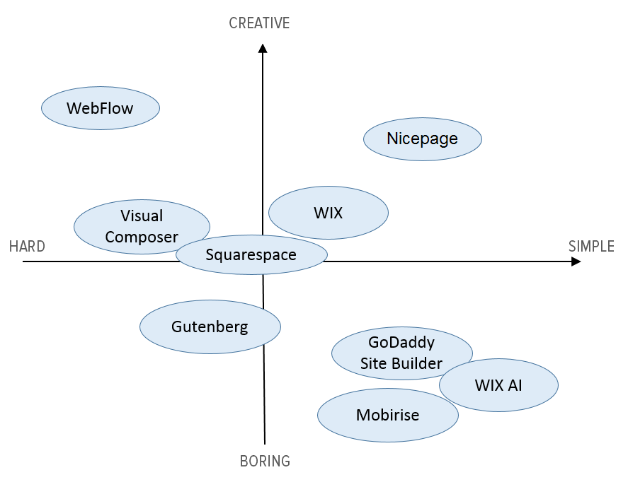
We see that current website builders are not simple and easy-to-use. If designers add some uniqueness to websites like in Web Design 3.0, the process is very difficult with the current systems. On the other hand, if a system is simple, it offers limited functionality.
The graph shows how the current website builders could be placed by creativity and simplicity. And there are website builders, where the creativity and simplicity are taken into consideration to allow building websites in Web Design 3.0.
Next, we will continue the discussion on how to create the trendiest web designs on the Web.
# Introduction
We love web design, and it is our passion. Web design is a part of our life. Since 2000, we have watched what is happening in the web design world every day. We are involved in the web design process, and there have been millions of web pages designed with our active participation. And now, we would like to share some of our exciting ideas with you.
For the first time, this article shares the secret about how to create the trendiest web designs in the world. You will learn the basic rules of modern web design to create world-class websites, blogs, and themes. You will find out how to become unique, how to stand out from the competition, and how to attract the attention of your customers.
This article consists of several chapters:
In **Chapter 1**, we will find out how web design is changing. Also, you will learn about the birth of the new generation of web designers, who are designing web pages in Web Design 3.0.
In **Chapter 2**, we will talk about website builders that are lagging behind the trends and slowing down the web design evolution.
In **Chapter 3**, you will learn how to create modern web designs quickly and easily in a new way.
# Chapter 1. Web Design Is Changing
The first thing we will talk about is [web design](https://nicepage.com/web-design). It is changing rapidly. To understand this, you need to review the web design evolution: from first sites to trendy websites of today. We will try to predict what kind of web designs will be popular in the nearest future.
There are three stages of the evolution of web design. In the picture below, we have colored each stage and added years to the timeline.
!design-history.jpg!
*Web Design Evolution*
###First Websites
The first websites were text-based. And it is hard to say that they had any web design.
###Transition To Web Design 1.0
Later, there was the transition to Web Design 1.0. Some graphical elements appeared on websites, which became more attractive. Web pages got tables. Then, tables transformed into Layouts and Grids. Tables gave some flexibility, but they were not mobile-friendly, and it was not required at that time.
Many people created their own Content Management Systems (CMS). So, webmasters did not have to edit the HTML files or upload them to servers. But it was possible to modify the content online in real time.
The evolution of web design and the spread of mobile phones led to new changes.
###Transition To Web Design 2.0
The next transition was to Web Design 2.0. Web pages got Grids, and web designers could arrange elements with Layouts.
Bootstrap accelerated the speed of Web Development. It simplified the process and made it more convenient. Bootstrap supported mobile devices from the beginning with Grids.
Bootstrap's Grid stretched automatically to the full width of screens. It reduced the developer’s time significantly spent on coding to support desktops, laptops, tablets, and phones.
!responsive.jpg!
*Modern website on various devices*
WordPress, Joomla, and Drupal became the most popular Content Management Systems. They replaced the self-written systems, which were imperfect and expensive to write and to maintain and which also had limited functionality. Thanks to WordPress and Joomla, anyone could create a blog or website. And today, more than 20% of sites are built using those systems.
WordPress and Joomla always supported themes and templates, which made it possible to modify the design without changing the content. It was possible to create themes manually or buy ready-made ones. Also, webmasters could use Theme Builder. There is a mass of themes and templates available.
In 2008, Artisteer arrived. It became the most popular Theme Builder at that time. With Artisteer, anyone could create themes and [website templates](https://nicepage.com/website-templates) in minutes. Millions of websites use themes designed in Artisteer.
###Is Web Design Dead?
It would seem that everyone should be happy: web designers, web developers, and users. However, there was a new problem. Web designers began to ask one question: "Is Web Design dead?". You can find articles asking the same question on all known platforms, such are Medium, Mashable, SmashingMagazine, Quora, and Reddit. Since 2015, web designers have been asking the same question.
In the picture below you can see the Google search results for this phrase.
!Seach-on-Google.png!
*Search results on Google*
Why is this happening? Bootstrap reached the height of its popularity in 2015-2016. You can see this in the chart below.
!bootstrap-popularity.jpg!
*Bootstrap in Google Trends*
The main cause of this problem was in Bootstrap and analogs. Bootstrap's web designs looked so similar to one another it was as if they were made with one template. Many website builders worsen the situation, having Bootstrap as the core of their systems. A Bootstrap's [website design](https://nicepage.com/website-design) starts with a big picture, and other parts fit into the two-, three-, and four-cell structure. Many themes and templates in Bootstrap boosted the distribution of this problem.
See in the image below.
!bootstrap-designs.jpg!
*Pinterest results for "web design bootstrap”*
In 2015, Ben Hunt published the book titled “Web Design Is Dead.” The main idea of the book is that the popularity of 50-dollar themes and templates almost killed the demand for the web designer's work. A custom web design costs much more because it requires time, knowledge and skills. Besides the design, it requires custom HTML and CSS coding.
Is this still a problem today? Yes, it is. After four years, the problem is still unresolved. In the picture below, you can see the Google search hints. People continue to ask this question today.
!google-2018.png!
*Search hints on Google*
Web designers started to find solutions. They could not stay away and watch [web design](https://nicepage.com/web-design), the passion of their lives, get stuck in progress. There are always designers who want to make the Web a better place. Steve Jobs once said, "Think different," about such kind of people. These people always seek new ideas.
###Print Design
Web design is very young. It is about two decades old. Print Design came long before web design, and it has hundreds of years in history.
!graphics-design-history.jpg!
*Evolution of Print Design. Copyright of onlinedesignteacher.com*
Print Design tools always allowed creatives to place items freely. Designers were not limited in their creativity. And publishers were always free in their ideas. They did not have to think about HTML, CSS, or mobile devices.
The Print Design formula:
###
<div style="border-top: 1px solid #3087df; border-bottom: 1px solid #3087df; color: #3087df; font-size: 24px; text-align:center; padding: 20px;">
FREE POSITIONING + CREATIVITY = MODERN PRINT DESIGN
</div>
###
!print-designs.jpg!
*Print Design on Pinterest*
Nowadays, many publishers have reduced print runs significantly and gone online. Printed pages have become web pages on the Web. But those web pages lost the creativity and freedom of Print Design. Designers did not want to lose the print ideas they have collected for years. They began to design with print ideas online.
###The Birth of Web Design 3.0
Starting in 2016, we began to notice ideas from Print Design appearing regularly on web page designs on Pinterest, Behance, and Dribbble. Those new web designs differed with:
1. Free positioning.
2. Element overlapping.
3. Breaking the limitations of Bootstrap-like Grids.
It meant the birth of Web Design 3.0!
###
<div style="border-top: 1px solid #3087df; border-bottom: 1px solid #3087df; color: #3087df; font-size: 24px; text-align:center; padding: 20px;">
Web Design 3.0 is about the designer's freedom
</div>
###
[!modern-designs.jpg!](https://nicepage.com/web-design)
*Modern web designs from Pinterest*
In the summer of 2016, **83 Oranges** (https://83oranges.com/) presented the article titled: “Web Design Trends.”
The author identified the following emerging styles in [website design](https://nicepage.com/website-design):
- Text Over Image
- Overlapping Images
- Vertical Text & Super Clean Layouts
- Uneven Grid Galleries
- Here Images with Big Headlines
- Abstract Brand Elements
!83oranges.jpg!
*83 Oranges on Pinterest*
In Chapter 3, we will take a closer look at styles and how you can create websites in Web Design 3.0.
###Removing Table Constraints
What does it mean to remove table constraints? Let's use the example, the image below which shows the typical photos on the wall. They look similar to the Grid.
!wall-2.jpg!
*Example from Pinterest*
If you search for “picture wall” on Pinterest or Google now, 90% of the results will look like those in the picture below. You notice the dramatic changes in Design in general nowadays. Design has seen rapid progress in all areas.
!wall-3.jpg!
*Example from Pinterest*
Agree that these examples look like modern Print Design and Web Design 3.0? Why is this happening? Nobody wants to see boring Grids from the past on their walls. People want to impress friends with unique ideas. Everyone wants to express their emotions with design.
##Modern Grid Layouts
We see more use of complex grids in web design. And the CSS Grid has become more popular.
!complex-grids.jpg!
##Web Design 3.0 Trends
Trendy designs breaking stereotypes are becoming more popular. In the chart, you can see that every year more designers discover the world of Web Design 3.0. This chart displays the results on the topic of "web design" on Pinterest, Behance, and Dribbble. We forecast that this trend will continue in the future.
!web-design-trends.png!
*Web design trends from Pinterest, Behance, and Dribbble.*
##Web Design Research
Every day we do the research and tests with new web design ideas. We upload our designs to Pinterest. We watch how users react by saving designs on their boards. We were very impressed with the results. Websites of web design 3.0 get ten times more feedback than 2.0 ones.
The actual data confirms these research results. In several months, we got about 800K unique monthly viewers. It says a lot about the growing popularity of pages in Web Design 3.0.
!viewers2.png!
*Audience growth on Pinterest*
If you want to make your web design ideas noticeable on Pinterest or Behance, there are no alternatives. You need to design websites in Web Design 3.0. If you have not started, you should hurry up! We will help you to understand what exactly you need to do.
##Our Goal
Our goal is to tell web designers about the newest web design trends. We want to explain the difference and how to create sites in Web Design 3.0. We try to spread our ideas. We love sharing our experience on how to become the most popular web designers in the world. We want to be the main driving power of Web Design 3.0 in the industry. We are always looking for people thinking differently. Together, we can change the web design industry.
!nicepage-designs2.jpg!
*Web Design 3.0 ideas on Pinterest*
##Site Builder Are Not For Creative People
You may ask, where are websites in Web Design 3.0? Why we still see a few of them on the Web as working websites? There are several reasons.
1. Designers do not have convenient tools to create HTML or WordPress pages in Web Design 3.0. And existing website builders lack free positioning. Designers still have to use Graphic Design tools like Adobe Photoshop, Adobe XD or Sketch App to realize ideas. To share ideas with the world, they upload ideas as images to Pinterest, Behance, and Dribbble. Web designers are unable to create working web pages. If they want to turn mockups into web pages, they need to write the HTML and CSS code by hand. But it is a long and expensive process.
2. There are no resources, where you can see the current trends in web design. Yes, there are Pinterest, Behance, and Dribbble. But to understand the trends, you need to monitor the changes every day. In every industry, there are resources where you can find out what is trending today: in movies, in music, on YouTube. Trends show everything, but not web design. It creates a lot of speculation on trends in web design. There are a lot of "experts" talking about trends. But we need a resource with data on web designs. Then it will be possible to understand today's trends in one click.
3. Due to the lack of real data and trusted authoritative opinions, designers continue to design in old styles.
4. There is a mismatch between designs and tools. Website builders are unable to create modern web designs. It slows down the growth of Web Design 3.0 significantly. We are strongly against the fact that designers are limited in the freedom of creativity. Designers should have a choice in which style to build their websites. Modern web designs should come off the podiums of fashion shows on Pinterest and Behance to become working websites.
###
<div style="border-top: 1px solid #3087df; border-bottom: 1px solid #3087df; color: #3087df; font-size: 24px; text-align:center; padding: 20px;">
Modern web designs should come off the podiums of fashion shows on Pinterest and Behance to become working websites.
</div>
###
##Summary
Web design is young, but it is progressing rapidly.
- **Transition 1** is the appearance of graphics on the Web. It made the Web more attractive and interesting and allowed the Web to conquer the world. The use of graphics allowed the Web to become a new independent way of information distribution.
- **Transition 2** is the appearance of blogs, grids, and support for mobile devices. The use of Bootstrap and the spread of [website templates](https://nicepage.com/website-templates) made web design boring.
- **Transition 3** is the most significant. It led to Web Design 3.0. Publishers going online and users transitioning to mobile devices. Designers taking ideas from Print Design to the Web. They want the freedom of creativity, free positioning, and removing table constraints.
#Chapter 2. Website Builders Are Behind Trends
The second part is about popular website builders, their evolution, and what they need to have to match Web Design 3.0.
Are website builders based on Bootstrap behind modern web design trends? Unfortunately, it is true. Every day the lag becomes more obvious and more visible. Let's find out why it is happening in detail.
##The Evolution of Website Builders
Similar to web design, let's take a look at the history of web design tools. There were also three transitions. In the picture below you can see some of the popular tools for web design.
!site-builders-history.png!
*Timeline of Website Builders*
Let's review these transitions in detail.
###Transition To Visual Editors
Webmasters edited the web page content in text editors. Those editors allowed to write the HTML code. At most, they offered convenient code coloring, automatic code formatting, and error highlighting in the HTML code. Transition 1 was from text to visual editors.
!text-to-visual.jpg!
*Transition to visual editors*
###Transition To Bootstrap
Transition 2 was the rise of blog systems like WordPress and Joomla and tools for creating themes, for example, Artisteer. People designed millions of themes in Artisteer. But in several years, Artisteer theme designs became outdated.
There were some popular website builders and WordPress plugins released: Webflow, VisualCompuser, Elementor, Divi, and others. Most of them are Bootstrap based. They are good for Web Design 2.0.
What are they missing for Web Design 3.0? These website builders and plugins do not have free positioning and layers. Also, they do not offer the simplicity and convenience of Graphic Design tools, which designers need.
Recently Bootstrap changed the main illustration on the home page. As you see below, it has layers. Perhaps Bootstrap is working on layers and free positioning.
!bootstrap.jpg!
*Bootstrap home page*
Here are other examples. If designers need white space, they have to add empty elements and rows. To create an overlapping of elements, they have to specify the negative values for margins. It turns the web design process, which should be fun, into complicated and boring work.
###Transition to Web Design 3.0
The current ongoing transition is to Web Design 3.0. And it is happening now. Unfortunately, many website builders are not ready for modern designs.
We believe that urgent action should be taken to prevent web design's progress from being stopped. The changes should be in the right direction. There are many variants of how to simplify website builders and to add more creativity to web designs. But not all variants are good enough.
We will review the following cases: the lack of creativity, Wix, and Gutenberg.
###Lack Of Creativity
It is impossible to believe, but sometimes developers move in the opposite direction. Some "new-fangled" tools, such as Wix ADI, GoDaddy Site Builder, and Mobirise have a fixed set of pre-made templates. Users can only change text and images, not the layout. Do developers want all websites to look the same? What kind of creativity and evolution of web design is that?
It is true that tools can be easy to use, as you cannot modify the design. Perhaps, some users agree to have simplicity without the ability to change the design. But our goal is to have the simplest builder and at the same time to keep the maximum freedom for creativity. We need a revolutionary breakthrough in tools.
###Gutenberg
Here is one more example. As you know, WordPress released a new article editor - Gutenberg. What is the reason for its appearance? It looks like WordPress developers wanted to create the same article editor that Medium.com has. Also, they wanted to have features of tools like VisualComposer. They made both, the article editor combined with the simple website builder. It would seem that everyone again should be happy. But in fact, we see the opposite. Users did not like this WordPress innovation. Please see the picture below.
!gutenberg.png!
*Screenshot from WordPress.org*
Why did this happen? The Gutenberg editor seems to be complicated for a simple article editor. At the same time, it has weak features for a website builder. Moreover, web designs generated by Gutenberg are not even in Web Design 2.0. They are more like Web Design 1.5 of 2010.
They could provide a convenient API to make it easier for developers to create their own website builders inside WordPress. Instead, they released another competitor for existing website builders. They also did not give any premade designs.
Perhaps over time, some developers will accept this. There is no alternative to WordPress. But it does not help us to get closer to the primary goal. We need the simplest editor to build websites in Web Design 3.0.
###WIX
Wix tried to become a tool for Web Design 3.0. Wix's problem is that its HTML does not meet the standards adopted by website developers. The element positioning is absolute. As a result, the HTML is not editable, and it is difficult to maintain mobile devices. Wix supports only desktops and phones. In practice, there is usually support for five types of devices. Wix recalculates the positioning with JavaScript, not HTML5 and CSS3. There is also no Property Panel like in all popular Graphic Design tools used by designers.
It seems that Wix is mostly for end users, not for designers and developers. For example, see the comments under the popular YouTube video, titled “How to Make a Website - Web Design Tutorial” on the “Draw with Jazza” channel. The discussion under this video is still going.
!wix-comment.png!
*Screenshot from YouTube*
Wix tried to simplify the website development and created Wix ADI. They removed the ability to edit the design completely. You can only modify the text and images. So, with ADI they went even farther away from Web Design 3.0.
###No Progress In Website Builders
Why is it so hard to create new tools that the web design industry needs?
1. **Difficulty**. Website builders are quite complex systems requiring significant investments and time into the development. It also requires a great idea that can change web design.
2. **Monopoly**. It is difficult for new tools to enter the existing market of website builders. The current tools have a large user base accumulated over the years. For new tools, it is difficult to inform a large number of users. Therefore, we need your help and support to spread information.
3. **Passivity**. Developers and users of existing website builders are very passive. Changes are always related to certain risks and extra efforts. People prefer not to change anything, as they think it will be like that forever. Please do not be passive!
##Progress Is Going On
As we have already seen, progress does not stand still and goes on. No one can stop it. At the same time, the new always meet difficulties on its way. Our common goal is to support the innovators of Web Design 3.0 to change the Web.
For example, electric vehicles continue to conquer the market, despite the enormous resistance of oil monopolies and manufacturers of traditional gasoline cars.
!tesla.jpg!
Similarly, it may seem that current Web Design 2.0 and website builders are the only options. It is not like that. Our task is to give a chance to something new. Together we can spread the word about Web Design 3.0 and the tools of the new generation!
###CSS Grid
The CSS Grid has become the newest standard for building layouts.
!grids.jpg!
###New Dimension In Web Design
The positioning of elements also has its evolution.
**Web Design 1.0** is "one-dimensional." The design elements are mostly arranged sequentially one after another.
**Web design 2.0** is "two-dimensional." There are Grids for placing elements in cells, which gives more freedom.
**Web design 3.0** is the new dimension. It has the free positioning of elements, overlapping, and layers like in Graphic Design tools. It opens the new prospects for web design. And it is the beginning of the new web design era.
!new-dimension.jpg!
*Dimensions in Web Design*
The new dimension is like LEGO bricks vs. mosaics.
!lego.jpg!
*Web design generations*
###Removing Table Constraints
As said, Web Design 3.0 requires free positioning and removing table constraints. The unique positioning of elements makes the web design itself unique. Unlike two-, three- and four-column designs which look very similar to each other.
###
<div style="border-top: 1px solid #3087df; border-bottom: 1px solid #3087df; color: #3087df; font-size: 24px; text-align:center; padding: 20px;">
Free positioning of elements makes web design unique
</div>
###
In the picture below you can see free positioning of elements in Web Design 3.0. The freedom of positioning makes a big difference for designers.
!positioning.png!
*Limited vs. Free Positioning*
In Web Design 3.0:
1. You can position elements freely. You can leave white space, if necessary.
2. You can resize elements freely.
3. You can overlay elements and Grid cells.
4. Of course, your web pages must be mobile-friendly.
These features are standard for Graphic Design tools. In Chapter 3, we will discuss how to apply these features in practice to create pages in Web Design 3.0.
Free positioning and element overlapping gain popularity in all types of Design.
!furniture-overs-small.jpg!
*Free positioning in interiors*
##Limited vs. Free Positioning
What do existing website builders offer? In the picture below you can see the example of a two-cell Grid. You see the text in the left cell. Imagine, you want to improve your design, so you wonder where to put the text.
There are two ways. The first one is to the left in the picture. You see the red lines. Those are placeholders supported in current website builders of Web Design 2.0. Usually, you can place elements between other elements in the Grid or into other cells. This is the limited positioning.
Seriously? Does anyone believe that such restrictions in the current website builders allow for the creation of truly unique and modern web designs? The answer is the limited positioning makes it almost impossible to build websites in Web Design 3.0!
However, there is the second way, which is to the right. As you see, there is an unlimited number of positions. You can put the text anywhere you want, not only where it is possible. And this is the way for new website builders of Web Design 3.0, the free positioning.
Popular website builders claim to have free positioning, or freehand. However, their freehand elements are positioned absolutely. Absolutely positioned elements are not mobile-friendly, and they must be repositioned manually in each mobile view. In Web Design 3.0 elements are positioned relatively and mobile-friendly.
!limited-positions.png!
*Positioning in web design*
For example, you travel in Washington, DC. You have two options to move around the city. You can use public transportation or drive around the city by car or taxi.
In the picture below, you see the map of public transportation to the left. The road map for driving by car is to the right. Do you feel the difference? It is very similar to the free positioning in Web Design 3.0. You have much more freedom of choice.
!washington.jpg!
*Maps of Washington DC*
Another example: this article was edited in Microsoft Word. It has limited positioning similar to Web Design 2.0. The MS Word features are enough to write an article. But MS Word is not enough to design a presentation. We have Microsoft PowerPoint for that. Do you feel the difference? In MS PowerPoint, you can place elements freely. It gives you much more freedom for creativity in design. See the difference in the following picture.
!word-powerpoint.jpg!
*Microsoft Word and Microsoft PowerPoint*
Building web pages in Web Design 3.0 using current website builders is similar to creating presentations in Microsoft Word. All these years, designers have been forced to use very limiting tools to design web pages. There was no one to tell and to give designers the alternatives.
##Separate Markets
Let's have a look at the market of current Graphic Design tools. Designers use these tools for creating ideas in web design 3.0. At the same time, there is another market for website builders. Webmaster use builders to create working websites. So, these are two broad separated markets.
!designers-vs-webmasters.jpg!
*Markets of tools for web designers and webmasters*
You see popular Graphic Design systems to the left. Designers always use these tools to design mock-ups in web design 3.0. All these tools have free positioning, element overlapping, and layers. But you cannot use them for creating working websites since they save only images.
There are some current popular website builders to the right. Designers use these platforms to build websites. But it is very difficult or almost impossible to design modern websites in Web Design 3.0 in these website builders.
Once we found an interesting [web page](https://www.anntaylor.com/a-list/cat1920002?loc=LBLP_AList_Summer1&ICID=LBLP_AList_Summer1) in Web Design 3.0, we were very curious about its HTML coding. In the browser inspector, we found that the whole design was as one large image.
Are there any buttons or links? Yes, buttons are clickable image areas in the HTML. We see that this page was designed in the Graphic Design tool and was uploaded to the website as an image because there is no suitable and easy-to-use website builder for Web Design 3.0.
!anntaylor.jpg!
**Web Designers** need:
- Free positioning
- Removing table constraints
- Layers
- Property Panel for elements
- Support for Windows and Mac OS
**Webmasters** need:
- Clean HTML and CSS
- Mobile device support
- WordPress and Joomla support
- Building websites online
As we can see, these requirements are different. To create websites in Web Design 3.0, we need Revolutionary Changes.
##Summary
1. Website builders are lagging behind the rapidly changing web design world.
2. The history of web design tools has involved several transitions. However, progress has stopped. There are numerous signs that the new transition must happen.
3. There are separate markets for web designers and webmasters. Popular website builders do not support the main features of Web Design 3.0: free positioning, modern grids, and layers.
#Chapter 3: Tools for Web Design 3.0
Do you think it is possible to create Web Design 3.0 using only one tool? Yes, but it is difficult. It is like using a one-wheel bike. It is easy with two wheels working together, like in a bicycle.
!monocycle-bicycle.jpg!
The new formula of the modern web design looks like the following:
###
<div style="border-top: 1px solid #3087df; border-bottom: 1px solid #3087df; color: #3087df; font-size: 24px; text-align:center; padding: 20px;">
WEB DESIGN + WEB MASTERING = WEB DESIGN 3.0
</div>
###
The new tools will have features of both web design and webmaster tools. At that, the support for responsive web design is a must. Web Design 3.0 builders are in the intersection blue area in the picture below.
!designers-and-webmasters.png!
*The intersection of markets for web designers and webmasters*
Do such tools exist? Yes, they do.
For example, [Nicepage][1] is a system for building pages in Web Design 3.0. It combined the features of a Graphic Design tool and a website builder. It is suitable for web designers and webmasters. It supports free positioning, element overlapping, mobile devices and modern grids. At that, it generates clean HTML and CSS. Nicepage is available for Windows, Mac OS, and online. There are also a Joomla Extension and WordPress Plugin.
###Creative and Simple
Are the current website builders simple and flexible enough to create unique websites in Web Design 3.0? Please look at the picture below.
!simple-flexible.png!
We see that current website builders are not simple and easy-to-use. If designers add some uniqueness to websites like in Web Design 3.0, the process is very difficult with the current systems. On the other hand, if a system is simple, it offers limited functionality.
The graph shows how the current website builders could be placed by creativity and simplicity. And there are website builders, where the creativity and simplicity are taken into consideration to allow building websites in Web Design 3.0.
Next, we will continue the discussion on how to create the trendiest web designs on the Web.
###
[1]: http://www.nicepage.com