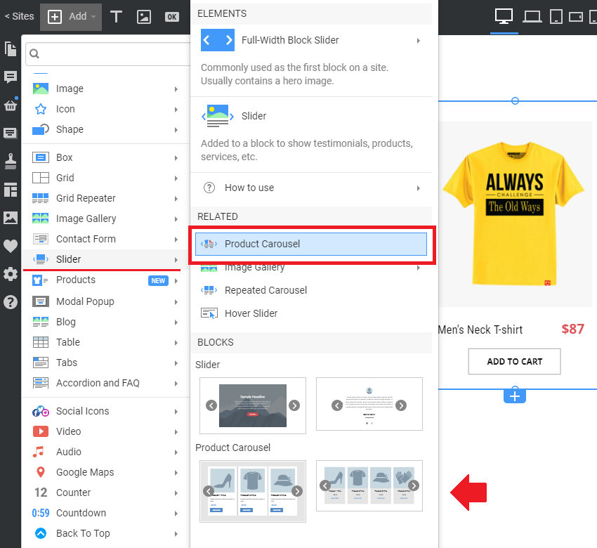
The Product Carousel is a special instance of the Products element that displays products as a carousel, allowing you to present them in a sliding format.
This Element will display the Product List created in your E-Commerce extension for WordPress or Joomla, such as WooCommerce or VirtueMart.
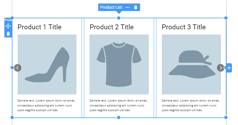
Product Carousel In Slider
You can use the Product Carousel Element and Presets from the Slider section.
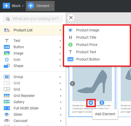
Add Product Elements
Use the plus sign inside the carousel item to choose what Product List Elements will appear in the carousel item. This will open the available Product List Elements.
Product Carousel Properties
After adding the Products Carousel Element to a page, you can edit different properties in the Property Panel to style it.
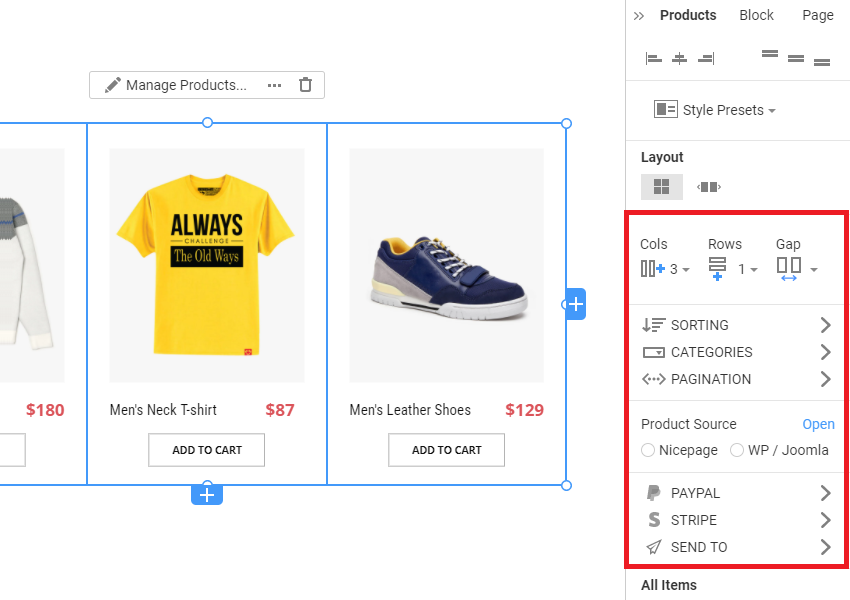
Size and Margin
You can manage the size options of your Carousel, making it screen-width or any other desired size. Also, you can edit margins.
Presets And Layouts
Choose one of the defined Product Presets and edit the Layout. You can select the Simple Grid Layout, which will make it a fundamental Product List element, or choose the Carousel option to create a sliding carousel.
You can set the number of Columns and specify the number of Product Presets with a Carousel using the Product Count option. To stylize the Layout, edit the Gap between Items.
Filter Products
Choose what products to be shown with the Products Carousel element. You can choose the Recent Products (all categories), Featured Products, or products from a specific Category (type the exact category name in the input below).
Arrows
Next, you can activate and stylize the Arrows in the Products Carousel. Choose the Icon and its style, and specify its default and hover state colors. Then, edit the Arrow Shape Style, activating the Background color or gradient with the desired colors.
The Arrows can have a Border with straight or rounded corners. Here, you can also specify the inner Spacing. The next option allows you to flip the arrow Icon in two directions. Also, you can hide the Arrows in any Responsive View if required.
Active Product
Here, you can choose the styling for a separate item inside the Carousel. For that, select the Active Item option, and then the above options, like Background and Hyperlink, will be applied to the currently active item only.
If you switch to the All Items option, the styling of the currently active item will be applied to all carousel items.
All / Item Properties
You can specify the Layout for all Products in your Carousel. Edit the Border Color, Width, Radius, and Padding inside the Carousel items.
You can also set the custom CSS Class for the Product Carousel element and specify if you need to hide it in any responsive mode.